googlefonts / googlefonts/roboto-flex
German eszett () Wght 900 | opsz 14
- Dominant language
- HTML
- Stars
- 525
- Forks
- 35
- PR merge metrics
- No merged PRs in 30d
Description
I was thinking about how the 'ß' begins to heavily distort its proportions:
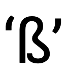
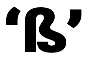
And I thought why not pull the stroke back? Three wide strokes at the base HAVE to be that wide. But if it is more like two and bit of a flip like at the base of the letter would not have to be so wide.
I also went to see "how atypical this solution I am objecting to?". In other words - maybe it is more common than I think. But I am not finding that's not true.

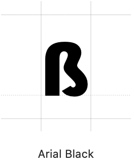
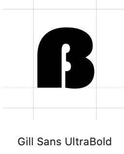
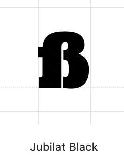
It exists, but not as extreme as this. And where the feature of the exists the stroke or serif is made smaller. Which brings up another point which is that when you do see something like this it seems to be more connected to a serif design.
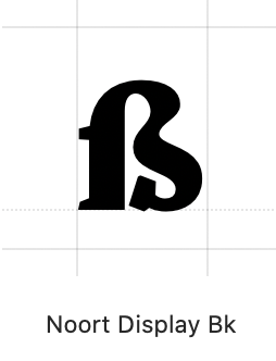

So in summary think it makes better sense in order to preserve the intent of the source Roboto to change either just the black or maybe all versions by cutting the inner stroke short so that it is possible to keep the general proportions rather than the stroke extent.
Contributor guide
No contributing guide indexed for this repository
Assessment
This issue has not been assessed yet.