googlefonts / googlefonts/roboto-flex
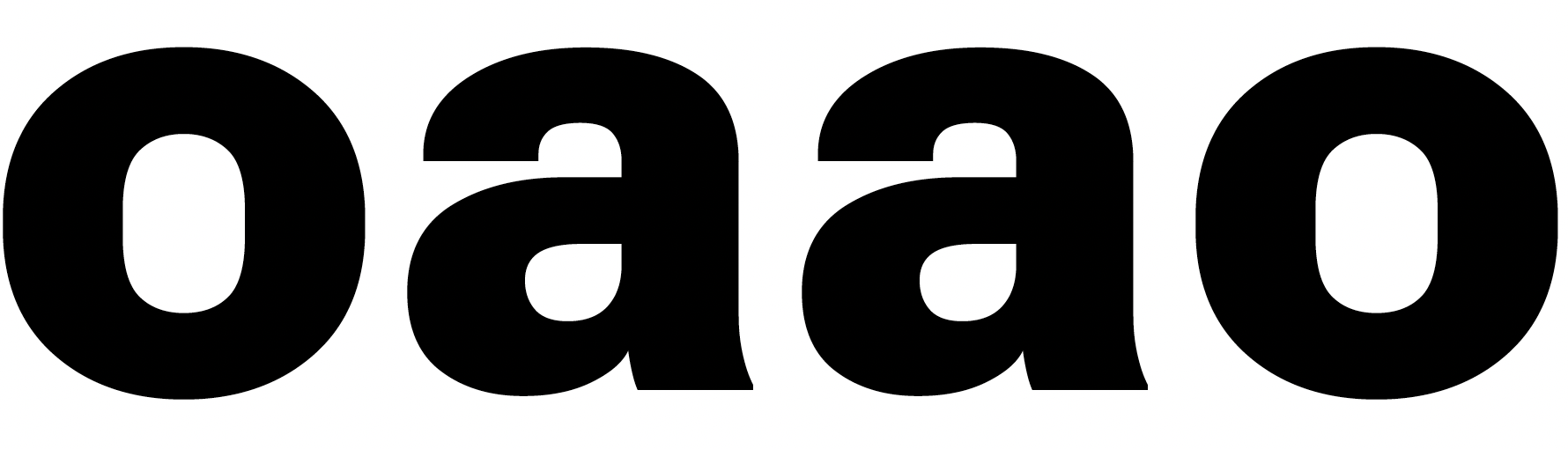
letter 'a' 100 & 900 wght | 14 opsz
- Dominant language
- HTML
- Stars
- 525
- Forks
- 35
- PR merge metrics
- No merged PRs in 30d
Description
In the light 100 wght the smoothness of the middle stroke forming the bowl of the letter 'a' doesn't seem to match the 400 wght. The height of the bar might be better moved up to better echo the feeling in the 400 too. The upper left part of the stroke also thins a bit more than seems ideal.
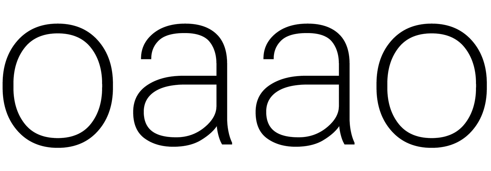
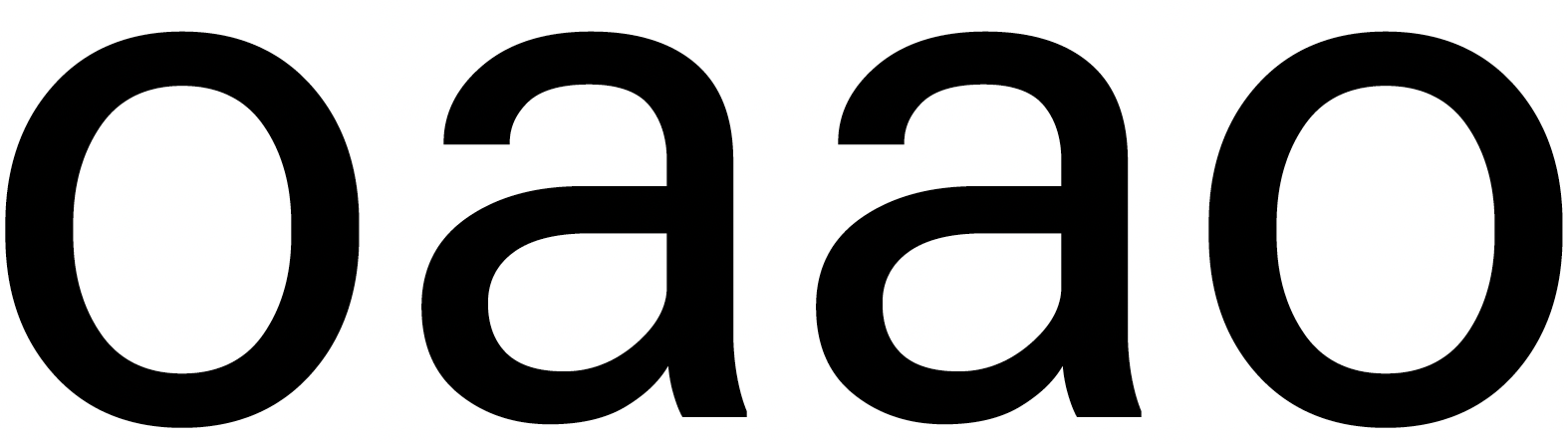
The 900 wght is smooth but the vibe from the 400 has changed. I think this is partly because the top of gets proportionally wider than we see in 400 and 100. I wonder f the bowl was slightly wider if that would fix it. The bowl of the 900 wght 'a' also seems to droop more than we see in 400 and 100. Fixing the lower left of the bowl by pulling that round in a little will fix this.
Contributor guide
No contributing guide indexed for this repository
Assessment
This issue has not been assessed yet.