googlefonts / googlefonts/roboto-flex
Caps and numbers that seem heavy
Open
- Dominant language
- HTML
- Stars
- 525
- Forks
- 35
- PR merge metrics
- No merged PRs in 30d
Description
In this sample the Z and X seem a bit too heavy. Also the top of T and the tops and bottoms of rounded shapes such as O Q 2 3 S P Z
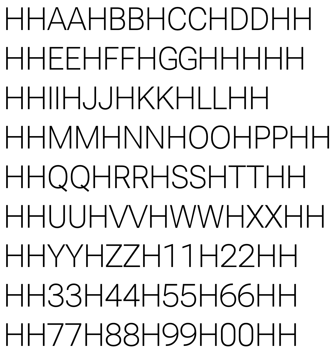
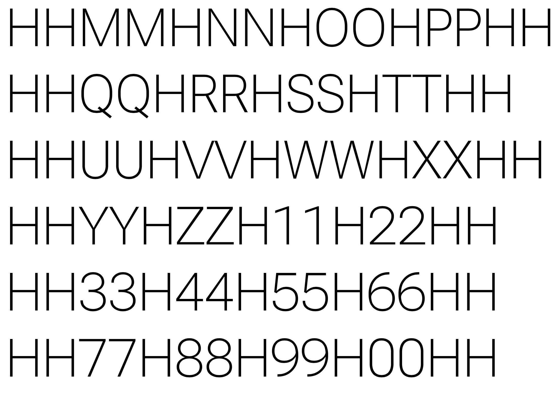
Admittedly in a PDF when seen at 100% size the problems seem to mostly go away
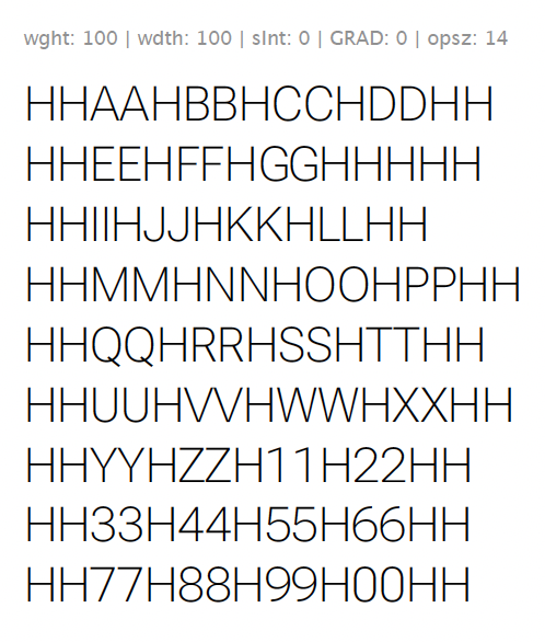
But still think they are worth resolving.
Contributor guide
No contributing guide indexed for this repository
Research direction
Review the attached sample images and compare the affected glyphs: Z, X, T, O, Q, 2, 3, S, and P. Determine whether their apparent heaviness persists at the reported viewing sizes; the work is done when the affected shapes no longer appear disproportionately heavy without introducing new inconsistencies.
Written by the indexing model from the issue text.
Assessment
- Domain
- design
- Issue type
- Bug
- Difficulty
- 5/5
- Estimated time
- Over a week
- Activity status
- Stale
- Clarity
- Mostly clear
- Newbie friendliness
- 30/100