googlefonts / googlefonts/roboto-flex
Diagonal stroke letter weight issues in 900 wght/ 14 opsz
- Dominant language
- HTML
- Stars
- 525
- Forks
- 35
- PR merge metrics
- No merged PRs in 30d
Description
The v and y seem slightly too light. I did that you are making them have a stroke contrast but modulating that seems worthwhile.
In k the weight is too dark in the lower stoke. But more than that the thickness of the join is also just not expected or in my view justifiable.
The lc z seems too dark in comparison with other lc letters
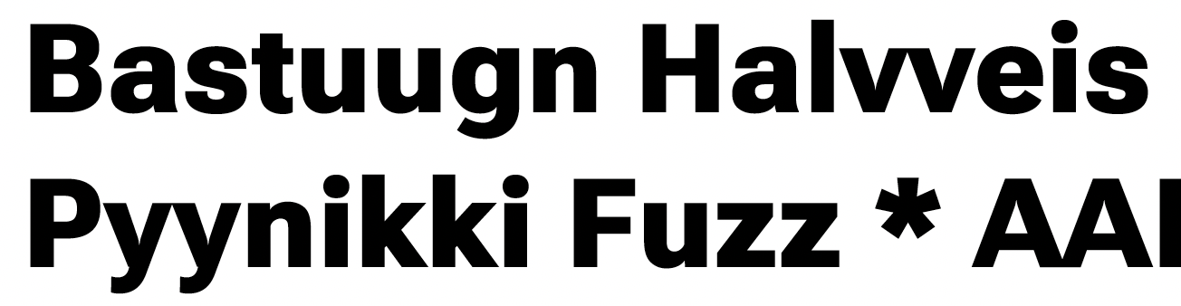

The capital K has a similar issue as the lower case k but it is less severe

The middle of S feels too dark and makes the S separate in apparent weight from the others. I think the I could be a few units thicker/darker to stand up to theothers better too.


Contributor guide
No contributing guide indexed for this repository
Research direction
No source file or test is named in the issue. Start by reviewing the attached comparisons at weight 900 and optical size 14, then evaluate the v, y, k, z, K, S, and I glyphs; the work is done when their apparent weights and joins are visually consistent with the surrounding letters.
Written by the indexing model from the issue text.
Assessment
- Domain
- design
- Issue type
- Bug
- Difficulty
- 5/5
- Estimated time
- Over a week
- Activity status
- Stale
- Clarity
- Needs clarification
- Newbie friendliness
- 25/100