googlefonts / googlefonts/roboto-flex
Diacritics - wght: 100/400/900 | wdth: 25/100/151 | slnt: 0 | GRAD: 0 | opsz: 14
- Dominant language
- HTML
- Stars
- 525
- Forks
- 35
- PR merge metrics
- No merged PRs in 30d
Description
**i - discussion of the dot on i.**
One of the big reasons I like to see the dot being slightly heavier than is common is because then it harmonizes better with letters that require larger longer or otherwise more involved diacritics. A mild quiet dot makes the other diacritics seem overblown in comparison. In a display face, this is more OK and diacritics can more readily fade back as a style choice. But in running text you need the clarity that only weight and/or scale can provide. So even though David, you said you want to keep the dot on 'i' as is this is my second attempt to suggest revision at least for 8opsz and 14 opsz. in 144 you have as I say, far more scope.
**in 400**
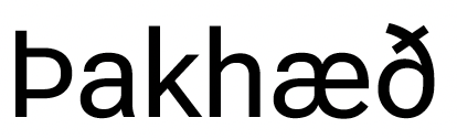
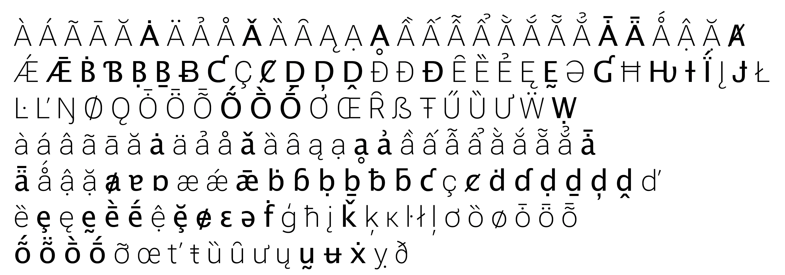
ð - The icelandic eth is too heavy on top in the received version. This looks like a quality error to me and I suggest we fix it in flex
Ł & ł - Polish lslash the diagonal bar is often made to end on the right at or near x height. Vika can speak to this better than I can @@(living in Poland as she does) but It looks to me like raising this bar would improve quality.

Vietnamese stacked accents - It looks like we are stacking full-size accents for Vietnamese. The ideal thing is to make scaled versions of these and to compose them so that, just as with the dot and the dieresis; the parts don't match but the weight of the combined diacritics in the eye does.

Dot above and dot below and dieresis shapes don't match
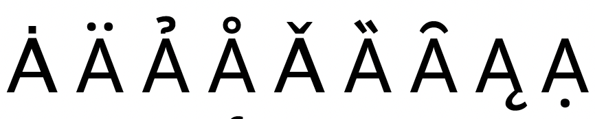
The weight of hook above is too much vs the other diacritics. The design style doesn't seem to fit either.

ae+ macron seems to be using the wrong base glyph
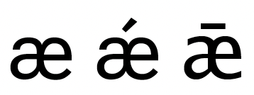
e - two kinds of wrong e shapes are used in these ( the one on the far left is correct) The second wrong kind is on the far right.

reverse breve - this diacritic floats too high
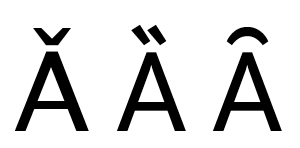
The base glyph for a+ diacritics is inconsistent. I see two wrong kinds in use.

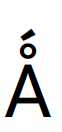
The ringacute is better made with aprecomose special diacritic rather than stacking them. But also if you did tstack them this would be too loose.
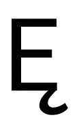
Eogonek - the ogonek should end parallel to the strokes of E instead of reaching past them to the right
**100**
mostly I see the same issues but with these additions
The Icelandic eth looks to compressed and small in light vs the other glyphs

Missing glyphs? - maybe Roboto flex just doesn't have the glyphs in the dark weight? That would explain a lot
**900**
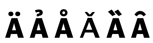
mostly I see the same issues but with these additions
Positioning of the hook over A isn't good. The reverse breve floats too high again
The cross bar of the Tbar is too short
Looking at 25 & 151 wdth I again see mostly the same problems.
Contributor guide
No contributing guide indexed for this repository
Assessment
This issue has not been assessed yet.