googlefonts / googlefonts/roboto-flex
cap to cap 100/400/900 | wdth 151 | slnt 0/-10 | GRAD 0 | opsz 14
- Dominant language
- HTML
- Stars
- 525
- Forks
- 35
- PR merge metrics
- No merged PRs in 30d
Description
wght: 100
G - right side bearing is too tight
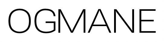
E - right side bearing too tight vs N O D

J - left side bearing too tight
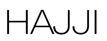
T - left and right side bearings too tight -

S - left and right side bearing stoo tight vs the general spacing
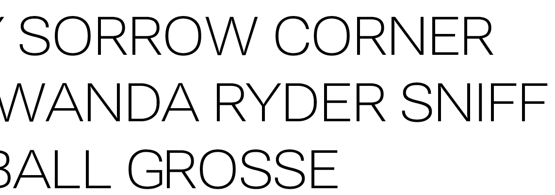
400
T - Even if the basic version of Roboto is like this I think a bit of air for this double T is a good idea
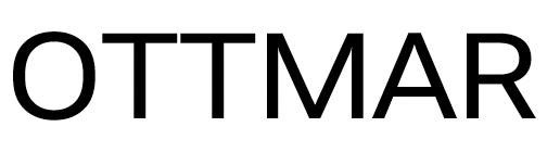
900
K is too dark
S - The middle is too dark
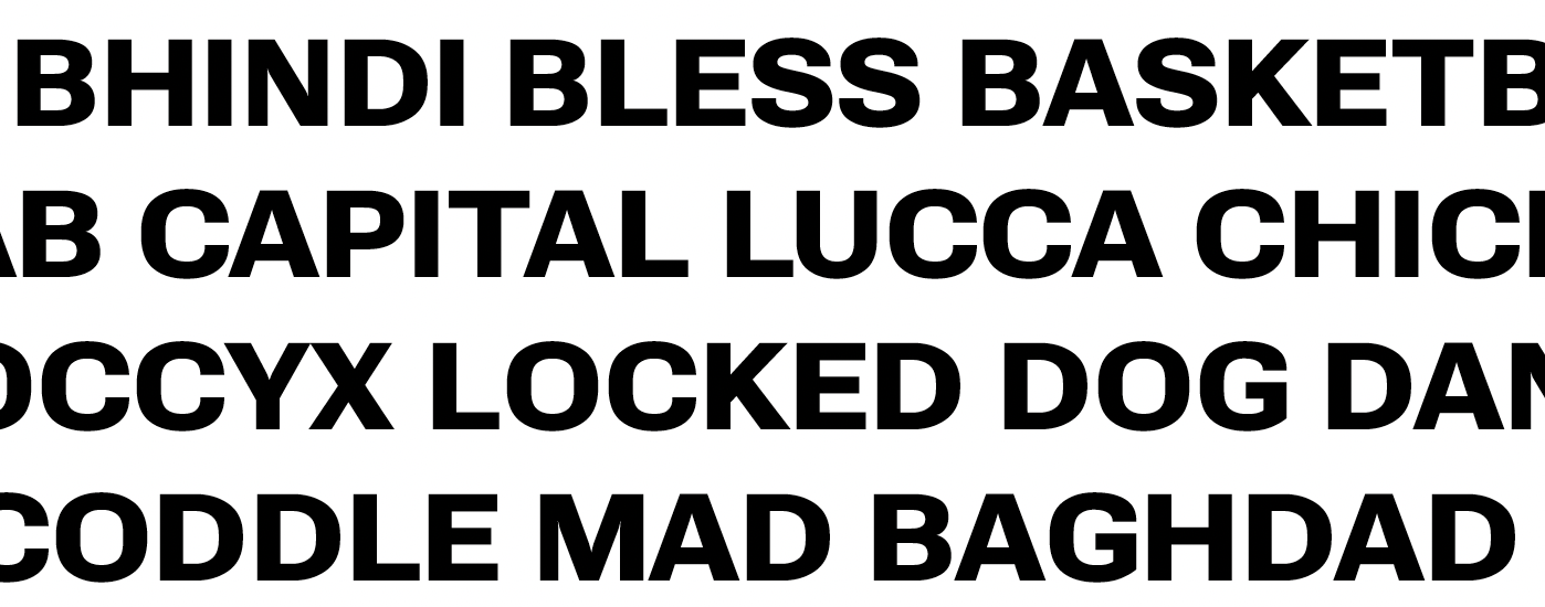
Diagonals in R and M too dark vs the rest
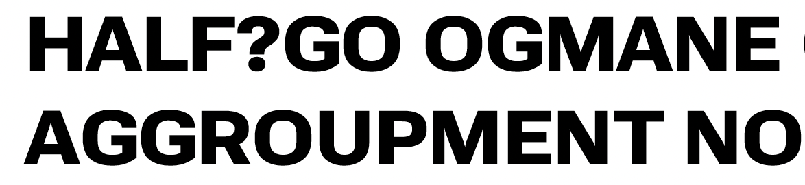
L & A - I am a big fan of letting Y W V and A touch in heavier weights to get better overall rhythm - But in the sample above it bits into L so I wonder if it make sense to give more space to A slightly and more to the right of L so that it can set without kerning without bleeding into each other. What about letting L be a bit darker? It feels weirdly light vs everything else.

O & Q - The rounds of O in 900 get boxier than in the other two weights. I want to suggest modulating that so that the personality stays more consistent. But also the counters of O are brighter and the strokes thinner than I was expecting. Less boxiness will help with the brightness a bit.

O & G - What about letting O & G ( & Q) be slightly less wide? They look a bit stretched vs other caps
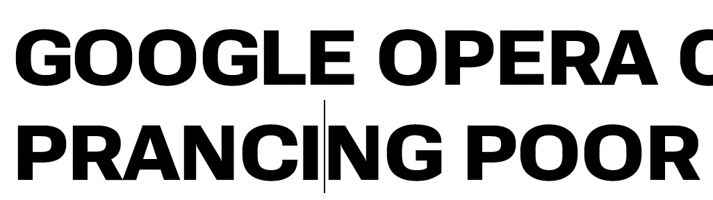
Z - Z is crashing into itself and other letters. Z also looks darker than other caps at this weight


N - what about letting N be slightly wider to better match other caps?

Contributor guide
No contributing guide indexed for this repository
Assessment
This issue has not been assessed yet.