googlefonts / googlefonts/roboto-flex
Ampersand & other symbols - wght: 100/400/900 | wdth: 25/100/151 | slnt: 0/-10 | GRAD: 0 | opsz: 14
- Dominant language
- HTML
- Stars
- 525
- Forks
- 35
- PR merge metrics
- No merged PRs in 30d
Description
& - The 900 weight ampersand feels too heavy next to the lc & uc

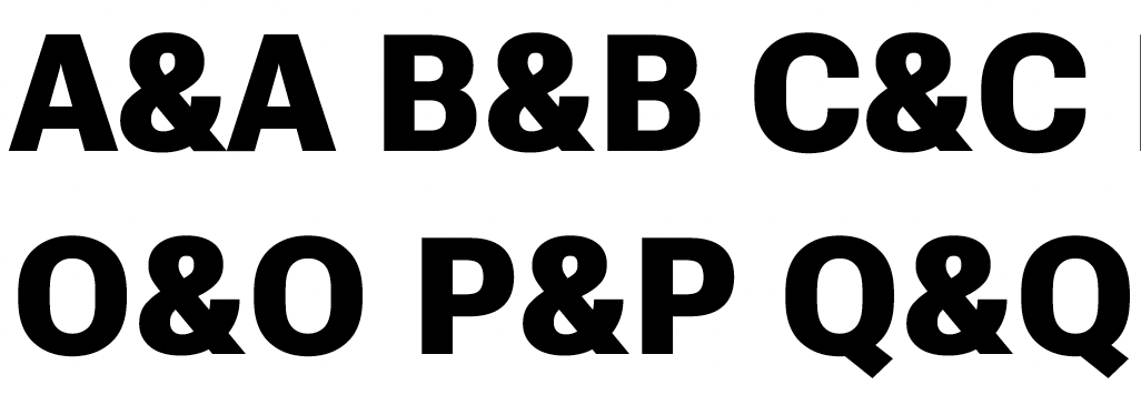
100 wght
- Shekel, infinity, partial differential, published ( circle P) and Service Mark are not done yet ( too heavy).
- Shekel also seems to have inconsistent treatment across weights.
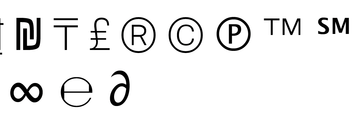
- Service mark and published are too dark

400
- infinity doesn't take on the style of the overall design. Is it a problem?
- This is also true of 'partial dif....
- In this weight published is too light.
- service mark and published are too light

900
- Shekel looks squashed din this weight.
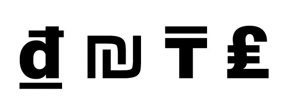
- The bar of cent looks too light

- Copyright and registered have distorted rings.
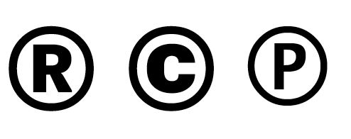
- Published is too light

- Not sign foot looks too subby

- Service mark is too light

Contributor guide
No contributing guide indexed for this repository
Research direction
Review the attached reference images and compare the listed ampersand and other symbols across weights 100, 400, and 900 and the stated variable-font axes. No source file or test is named; done means the reported glyph weight, proportions, spacing, and distortion issues are corrected consistently across the specified instances.
Written by the indexing model from the issue text.
Assessment
- Domain
- design
- Issue type
- Bug
- Difficulty
- 5/5
- Estimated time
- Over a week
- Activity status
- Stale
- Clarity
- Mostly clear
- Newbie friendliness
- 25/100