googlefonts / googlefonts/roboto-flex
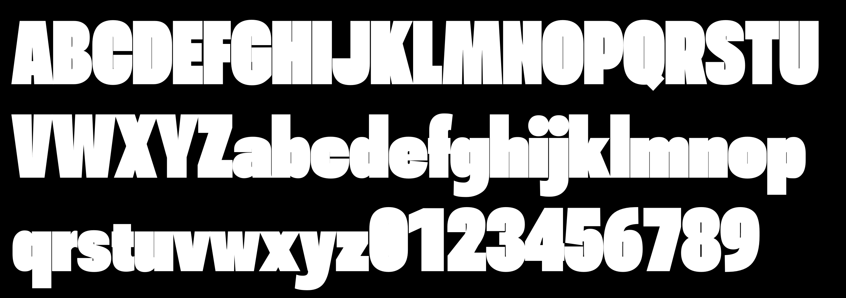
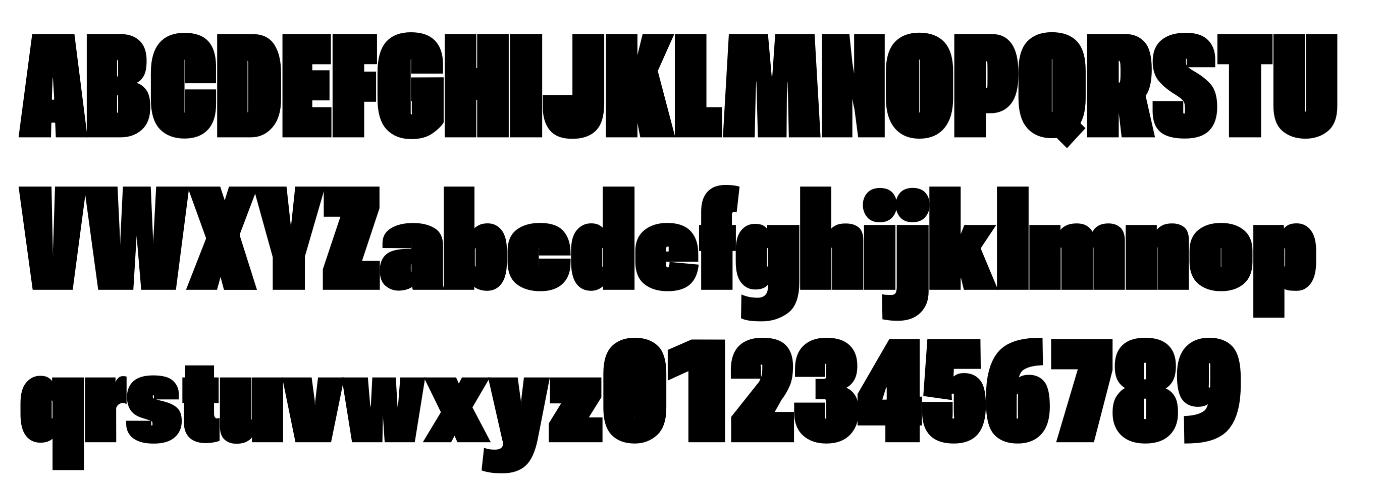
Counters are closing up in wght: 900 | wdth: 25 | slnt: 0 | GRAD: 50 | opsz: 144
- Dominant language
- HTML
- Stars
- 525
- Forks
- 35
- PR merge metrics
- No merged PRs in 30d
Description
Counters in some letterforms are closing up or becoming very tight in grad 50.
This happens to smaller extent Latin:
- a (top part) and c.
- e - shape of counter is a little irregular
In numbers:
- number 0.
- number 1 has a different issue, it looks very wide.
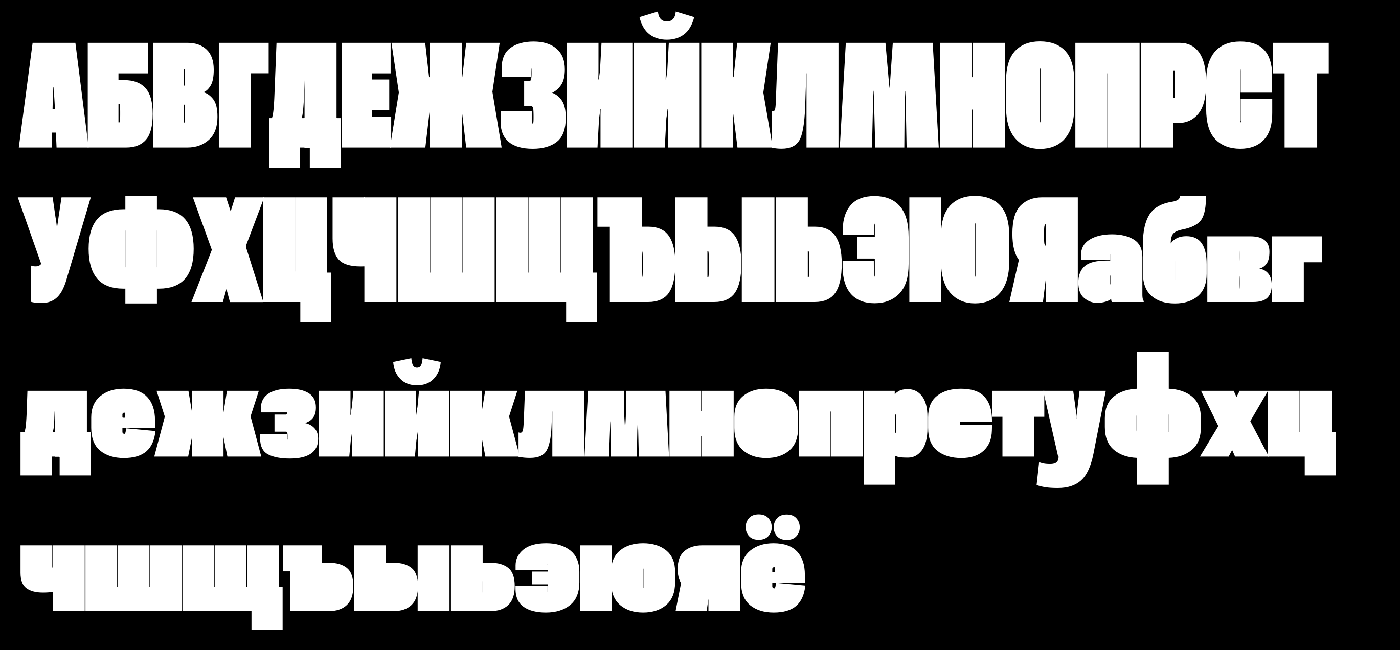
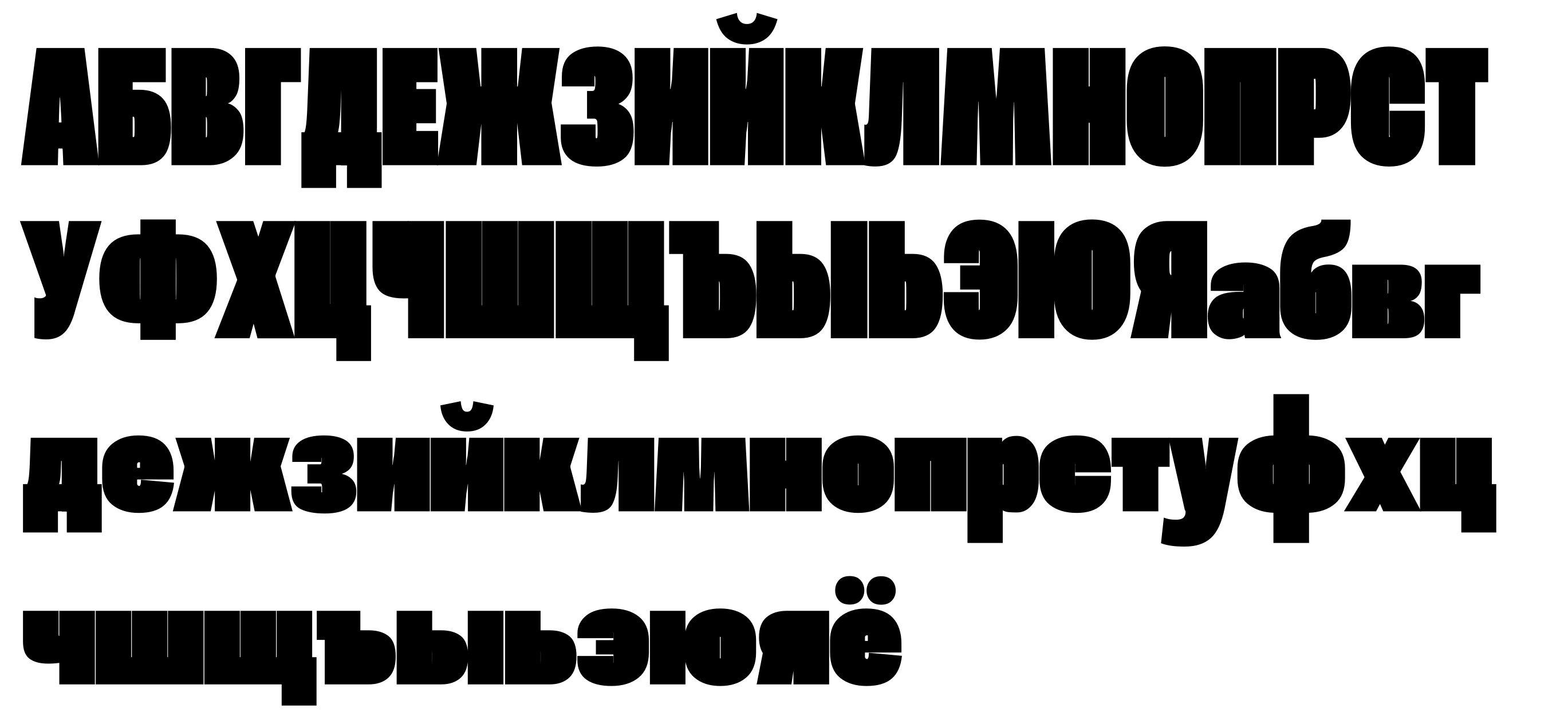
And there are more cases in Cyrillic:
- Closed counters in: Ч я ъ
- Very tight, almost invisible counters in ыь. Counters in ъ and ыь shouldn't be different.
- эє counters are almost invisible
- Counters in ПЦШЩ are thinner than in H. If possible, I think they should be equal in this weight, optical size and grade.
- Ф has thinner counters than Р. I think they should be equal if possible.
- ИЙ - shapes of counters get a little unlucky
Contributor guide
No contributing guide indexed for this repository
Assessment
This issue has not been assessed yet.