googlefonts / googlefonts/roboto-flex

lower case - wght: 100/400/900 | wdth: 151 | slnt: 0 | GRAD: 0 | opsz: 8

Open
#225 0 comments 0 reactions 0 assignees View on GitHub
Dominant language
HTML
Stars
525
Forks
35
PR merge metrics
No merged PRs in 30d

Description

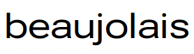
* a - The a feels slightly tight 400

![image](https://user-images.githubusercontent.com/2181213/153488786-5c8bc5b2-90c1-45d4-85fe-01eedc7d35b7.png)
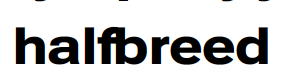
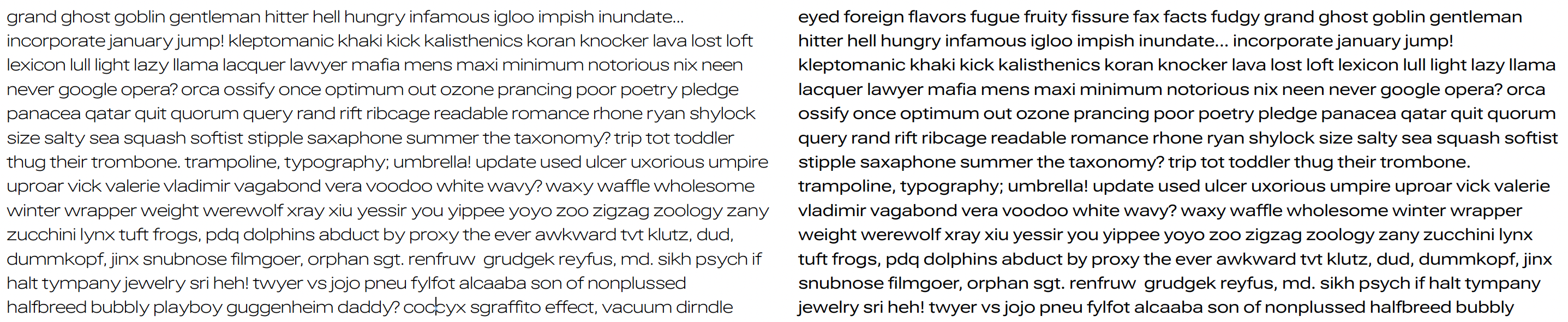
* 100 wght spacing - The light is meant to be a 8 opsz and yet it has the spacing of a display type. Much too tight. 400 and 900 are ok but the 900 could be looser.
![image](https://user-images.githubusercontent.com/2181213/153489212-8d3fe711-7a2d-405e-8b2d-80d1561ed424.png)
![image](https://user-images.githubusercontent.com/2181213/153489402-c0496c5d-fc9f-4ca7-8199-0b9dad351b4e.png)
* w - too light in 400. Slightly too light in 100 & 900

![image](https://user-images.githubusercontent.com/2181213/153489533-896eb268-fc1a-4f60-be9a-204a7b83fc4a.png)
![image](https://user-images.githubusercontent.com/2181213/153489590-01271b52-62e9-4381-bad1-f66de8ea4648.png)
![image](https://user-images.githubusercontent.com/2181213/153489655-8163ee40-6c3e-4987-85f1-6f8c0526e7ed.png)
actually a lot of diagonals are see: x & y

![image](https://user-images.githubusercontent.com/2181213/153489812-ef37778e-cd6f-4b54-b89a-37060f105ac7.png)
* g - bottom too heavy in 400
![image](https://user-images.githubusercontent.com/2181213/153489960-d6cf05e6-b094-4265-8b09-4e5cc0eb9f82.png)
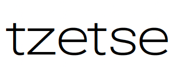
* z - too heavy in 900
![image](https://user-images.githubusercontent.com/2181213/153490057-27666495-658b-4765-8372-46496387cf78.png)
Pull the upper left stroke in on z in 100/400 /900
![image](https://user-images.githubusercontent.com/2181213/153490139-2e4b4727-ea02-44b0-9209-efa9fdf9a428.png)
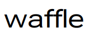
* f - right sidebearing too small in 100/400/900 with 900 being pretty severe
![image](https://user-images.githubusercontent.com/2181213/153490304-437d3de3-3925-4c0a-990b-29df957a5e6a.png)
![image](https://user-images.githubusercontent.com/2181213/153490360-478e1dbf-b37c-4c72-9b8f-2c78e953a5a3.png)
![image](https://user-images.githubusercontent.com/2181213/153490396-bea0924b-8344-4728-aee3-602633968b44.png)
![image](https://user-images.githubusercontent.com/2181213/153490509-72139253-9b0b-43ad-943e-07c32e3f98ed.png)
* j - in 100 j is set more tightly than i. this sis a bit true in 400 too.

![image](https://user-images.githubusercontent.com/2181213/153490742-32e70aba-f3aa-4b7b-aac6-419931300864.png)
![image](https://user-images.githubusercontent.com/2181213/153491021-005f5e8f-e808-4b7b-806c-76806bd4f36f.png)
![image](https://user-images.githubusercontent.com/2181213/153491373-d63e878a-b928-434e-8ed6-a80ab9e3dcaf.png)

Contributor guide

No contributing guide indexed for this repository

Research direction

Review the screenshots and the listed glyphs and axis settings (wght, wdth, slnt, GRAD, and opsz) to understand the requested visual adjustments. The issue does not name source files or tests; first locate the font source and a way to inspect its variable-font masters. Done means addressing the described spacing, weight, stroke, and sidebearing concerns across the specified weights.

Written by the indexing model from the issue text.

Assessment

Tech stack
html
Domain
design
Issue type
Refactor
Difficulty
4/5
Estimated time
3-5 days
Activity status
Stale
Clarity
Mostly clear
Newbie friendliness
35/100

Get new issues in your inbox

A short digest of beginner-friendly GitHub issues.