googlefonts / googlefonts/roboto-flex
lower case - wght: 100/400/900 | wdth: 25 | slnt: 0 | GRAD: 0 | opsz: 8
- Dominant language
- HTML
- Stars
- 525
- Forks
- 35
- PR merge metrics
- No merged PRs in 30d
Description
* f & t - I would like to see these letters set looser @ 8 opsz and 100/400 wght
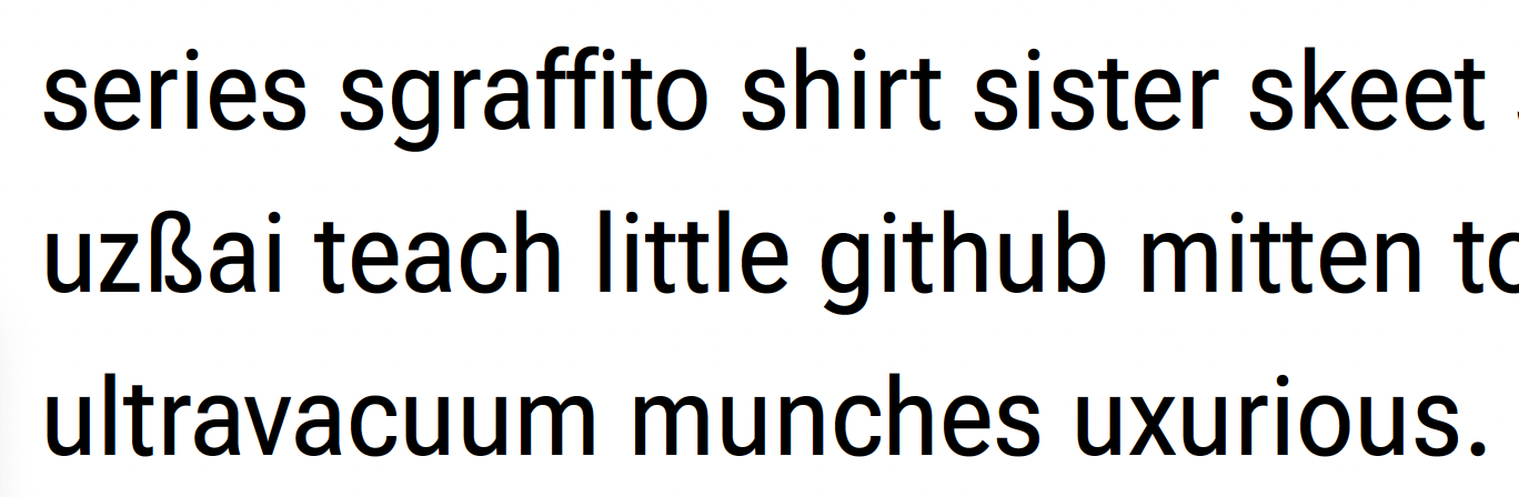
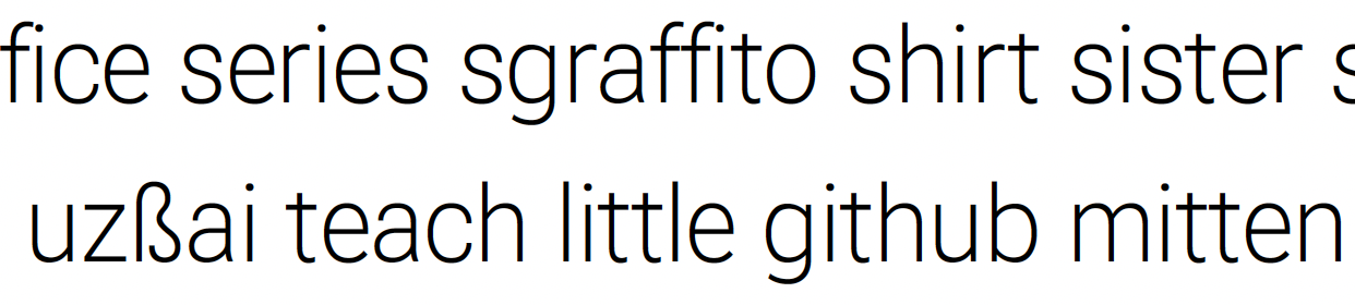
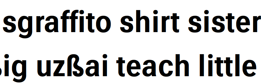
* z - In 900 z is a bit to tightly spaced and a bit too dark

In 400 it seems to lean to the left and seems a little bit too heavy

In 100 it seems to lean to the left, and the top and bottom strokes seem slightly too heavy

* y - in 100 it seems a bit light

in 400 the same issue but also it seems a bit too narrow as well
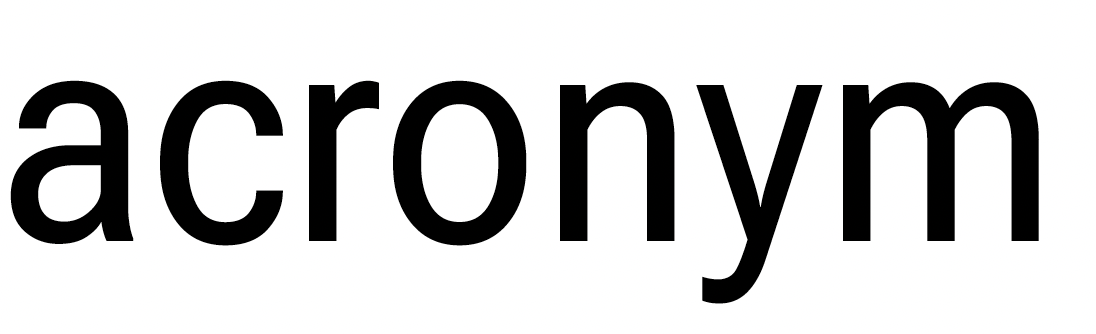
In 900 it feels a little too narrow and we have what seems like a bit too much stroke contrast between left and right diagonals
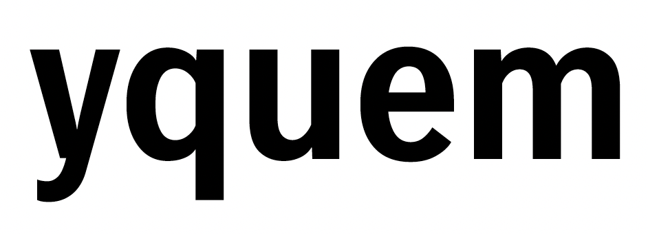
Contributor guide
No contributing guide indexed for this repository
Research direction
Reproduce the lower-case f, t, z, and y examples at the stated wght, wdth, slnt, GRAD, and opsz settings, using the attached comparisons as the visual reference. No source file or test is named, so first locate the repository's font source and determine how glyph edits are previewed; done means the listed spacing, weight, lean, width, and contrast concerns are addressed across the cited instances.
Written by the indexing model from the issue text.
Assessment
- Domain
- design
- Issue type
- Bug
- Difficulty
- 5/5
- Estimated time
- Over a week
- Activity status
- Stale
- Clarity
- Mostly clear
- Newbie friendliness
- 25/100