googlefonts / googlefonts/roboto-flex
Ruder test - letters k f t v w z - tight letters in 14 pt ( 19 px) the 100 wght 14 opsz 0 grad 0 slnt
Open
- Dominant language
- HTML
- Stars
- 525
- Forks
- 35
- PR merge metrics
- No merged PRs in 30d
Description
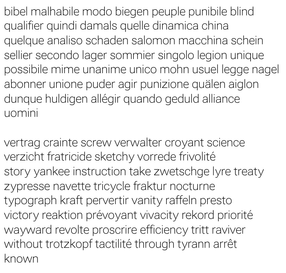 in 14 pt ( 19 px) the 100 wght 14 opsz 0 grad 0 slnt looks a bit too wide or spaced too tightly on their diagonal or cross bars portion given the rest of the design at this setting. Clearly the intent is to make the design more text-y and open in the counters than the old design which is working but this means just a bit more space for these I think.
Contributor guide
No contributing guide indexed for this repository
Assessment
This issue has not been assessed yet.