google / google/material-design-icons
Shape of Error icon too similar to Info icon
- Dominant language
- No language data
- Stars
- 54k
- Forks
- 9.7k
- PR merge metrics
- No merged PRs in 30d
Description
The shape and content of the Error icon is too similar to the Info icon.
If you have [a low vision](https://www.w3.org/TR/low-vision-needs/) it is nearly impossible to recognize the difference between both icons. Of course I can provide traffic light colors for my alerts, but that does not help f.e. colorblind people.
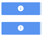
I would suggest using the **shape of a stop sign**, to provide a high shape contrast. Also the i-letter could be extended by serifs.
Contributor guide
Research direction
No file or test is named; start with the comparison image in the issue and inspect the current Error and Info icon assets. Evaluate a stop-sign silhouette and serif treatment for clear shape contrast without relying on color, including for low-vision and colorblind users.
Written by the indexing model from the issue text.
Assessment
- Domain
- accessibility, design
- Issue type
- Feature
- Difficulty
- 5/5
- Estimated time
- Over a week
- Activity status
- Stale
- Clarity
- Mostly clear
- Newbie friendliness
- 25/100