Improve braille glyphs in monospace fonts by changing to connecting box elements
- Dominant language
- HTML
- Stars
- 20.5k
- Forks
- 2.9k
- Avg merge
- 1d 21h
- Merged PRs (30d)
- 95
Description
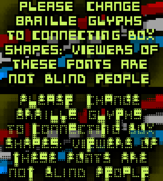
All monospace console fonts can be improved by designing braille glyphs with connecting box characters.
### Given the following facts:
1) Blind people read braille with their fingers, not their eyes.
2) The primary use of braille characters in *fonts* is for rendering graphical elements and images for viewing by sighted people.
3) The 256 braille 2^(2x4) characters provide a higher resolution image-rendering alternative to the unicode box-drawing characters 2^(2x2) = 16.
### We can agree to conclude:
**Fonts which render braille glyphs with small dot-shapes do not serve their most commonly used application as well as those with braille glyphs consisting of connecting box elements.**
### Example:
### Suggestion:
Font designers of monospace fonts are advised to revise the braille glyphs to render with connecting boxes.
Thank you for your attention.
Contributor guide
Assessment
This issue has not been assessed yet.