Documentation > Improve Noto Guidance
- Dominant language
- HTML
- Stars
- 20.5k
- Forks
- 2.9k
- Avg merge
- 1d 21h
- Merged PRs (30d)
- 95
Description
A user wrote in this query about how Noto has become fragmented in Google Fonts.
We should improve the guidance when the current work to ship Noto is complete.
> I have a question about the different font-weight between fonts in computer to design and web font for R&D to coding, when I download noto font from this web : https://www.google.com/get/noto/#sans-lgc
>
> 
>
>
> there is a lot of font weight, after I design all my sample, then make the font system,
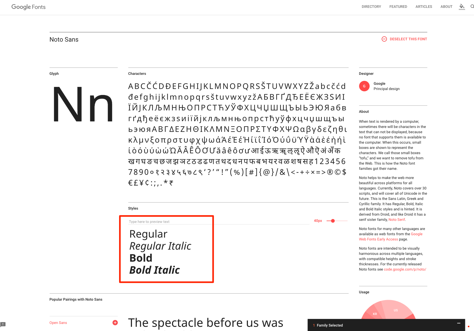
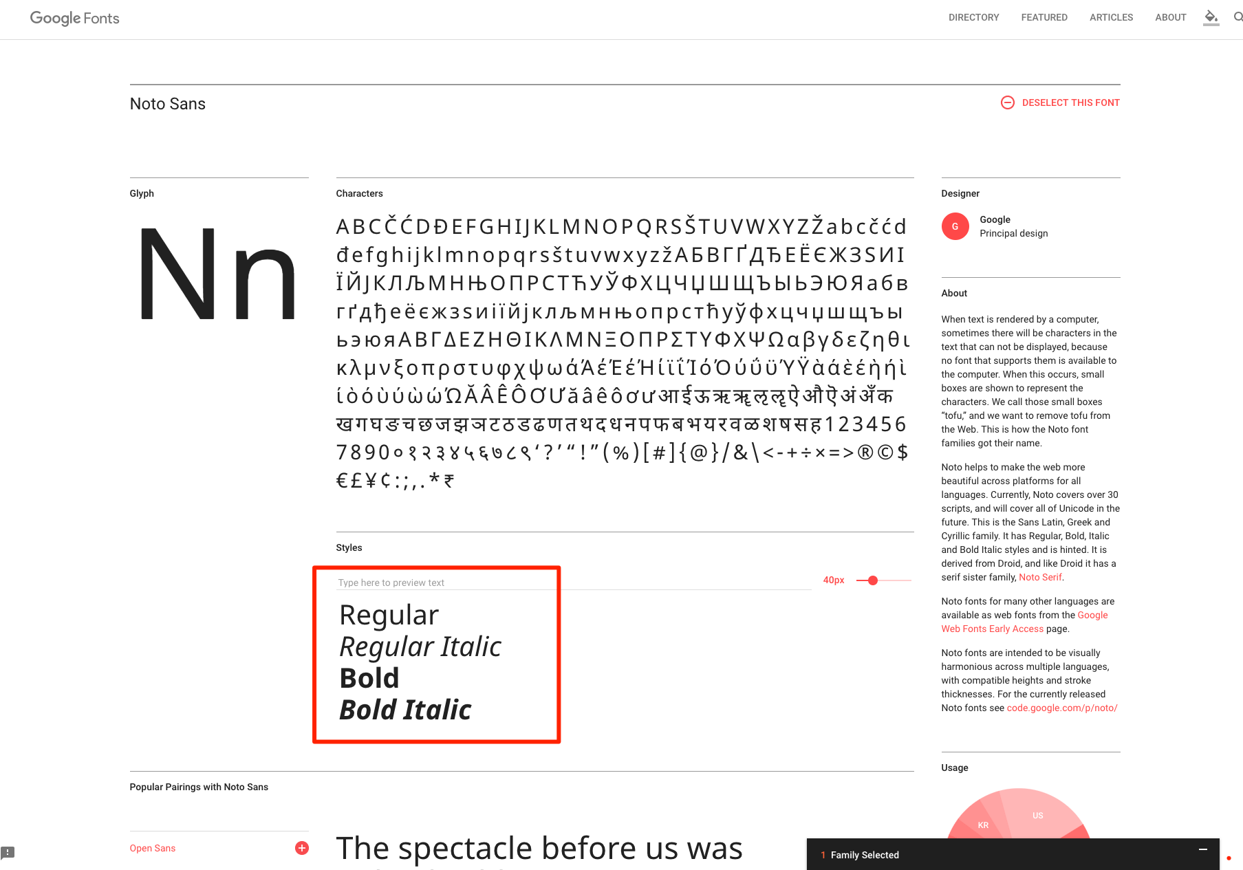
> then R&D tell me we ca't do that as web font way, cause there only offer regular and bold,
> https://fonts.google.com/specimen/Noto+Sans
>
> 
>
> then refer guideline
> https://www.google.com/get/noto/help/guidelines/
>
> "It is recommended to use "Noto Sans CJK {JP, KR, SC, TC}" rather than "Noto Sans {JP, KR, SC, TC}", unless space/latency is very restricted. Each of the font families "Noto Sans CJK {JP, KR, SC, TC}" supports all four languages, but has a different default language. "
>
> and this doc
> https://www.google.com/get/noto/help/cjk/
>
> Noto Sans CJK and Noto Serif CJK comprehensively cover Simplified Chinese, Traditional Chinese, Japanese, and Korean in a unified font family.
>
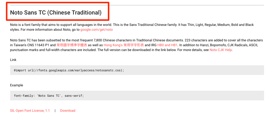
> can I use this web font :
> https://fonts.google.com/earlyaccess
> Noto Sans TC (Chinese Traditional)
>
> 
>
> who has 7 font-weight to replace this ?
> https://fonts.google.com/specimen/Noto+Sans
>
> 
>
> thanks for confiom for me,
>
> hope we can fix the problem with using this instead and get different font-weight we need.
>
> @import url(//fonts.googleapis.com/earlyaccess/notosanstc.css);
Contributor guide
Assessment
This issue has not been assessed yet.