Improve alert component accessibility (colors, icons, etc)
Nobody has claimed this yet.
- Dominant language
- TypeScript
- Stars
- 13.8k
- Forks
- 1.4k
- Avg merge
- 17h 58m
- Merged PRs (30d)
- 5
Description
Problem to solve
The new alert component introduced back in https://github.com/gitpod-io/gitpod/pull/8783 was the next iteration of the alert component improved for https://github.com/gitpod-io/gitpod/issues/7613.
🅰️ We're tracking in https://github.com/gitpod-io/gitpod/issues/9411 the pending migration of the previously used InfoBox and AlertBox components to the new Alert component.
🅱️ However, there's still room for improving the alert component design including colors, icons, and variations of those in light and dark themes.
See also relevant discussion (internal).
| Alert Component / Info Variant / Light Theme | Alert Component / Info Variant / Dark Theme |
|---|---|
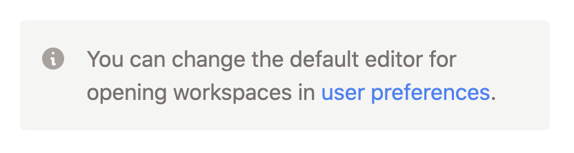 |
 |
| Alert Component / Warning Variant / Light Theme | Alert Component / Info Variant / Dark Theme |
|---|---|
 |
 |
Proposal
This issue acts as a placeholder for tracking these improvements and the next iteration of the alert component.
Thankfully, now that the new alert component is in place we will only have to update the designs in one place. 🔮
Designs
TBD (To be discussed)
Contributor guide
First steps
- Read the whole issue, then the project's contributing guide.
- Comment on the issue to say you are picking it up — it saves two people doing the same work.
- Fork the repository and make your change on a branch.
- Open a pull request that references the issue number.
Research direction
Start with components/dashboard/src/components/Alert.tsx and review the linked discussion and screenshots for the proposed light and dark variants. Designs are still TBD, so first clarify the colors, icons, and variations before changing the component. Done means the agreed accessibility and design improvements are implemented in the Alert component.
Written by the indexing model from the issue text.
Assessment
- Tech stack
- typescript
- Domain
- accessibility, design, frontend
- Issue type
- Feature
- Difficulty
- 5/5
- Estimated time
- Over a week
- Activity status
- Stale
- Clarity
- Needs clarification
- Newbie friendliness
- 20/100