Update provider selection header
Nobody has claimed this yet.
- Dominant language
- TypeScript
- Stars
- 13.8k
- Forks
- 1.4k
- Avg merge
- 17h 58m
- Merged PRs (30d)
- 5
Description
Problem to solve
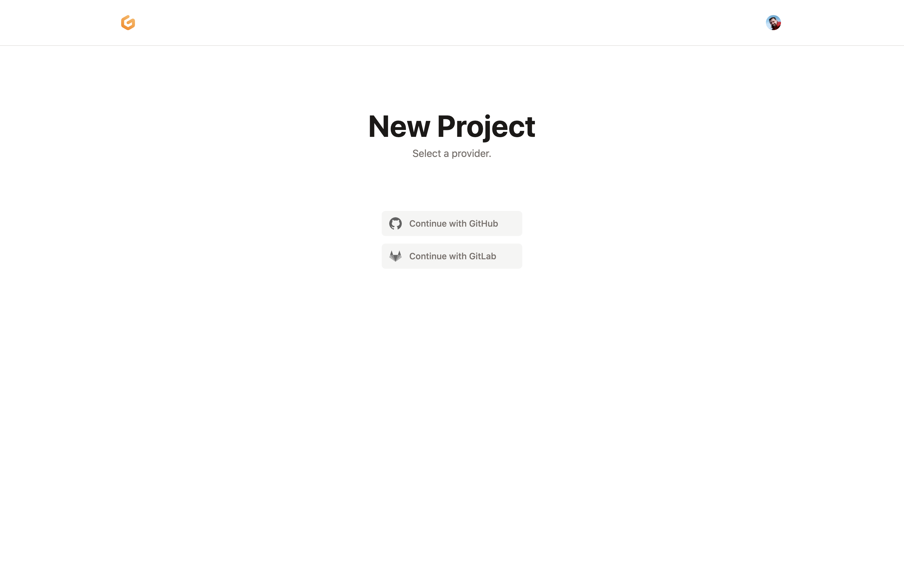
Following the updates in https://github.com/gitpod-io/gitpod/pull/7163, the provider selection step in the onboarding flow is still using some borders that could be removed from the elements.
Proposal
Let's 🅰️ remove the borders from the provider selection step and 🅱️ move the help text below the heading.
Possibly, it's worth consolidating header structure for all steps during the onboarding flow. 💡
TBD (To be discussed)
| BEFORE | AFTER |
|---|---|
 |
 |
Contributor guide
First steps
- Read the whole issue, then the project's contributing guide.
- Comment on the issue to say you are picking it up — it saves two people doing the same work.
- Fork the repository and make your change on a branch.
- Open a pull request that references the issue number.
Research direction
Start from the provider selection step in the onboarding flow and compare its current header with the before and after screenshots in the issue. Done means the specified borders are removed and the help text appears below the heading; consider the broader header consolidation only if it is clarified.
Written by the indexing model from the issue text.
Assessment
- Tech stack
- typescript
- Domain
- frontend
- Issue type
- Feature
- Difficulty
- 2/5
- Estimated time
- 1-3 hours
- Activity status
- Stale
- Clarity
- Mostly clear
- Newbie friendliness
- 45/100