Improve radio input indicator on the selectable card component
Nobody has claimed this yet.
- Dominant language
- TypeScript
- Stars
- 13.8k
- Forks
- 1.4k
- Avg merge
- 17h 58m
- Merged PRs (30d)
- 5
Description
Problem to solve
The Plans and Preferences pages in settings are using the same (selectable) card component, see https://github.com/gitpod-io/gitpod/issues/3358 and https://github.com/gitpod-io/gitpod/issues/3455. However, they both use the default radio input indicator instead of a custom icon.
Proposal
Plan A: A good MVC (minimum viable change) which could suffice would be to remove the radio input indicator altogether.
Plan B: Alternatively, using the initial specs with a custom icon indicator should suffice.
| Plans | Preferences |
|---|---|
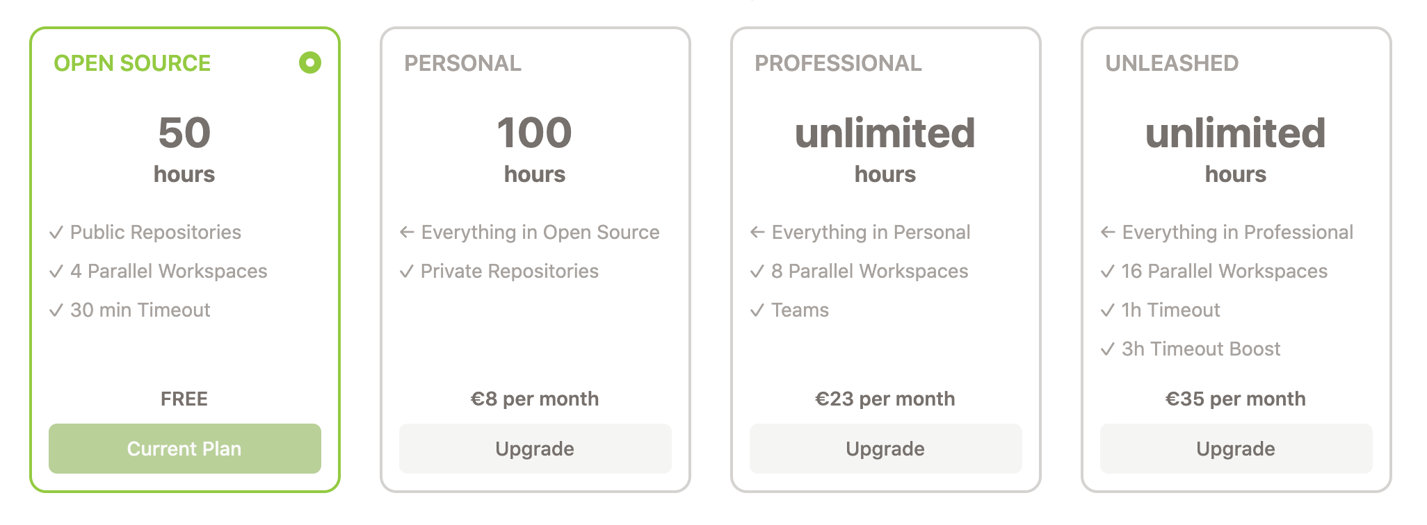 |
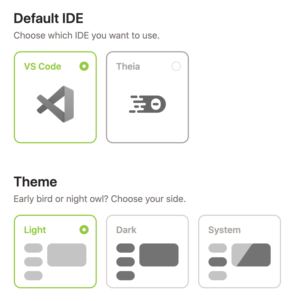 |
Contributor guide
First steps
- Read the whole issue, then the project's contributing guide.
- Comment on the issue to say you are picking it up — it saves two people doing the same work.
- Fork the repository and make your change on a branch.
- Open a pull request that references the issue number.
Research direction
Start with components/dashboard/src/components/SelectableCard.tsx and inspect its use on the Plans and Preferences settings pages. Compare the current radio indicator with the linked issue context and screenshots, then confirm the selected-card states no longer show the default indicator and that both page usages remain correct.
Written by the indexing model from the issue text.
Assessment
- Tech stack
- typescript
- Domain
- design, frontend
- Issue type
- Feature
- Difficulty
- 2/5
- Estimated time
- 1-3 hours
- Activity status
- Stale
- Clarity
- Mostly clear
- Newbie friendliness
- 38/100