getgrav / getgrav/grav-plugin-admin
Checkbox on page options are confusing
- Dominant language
- PHP
- Stars
- 377
- Forks
- 225
- Avg merge
- 11h 51m
- Merged PRs (30d)
- 4
Description
I'm finding the checkboxes on page options quite confusing, and suspect they could be improved. THey make sense once you figure them out, but for a first time user (or a non-technical user) I think they will continue to be confusing. For example, here is my experience setting up my very first test page. I create the page, write some stuff, and go to options to ensure it's not published before I save the content. We are greeted with this UI:
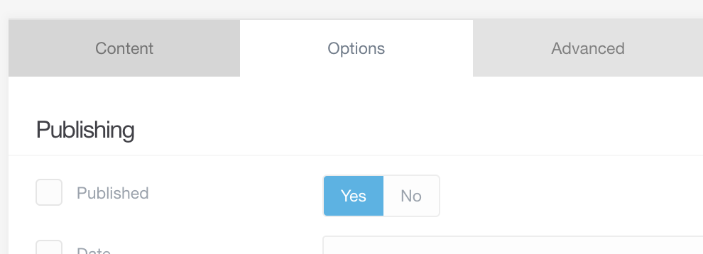
If I click "No" then it enables the frontmatter key for published, and sets the value to false e.g.
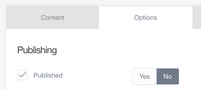
Ok, that's a little non-standard for a checkbox.....I'm confused why the checkbox was selected when I just clicked "No". I think this is probably a common confusion - it's unusual for a checkbox and a toggle button to have to be used in tandem. In my confusion, I uncheck the checkbox. "No mr. silly admin plugin, I really do not want this page published please stop trying to select published". I now get this UI:
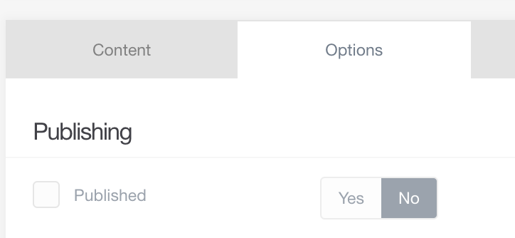
At this point I'm feeling good - I fought the confusing JS and won the battle. Then I click save....and it toggles back to 'Yes'...
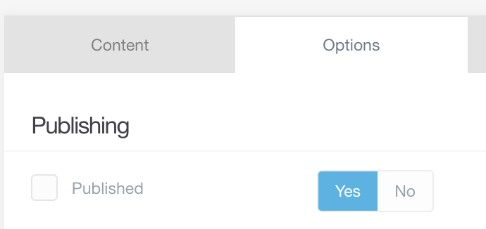
At this point I just went to a different screen (Manage Pages) where the published vs unpublished status is displayed clearly.
-- End of Story
This happens for other plugins that use the options - MathJax has a similarly confusing setting, and IIRC it will by default will serve the mathjaax css/js on every single page unless you go into the options, click the checkbox to enable the mathjax setting, and then click the no toggle.
Short-term, it would be good if there was some minor JS added to ensure the toggle slides back to "Yes" if you uncheck the checkbox - that would be good instant feedback rather than the unpleasant surprise of seeing it change when the page is saved.
Long-term, perhaps some help text icon saying "default state is enabled" or something? Or a cleaner UI in some other way - I get that we are trying to display the difference between a notset-yes-no, but perhaps just a 3-way toggle between those options would be a better choice?
Contributor guide
Assessment
This issue has not been assessed yet.