Moving browser from retina to non retina screen redraws incorrectly
Nobody has claimed this yet.
- Dominant language
- Python
- Stars
- 17k
- Forks
- 694
- Avg merge
- 1d 14h
- Merged PRs (30d)
- 33
Description
This occurs 100% of the time for Safari on macOS 13.1 and about 50 percent of the time on Firefox.
Moving the browser window from retina to non retina screen or vice versa cause the screen to redraw incorrectly, It is either very compressed or very blown up depending on direction
You can use the responsive_menu_layout.py in the examples repository
Describe the results you expected:
Normal on app opening:
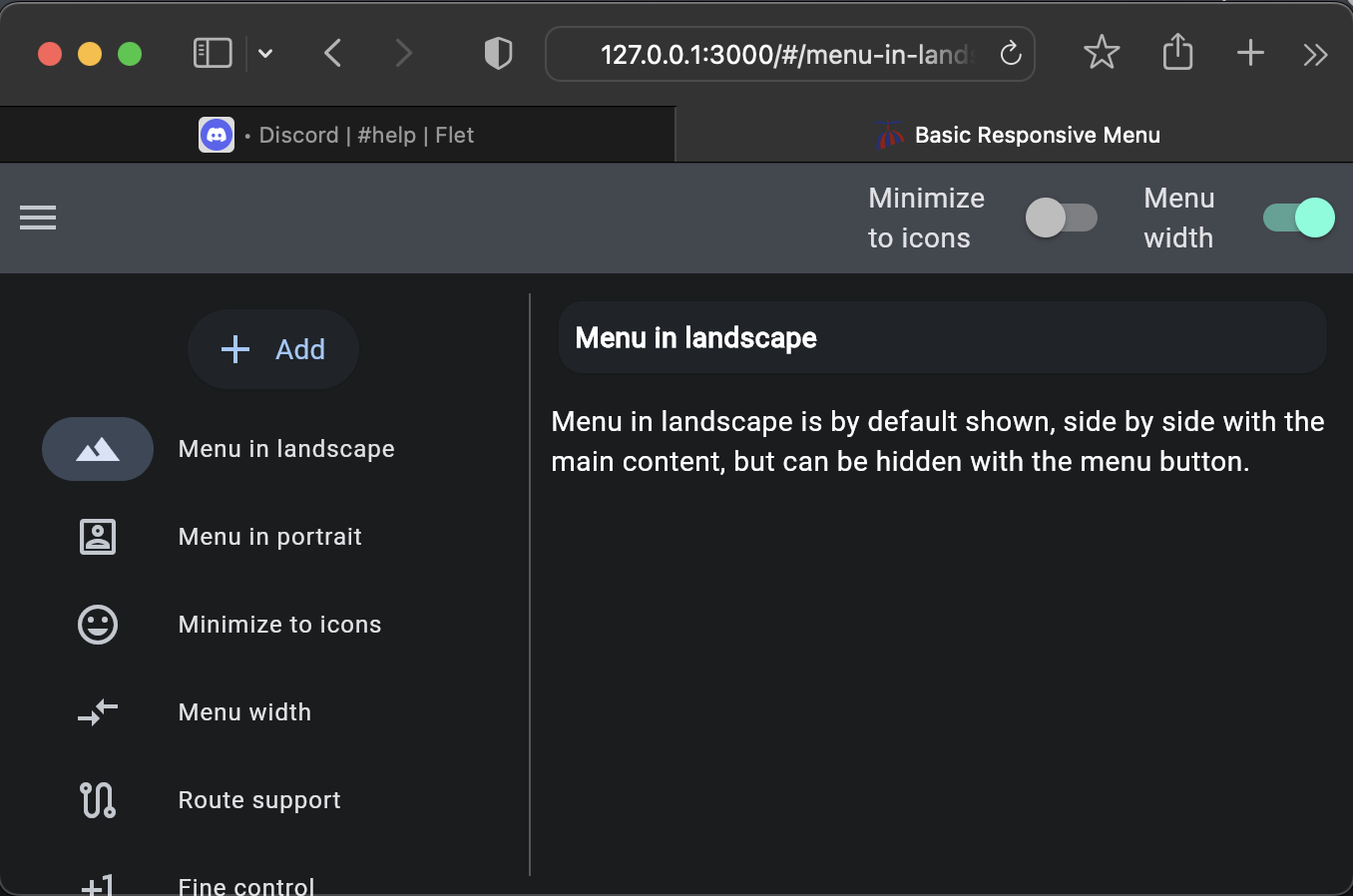
wrong resolution on move from retina to non-retina screen
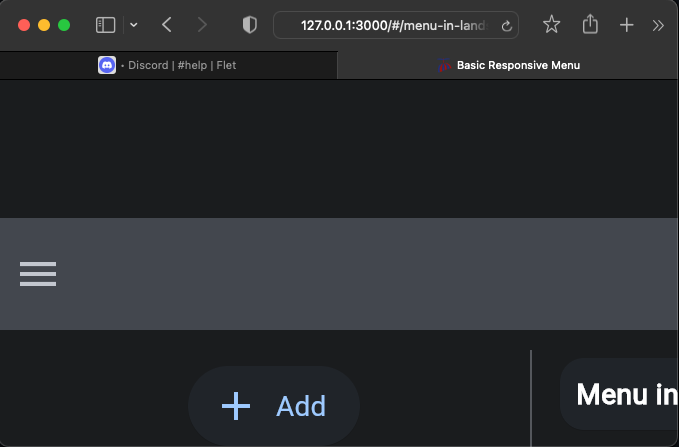
moving from non-retina to retina screen
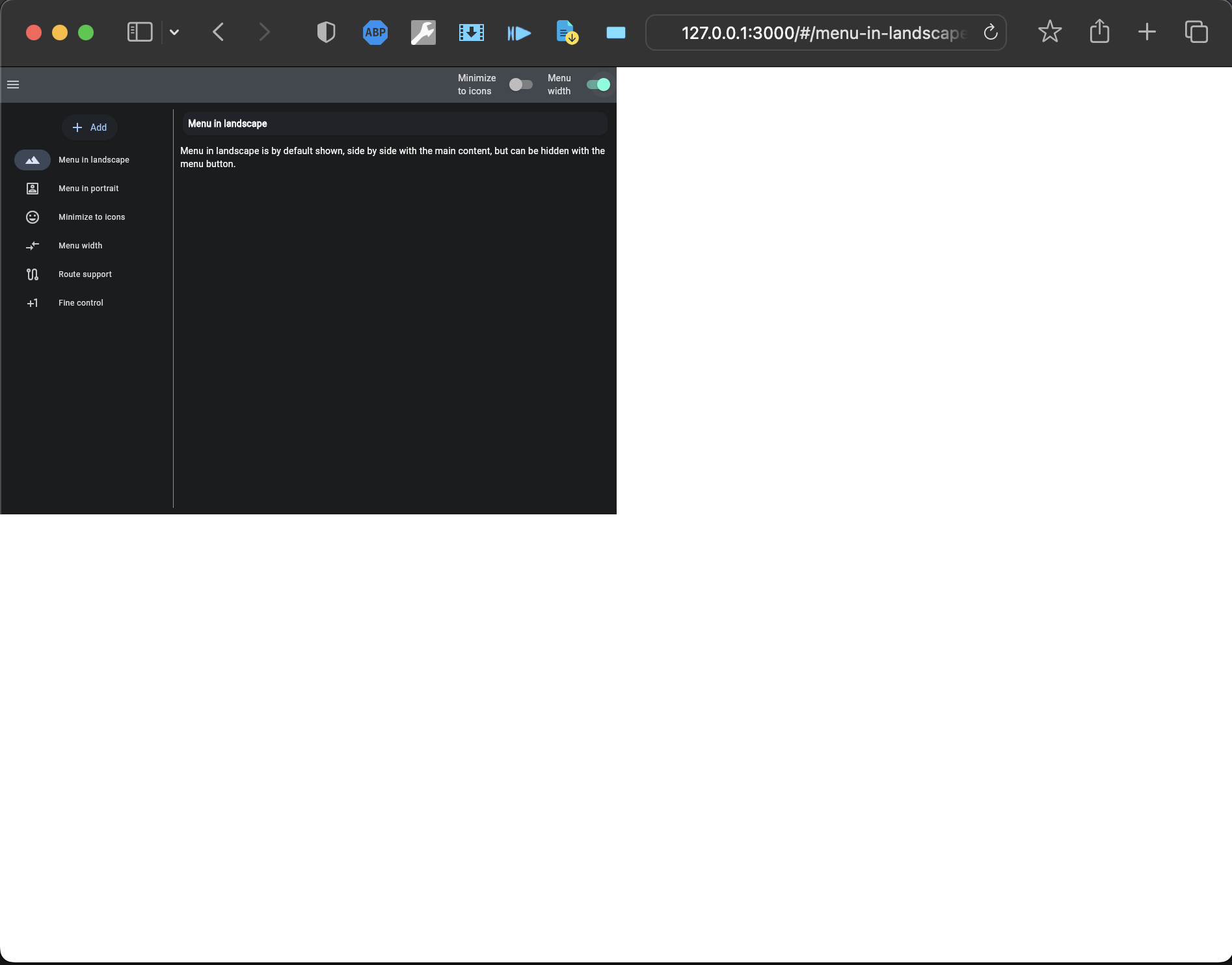
Flet version 0.3.2:
MaxOS 13..1
Contributor guide
First steps
- Read the whole issue, then the project's contributing guide.
- Comment on the issue to say you are picking it up — it saves two people doing the same work.
- Fork the repository and make your change on a branch.
- Open a pull request that references the issue number.
Research direction
Start by running responsive_menu_layout.py from the examples repository and reproduce the transition between retina and non-retina screens on macOS 13.1, especially in Safari and Firefox. Compare the rendering after each screen move with the initial layout; done means the app redraws at the correct resolution in both directions.
Written by the indexing model from the issue text.
Assessment
- Tech stack
- python
- Domain
- frontend
- Issue type
- Bug
- Difficulty
- 4/5
- Estimated time
- 3-5 days
- Activity status
- Stale
- Clarity
- Mostly clear
- Newbie friendliness
- 35/100