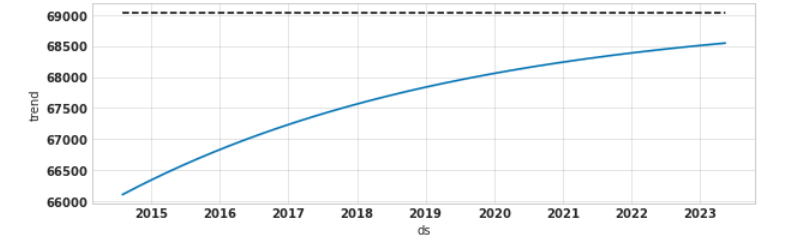
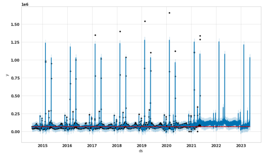
trend and change point plot
Open
- Dominant language
- Python
- Stars
- 20.4k
- Forks
- 4.6k
- Avg merge
- 19h 52m
- Merged PRs (30d)
- 1
Description
I originally built a linear growth model. However, the forecast looks like over forecasted. Then, I want to use Saturating growth. I set the growth='logistic' and tuned the cap value to try to make the future forecast lower. The trend plot is a logistic growth curve and gets much lower. However, the forecast doesn't follow logistic growth and doesn't get lower. The 'add_changepoints_to_plot' plotted the change point line (red line) which is not logistic growth either. How to understand this?
How to make the forecast lower? Thanks
Contributor guide
Assessment
This issue has not been assessed yet.