link styles in docs
Open
documentation
- Dominant language
- Rust
- Stars
- 22.3k
- Forks
- 1.9k
- PR merge metrics
- No merged PRs in 30d
Description
Does anyone else find the links difficult to see in the docs? That is, difficult to differentiate from plain text
eg
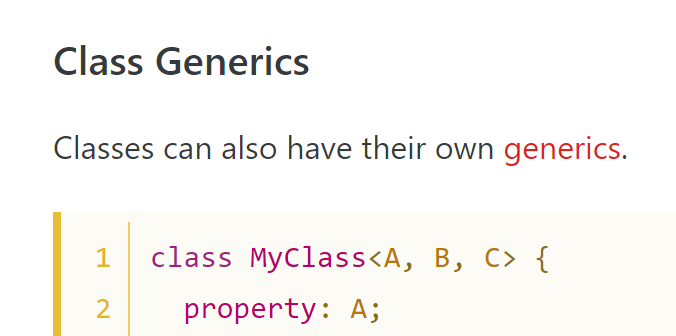
This could be my monitor calibration or my medium-bad color-blindness, but I have a lot of trouble seeing that's a link w/o mousing over it.
Would there be any objections to adding something like an underline, or heavier font weight?
Contributor guide
Assessment
This issue has not been assessed yet.