ethereum / ethereum/staking-launchpad
Redesign workflow steps
- Dominant language
- TypeScript
- Stars
- 304
- Forks
- 226
- PR merge metrics
- No merged PRs in 30d
Description
There's a chance that translated content will break the design of the workflow steps. This can diminish trust and authenticity for users of the site. This is a feature request to redesign these steps to prevent the design breaking and improve the UX by narrowing the focus on the task at hand and displaying progress in a clearer way.
---
This **doesn't block** the translations work.
---
German example:
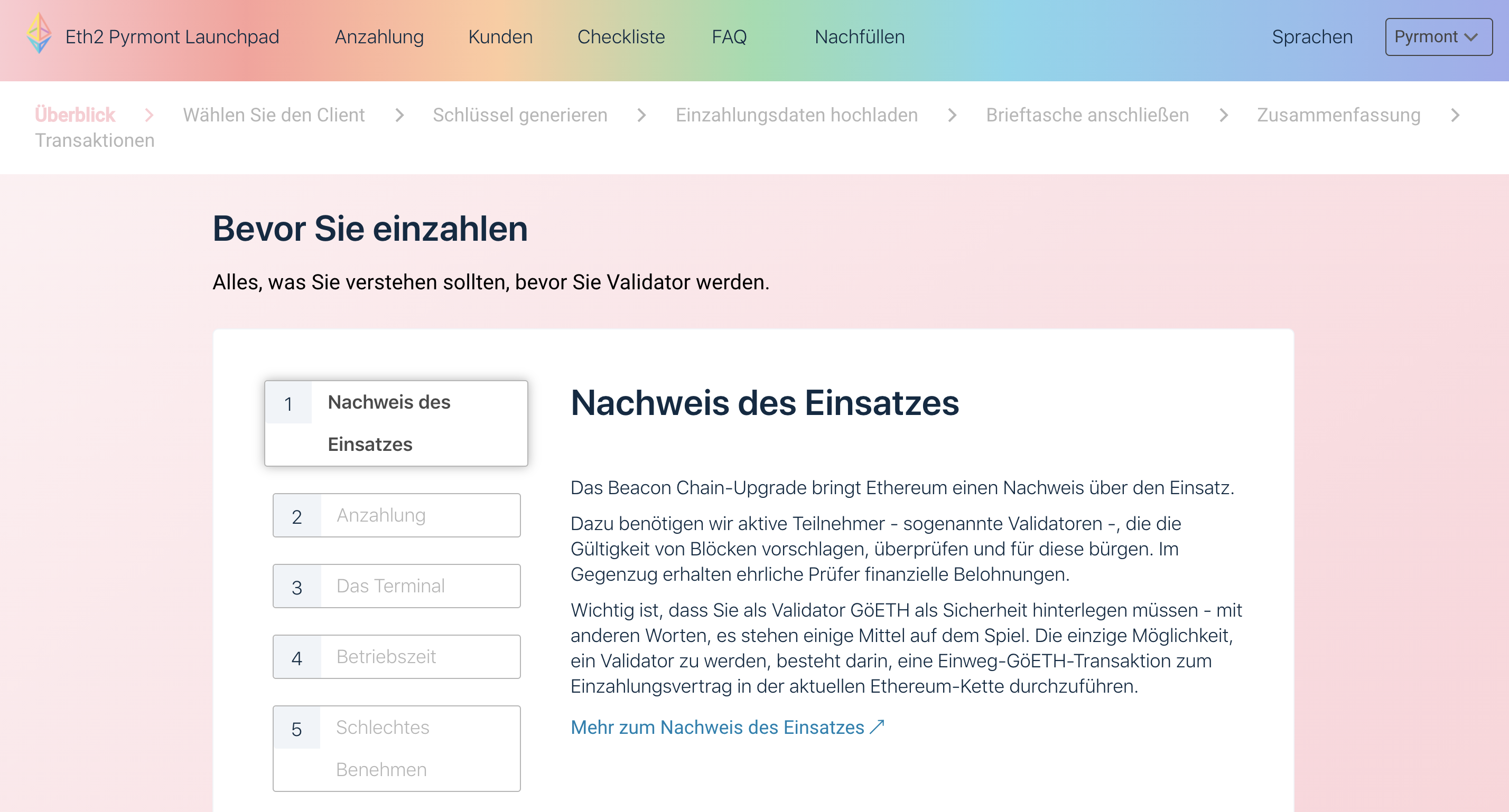
As this is a desktop-only experience I suggest transitioning this workflow into a persistent vertical list like this:
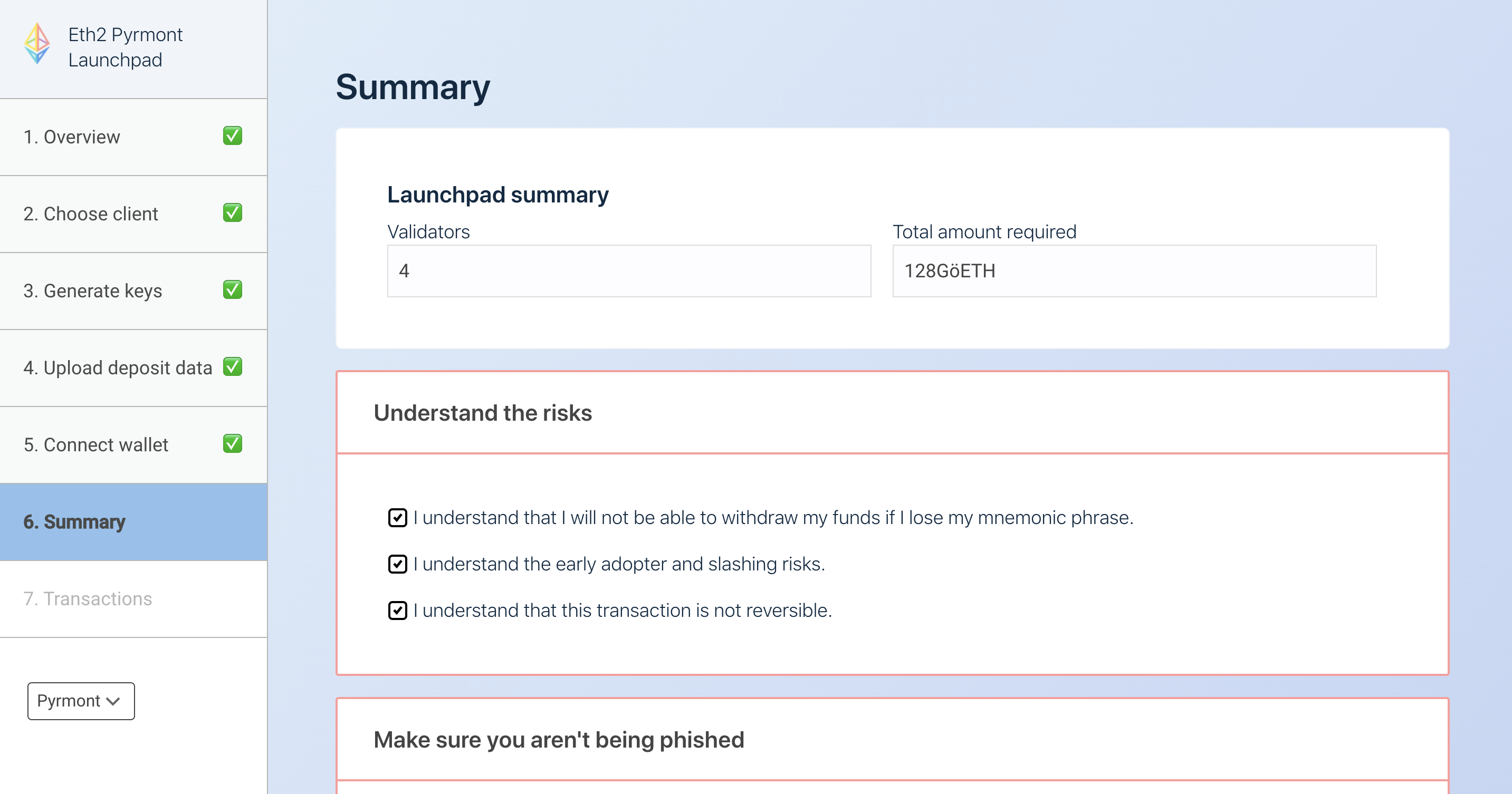
Additional changes in this screenshot:
1. Clearer delineation between steps that are current, completed and to-do
2. Removal of main navigation to focus the user's attention more on the task-at-hand
3. Use rainbow to color the "step box" rather than changing the text color which has accessibility issues
Have also played with making the completed steps even clearer with the rainbow branding like so. (NOTE: there's always a danger with using colors that a lot of people associate with errors, e.g. the reddish-pink in the rainbow gradient)
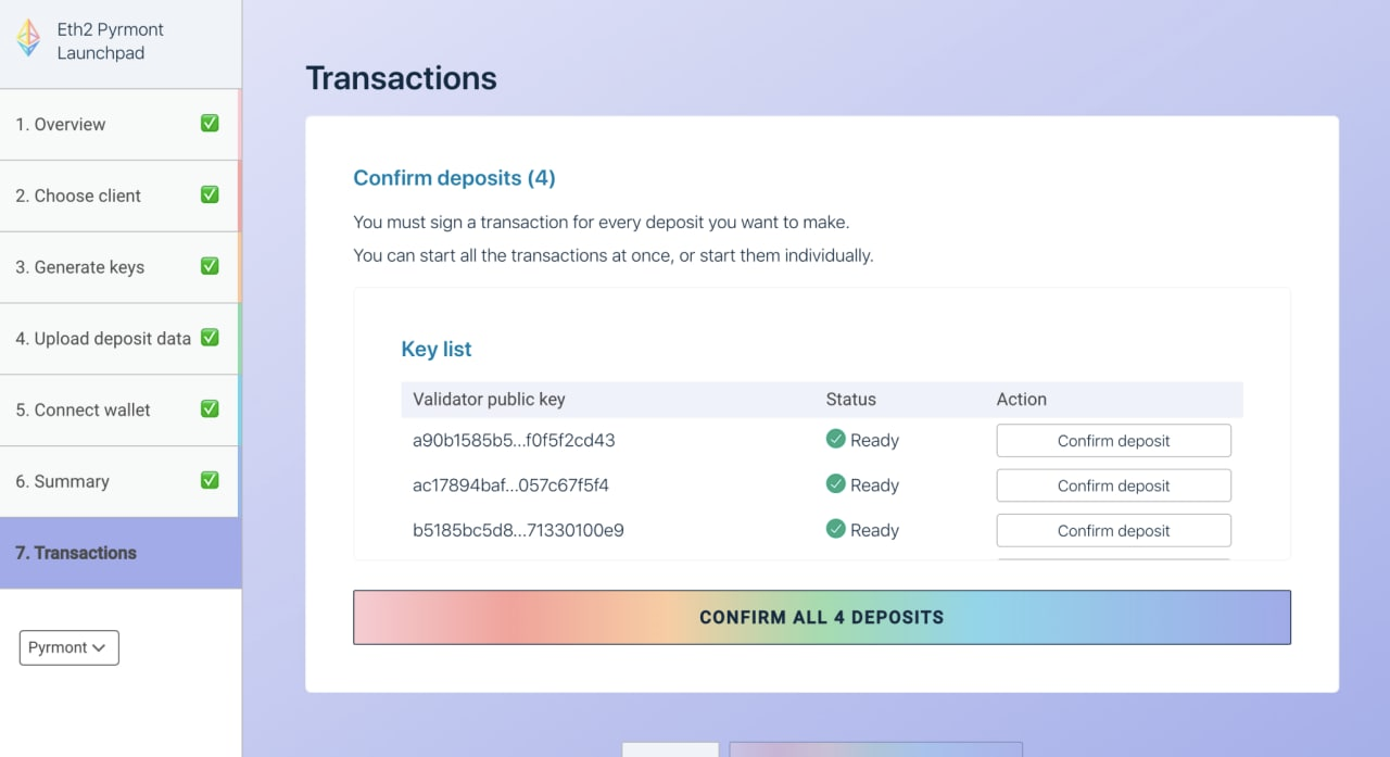
Still to figure out design-wise:
- Text still wraps in other languages although this doesn't break the design. We may want to adjust font size or width of the column.
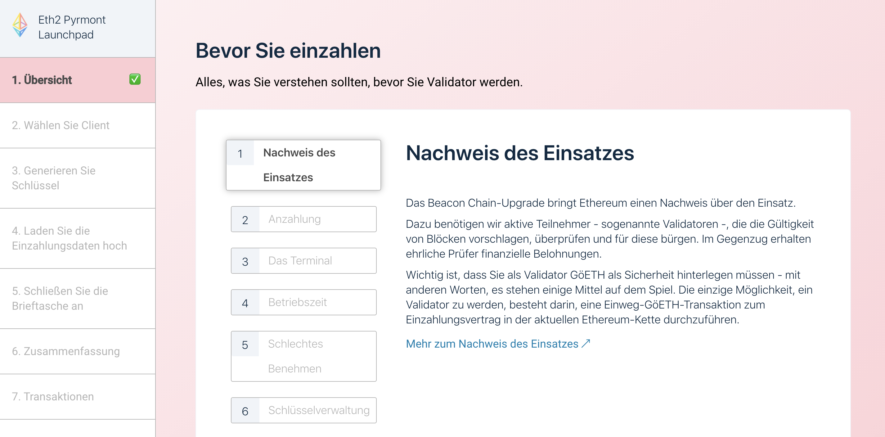
- This has some impact on the design of the "advisories" step as that also has a vertical progress column. We may want to redesign that step... here's a rough sketch:
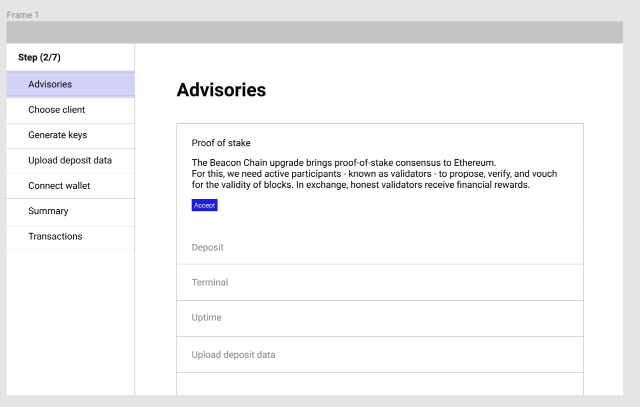
- The network display needs to be worked into the column better.
---
WIP BRANCH: https://github.com/ethereum/eth2.0-deposit/tree/workflow-design-update
---
Contributor guide
No contributing guide indexed for this repository
Research direction
Review the workflow-design-update WIP branch and the screenshots in the issue first. Compare the current workflow and advisory presentation against the proposed persistent vertical layout, including translated text and the network display. Done means the workflow remains usable across languages with clearer current, completed, and upcoming steps without the listed design issues.
Written by the indexing model from the issue text.
Assessment
- Tech stack
- typescript
- Domain
- accessibility, design, frontend, internationalization
- Issue type
- Feature
- Difficulty
- 5/5
- Estimated time
- Over a week
- Activity status
- Stale
- Clarity
- Mostly clear
- Newbie friendliness
- 25/100