elementor / elementor/elementor
🔃 🔗 🐞 Bug report: Flexbox Experiment - Gap Calculation Issue + Converter Issue (Related to #17985, #18303, #18364)
- Dominant language
- PHP
- Stars
- 7.1k
- Forks
- 1.6k
- Avg merge
- 1d 5h
- Merged PRs (30d)
- 193
Description
### Prerequisites
- [X] I have searched for similar issues in both open and closed tickets and cannot find a duplicate.
- [X] The issue still exists against the latest stable version of Elementor.
### Description
This is an important bug but also to resolve a potential feature request.
**REPORT 1.** The Converter issue. When you have a standard layout like the one below you have spaced out gaps that are even, this is using the old sections and columns, which the column gaps are using padding in the old version.
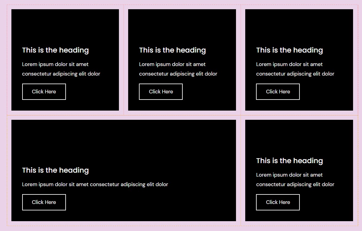
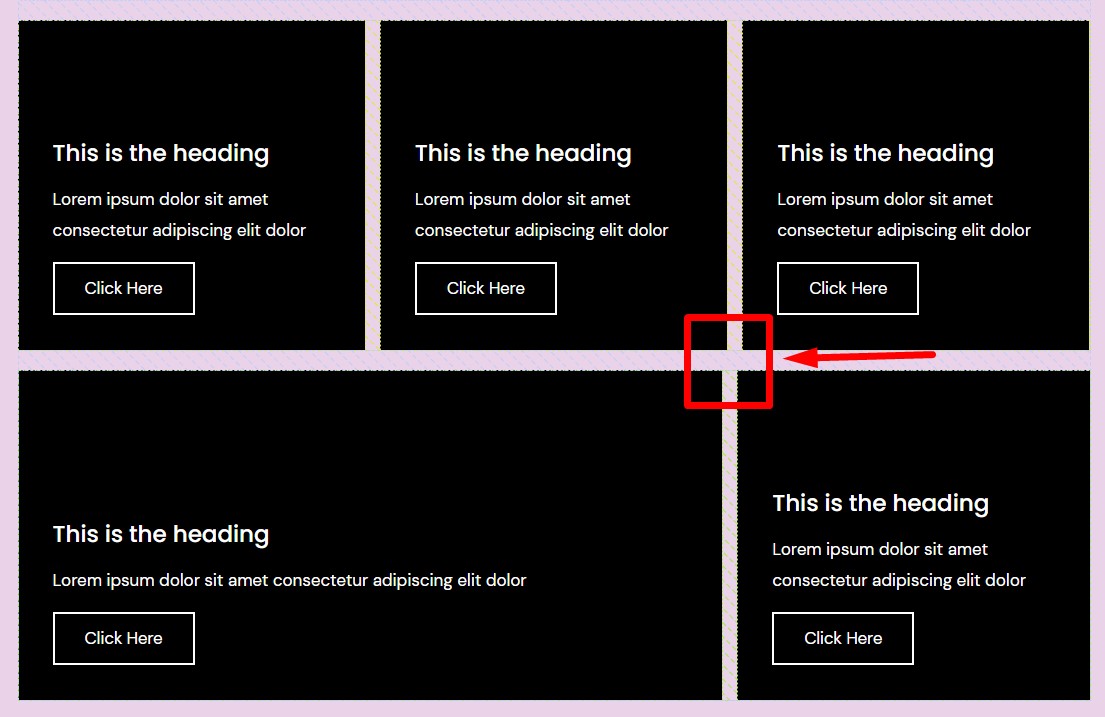
But when converted, the gap doesn't work as this now uses the flex feature for gaps rather than padding as seen below. This change of function calculates on a per row basis (single dimension ~ as some describe) it shares extra space equally between the child element. So by having another row with more or less columns (containers) it shares the space differently compared to other rows so the gap size is the same always but the container size differs making the alignment wrong.
**REPORT 2.** This continues from the converter issue, but relates to the whole of the experiment, as it is converting the old containers wrong and should be using padding on the containers and setting the gap to 0. This report is about adding flex-basis with gap calculation so there is more flexibility around have containers wrap creating multiple rows without having the gap break more lines and allow the user to adjust the grow amount to suit the layout. Videos below of before and after with my custom CSS. Plus an extra video of flex-basis working better then using the calculation in width direct.
```
.e-container {
--parent-gap: var(--gap);
}
.e-container > .e-container {
--parent-gap: inherit;
flex-basis: calc(var(--width) - var(--parent-gap));
}
```
Before custom CSS:
https://user-images.githubusercontent.com/55829113/160861729-e76edd48-620d-4913-9bba-e7dc0d95dbd9.mp4
After custom CSS:
https://user-images.githubusercontent.com/55829113/160862101-7bc6a5a7-b4dc-484e-8bed-5e666baccddd.mp4
What happens when using Width rather than flex-basis:
https://user-images.githubusercontent.com/55829113/160862121-d1000605-0029-495e-8ecc-6e7273f0b9fe.mp4
As you saw in the second video flex-grow doesn't work at the moment. Refer to issue report #18303
**My Suggestion:** I think each widget and container needs to have an option where the width/grow-shrink options are so you can have it optionally calculate to remove the parent gap value from the flex-basis. So by default it would be set to auto, but when you enable the custom flex-basis option you can leave it on the predefined 100% but there will be an option below that to calculate the removal of the gap from the input based on the parent gap.
**My 2-pence:** I think currently the whole flex experiment is complicated for a simple customer with no design or complex UI use experience. I think there should be a basic and advanced mode, so basic being the current sections and columns and advanced being the full unrestricted access to flexbox features.
### Steps to reproduce
See description
### Isolating the problem
- [X] This bug happens with only Elementor plugin active (and Elementor Pro).
- [X] This bug happens with a Blank WordPress theme active ([Hello theme](https://wordpress.org/themes/hello-elementor/)).
- [X] I can reproduce this bug consistently using the steps above.
### System Info
Using Elementor core 3.6.1 only with hello theme.
Contributor guide
Assessment
This issue has not been assessed yet.