elementor / elementor/elementor
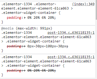
Paddings for desktop overrides that ones for tablet and mobile view, because of inline CSS [ED-15242]
- Dominant language
- PHP
- Stars
- 7.1k
- Forks
- 1.6k
- Avg merge
- 1d 5h
- Merged PRs (30d)
- 193
Description
## Prerequisites
- [x] I have searched for similar issues in both open and closed tickets and cannot find a duplicate.
- [x] The issue still exists against the latest stable version of Elementor.
## Description
We just have the problem that paddings for desktop view partially overwrite those for tablets and mobile devices, which is due to the fact that the values for desktop additionally end up as inline CSS in the source code. The paddings for tablets and mobile devices, on the other hand, end up in an external post CSS and are then overwritten by the inline CSS.
## Steps to reproduce
In our case it's a section with background-image, headline and text. The headline and text both have percentage paddings for desktop and px values for tablet and mobile. As you can see on the screenshot.
## Isolating the problem
- [x] This bug happens with only Elementor plugin active (and Elementor Pro).
- [ ] This bug happens with a default WordPress theme active.
- [x] This bug happens with the hello Elementor theme.
- [x] I can reproduce this bug consistently using the steps above.
## Environment
System Info
```
```
Contributor guide
Assessment
This issue has not been assessed yet.