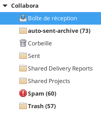
New mail-mark-junk icon is too distracting
- Dominant language
- Meson
- Stars
- 594
- Forks
- 83
- Avg merge
- 23h 39m
- Merged PRs (30d)
- 11
Description
After some time testing this icon, It feel that the red is too strong and is very eye-catching when I don't have to mark things as spam that often.

---
Want to back this issue? **[Post a bounty on it!](https://www.bountysource.com/issues/68835385-new-mail-mark-junk-icon-is-too-distracting?utm_campaign=plugin&utm_content=tracker%2F27377189&utm_medium=issues&utm_source=github)** We accept bounties via [Bountysource](https://www.bountysource.com/?utm_campaign=plugin&utm_content=tracker%2F27377189&utm_medium=issues&utm_source=github).
Contributor guide
Assessment
This issue has not been assessed yet.