Packed icons on sidebar in File Chooser
- Dominant language
- Vala
- Stars
- 365
- Forks
- 82
- Avg merge
- 4d 2h
- Merged PRs (30d)
- 3
Description
## Prerequisites
- [x] I have searched open and closed issues for duplicates.
## Describe the bug
Spacing between icon and text on sidebar is too small in file chooser.
### To Reproduce
Steps to reproduce the behavior:
1. Anything that opens FileChooser
### Expected behavior
### Screenshots or screen recordings
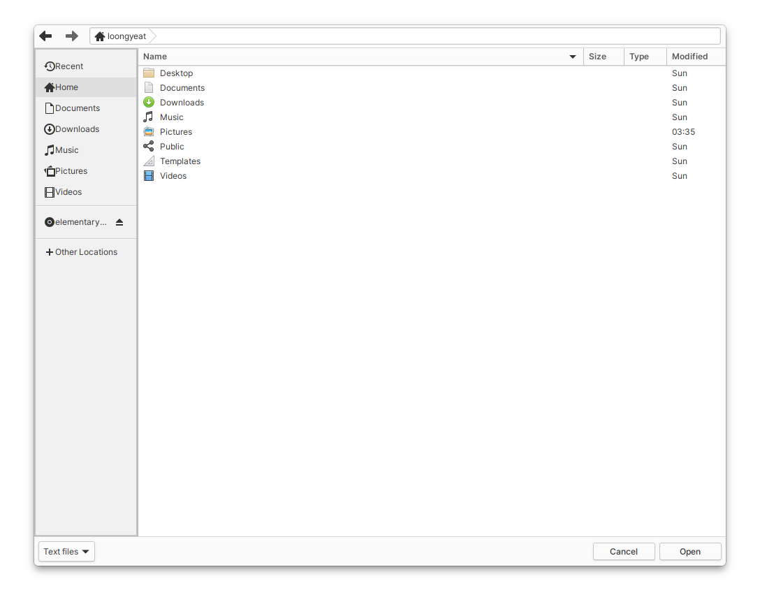
In comparison to the sidebar in Files for instance
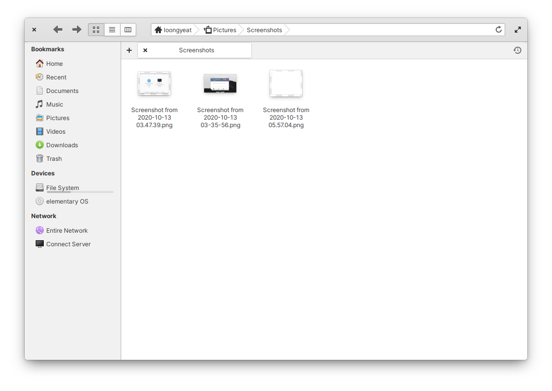
The spacing between the icon and text in FileChooser is a little too tight. The margin around the breadcrumb is also very small, though I'm not sure if this is a design decision or not.
### Logs
## Platform Information
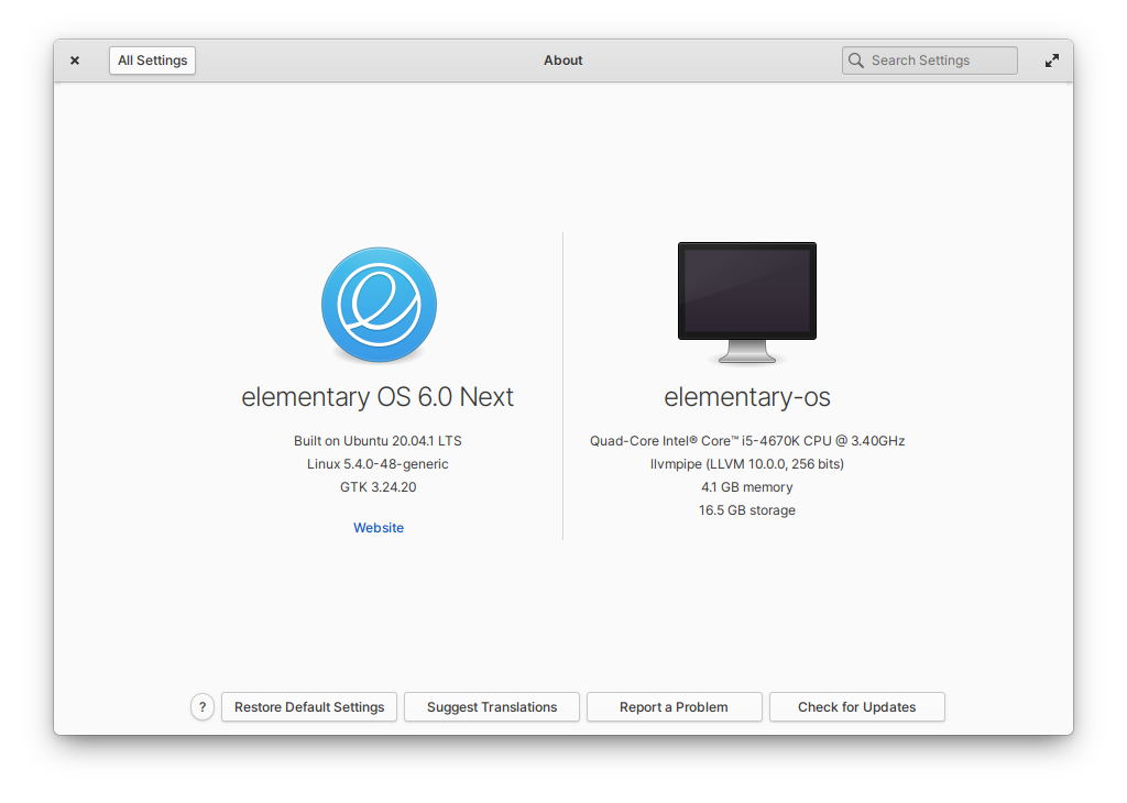
- [ ] I'm using the latest version from git that I've manually compiled
- [ ] I'm using the latest released stable version
## Additional context
Contributor guide
Assessment
This issue has not been assessed yet.