element-hq / element-hq/element-web
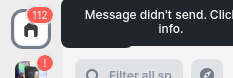
Tooltips stack looks a little ugly
Open
A-Appearance
O-Occasional
S-Tolerable
T-Enhancement
X-Needs-Design
- Dominant language
- TypeScript
- Stars
- 13.5k
- Forks
- 2.8k
- PR merge metrics
- PR metrics pending
Description
### Your use case
#### What would you like to do?
Have more aesthetically pleasing tooltip stacks
#### Why would you like to do it?
So element is more visually pleasing
#### How would you like to achieve it?
The "all rooms" tooltip should be completely covered by the one on top:
### Have you considered any alternatives?
Show only one tooltip instead of stacking them?
### Additional context
_No response_
Contributor guide
Assessment
This issue has not been assessed yet.