element-hq / element-hq/element-ios
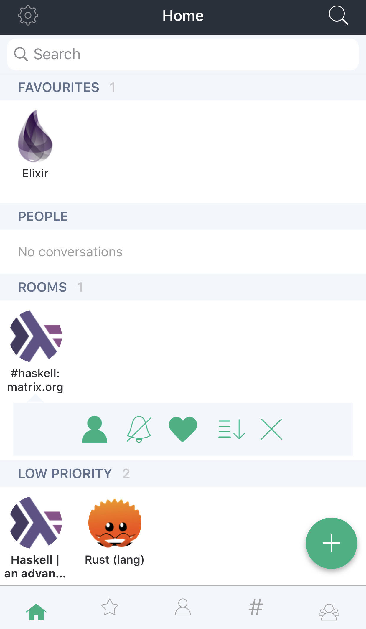
tap+hold rooms dropdown menu icons need to be more clear
Nobody has claimed this yet.
- Dominant language
- Swift
- Stars
- 1.8k
- Forks
- 544
- PR merge metrics
- PR metrics pending
Description
In the Haskell room, we can see the standard dropdown menu.
I think the icons needs to be **way** more clear.
- person icon = no idea what this does even after trying it
- crossed out bell = mute all notifications? Even username mentions?
- heart = favorite (need to try this in order to figure out what it does though)
- down arrow = Move it down (need to try this in order to figure out what it does though)
- X button = **I thought this would close the menu**, but it actually leaves the room
Perhaps this menu can use standard english words in a vertical list rather than horizontal?
For example, user tap+hold on a room and it brings up a list of options laid out like
- personify / de-personify (still don't know what this does)
- mute notifications / enable notifications
- favorite / un-favorite
- make low priority / make normal priority
Contributor guide
First steps
- Read the whole issue, then the project's contributing guide.
- Comment on the issue to say you are picking it up — it saves two people doing the same work.
- Fork the repository and make your change on a branch.
- Open a pull request that references the issue number.
Research direction
Start by reproducing the tap-and-hold room menu in the Haskell room and inspect the existing icon actions. Compare each action with the reported behavior, then make the options and the menu-dismissal behavior understandable; done means users can identify each action without trial and error.
Written by the indexing model from the issue text.
Assessment
- Tech stack
- ios, swift
- Domain
- accessibility, design, mobile
- Issue type
- Feature
- Difficulty
- 4/5
- Estimated time
- 3-5 days
- Activity status
- Stale
- Clarity
- Mostly clear
- Newbie friendliness
- 38/100