improve user-field-pills
Open
webui
- Dominant language
- Elm
- Stars
- 2.3k
- Forks
- 184
- Avg merge
- 8h 2m
- Merged PRs (30d)
- 4
Description
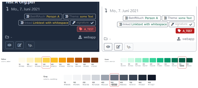
In order to improve the readability of the user field pills in card view, it would be nice to optically separate the field name from the content. As discussed [here](https://matrix.to/#/!XPBQozyvvbElwZbbOO:gitter.im/$cq-lUqrkfyZR0VpO18vNdex3VP9UrFZ2z6XH2PEtQqg?via=matrix.org&via=gitter.im&via=wdatrix-test.g) could
- add an additional separator and adjust the text colors and / or the text style.
- Another or additional option would be user-defined icons for each user field. The field name could be left out, which would save space.
Here is my mokup (tailwind default color palette):
Contributor guide
Assessment
This issue has not been assessed yet.