eclipsesource / eclipsesource/tabris-js
Improve drawer appearance
- Dominant language
- JavaScript
- Stars
- 1.4k
- Forks
- 171
- PR merge metrics
- No merged PRs in 30d
Description
### Problem description
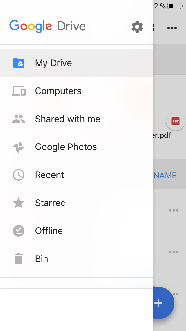
The shadow of the drawer is too dark and hard for the shadows typically used in modern iOS.
Compare:
#### Tabris.js Drawer

#### Native UI
|App Store cards|Popover|
|---|---|
|||
### Expected behavior
#### Proposal 1
Better align the shadow color, opacity and blur with shadows used in native UI.
#### Proposal 2
Since there is no HIG specification for a drawer on iOS, align the drawer appearance with the [Material Design guidelines](https://material.io/guidelines/patterns/navigation-drawer.html#navigation-drawer-content). This has the advantage that drawers will look consistent among iOS and Android and the drawer content won't be covered by a shadow on its right edge. See the drawer implementation of Google Apps on iOS:
Contributor guide
Assessment
This issue has not been assessed yet.