dotnet / dotnet/AspNetCore.Docs
Improvement Request: Better visualization of Sliding Window Limiter and other limiters
- Dominant language
- C#
- Stars
- 13.1k
- Forks
- 24.6k
- Avg merge
- 1d 3h
- Merged PRs (30d)
- 97
Description
### Description
I feel it's hard to grasp the logic behind the Sliding Window limiter from the documentation.
The red and blue lines of the diagram in the documentation don't make sense. The diagram also doesn't convey the reasoning behind the Sliding Window Limiter logic:
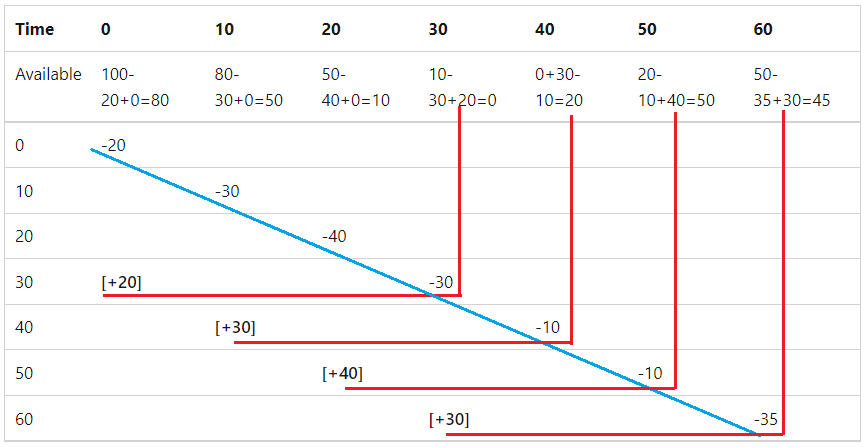
Hence, I'd like to suggest to replace the existing diagram in the documentation with an animation that's more vividly and comprehensibly conveying the reasoning behind the Sliding Window Limiter:

---
If you believe this to be a good idea but want to improve on the column headers or animation itself, please find the source Excel file and two animated GIFs (one is 15 fps, the other one 30 fps):
[Rate limiting middleware.zip](https://github.com/dotnet/AspNetCore.Docs/files/13679293/Rate.limiting.middleware.zip)
I would also create a corresponding pull request if you are satisfied with my current design and suggest to create a PR.
### Page URL
https://learn.microsoft.com/en-us/aspnet/core/performance/rate-limit?view=aspnetcore-8.0#sliding-window-limiter
### Content source URL
https://github.com/dotnet/AspNetCore.Docs/blob/main/aspnetcore/performance/rate-limit.md
### Document ID
bb96b20f-0991-d6de-4d98-192cd469460f
### Article author
@Rick-Anderson
Contributor guide
Assessment
This issue has not been assessed yet.