dequelabs / dequelabs/cauldron
Allow buttons to be inline or stacked depending on the screen size
- Dominant language
- TypeScript
- Stars
- 127
- Forks
- 31
- Avg merge
- 2d 12h
- Merged PRs (30d)
- 8
Description
The CSS below for [adding margin-left to the second button](https://github.com/dequelabs/cauldron/blob/develop/packages/styles/button.css#L193-L195) doesn't look good on smaller screens since the second button is not left aligned with the first button.
> as a general rule buttons should have spacing applied and it should be up to the content author to determine when that’s not needed. - @scurker
```
[class*='Button--'] + [class*='Button--'] {
margin-left: var(--space-smallest);
}
```
Example from Cauldron docs:
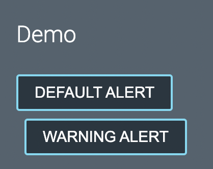
[Discussion from Deque Slack](https://deque.slack.com/archives/C5MUFQ7UM/p1665776153371979)
## Potential Solutions
- From @schne324: Create a basic wrapper for having inline buttons with margins. Take the margins off the buttons and use the wrapper to declare the margins.
``
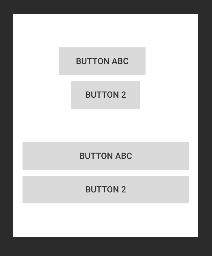
> Using grid or flex it'd be easy to make the buttons look good inline as well as when they wrap to one button per "row"
- From @bobbyomari:
> There's probably a discussion about when stacked buttons should be full width vs "normal" and the ability to turn that on/off depending on the use case
Contributor guide
Assessment
This issue has not been assessed yet.