More intuitive colours for the dashboard task graph
Open
- Dominant language
- Python
- Stars
- 1.7k
- Forks
- 778
- Avg merge
- 2h 50m
- Merged PRs (30d)
- 3
Description
First: the dashboard is amazing!
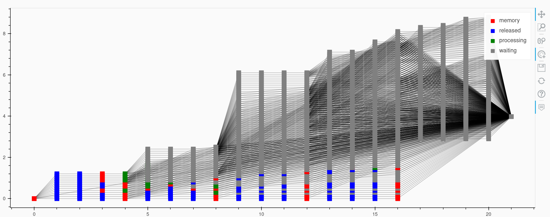
I think the colours of the nodes in the tasks dashboard could be more intuitive. Perhaps green and blue could be swapped so that green would mean fully done, i.e. "released"?
Contributor guide
Assessment
This issue has not been assessed yet.