New dashboard plot discussion
- Dominant language
- Python
- Stars
- 1.7k
- Forks
- 778
- Avg merge
- 2h 50m
- Merged PRs (30d)
- 3
Description
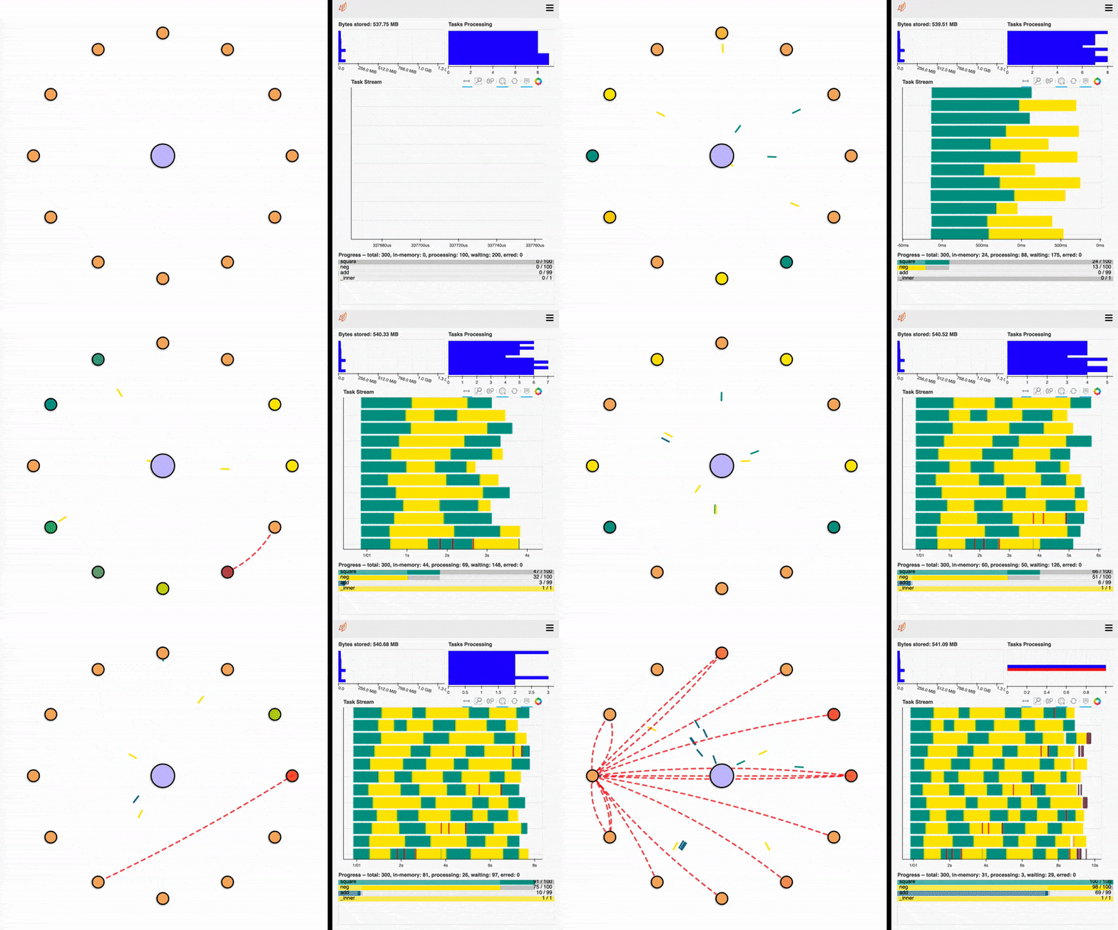
I've been experimenting with a new dashboard element to help visualise transfer between workers and overall cluster communication. This is a super early rough mockup of the kind of thing we could have. I'd like to share it and have some discussion around it before I put more time into it.
Currently it shows tasks being sent to workers and memory transfer between workers.
Things on my list of improvements so far are:
- Place workers spatially based on their network performance. Workers with higher bandwidth to each other should be closer together.
- Workers could show their memory and CPU usages.
- Clients could be shown and client-scheduler transfers could be shown. (We could have the client notify the scheduler of incoming work if it is about to serialise a lot of things, the apparent hang here is a common grumble).
- Various UCX protocols could be shown somehow instead of just the red transfer lines.
- Show disk-read and disk-write operations somehow.
Feedback/criticism would be appreciated!
### Autoscaling example

Contributor guide
Assessment
This issue has not been assessed yet.