cryptoadvance / cryptoadvance/specter-desktop
UI Suggestion: more consistent display for wallet name & balance across all wallet screens
- Dominant language
- Python
- Stars
- 847
- Forks
- 259
- Avg merge
- 6d 18h
- Merged PRs (30d)
- 2
Description
Just a suggestion here to modify the UI to add a bit of consistency. Here are two different screens, with two different ways (and verbiage) to display the balance.
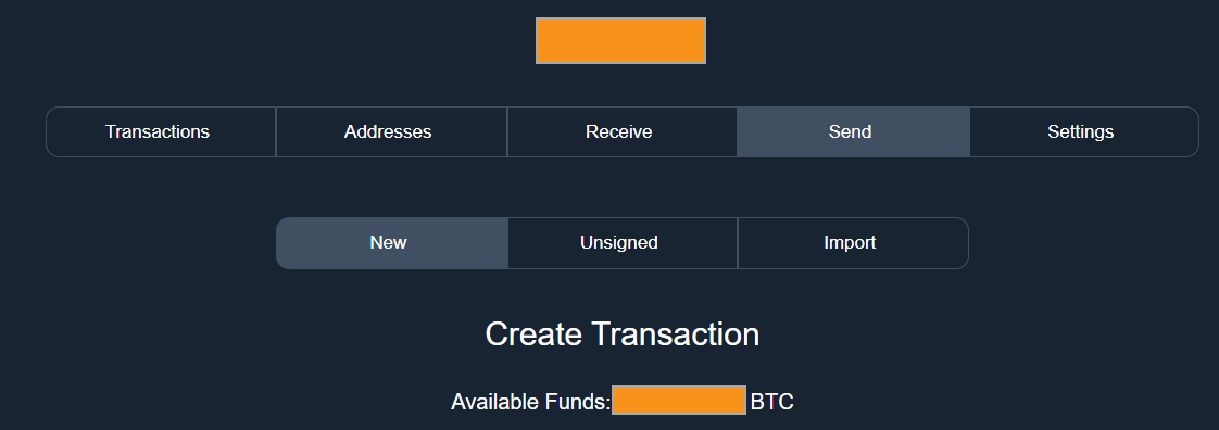
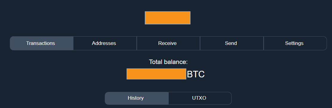
My instinct would be to move the balance up to just below the name of the wallet is, and keep it displayed across all wallet-related screens (unless user toggles to hide balance).
Contributor guide
Research direction
No files or tests are named. Begin by locating the wallet-related screens in the desktop GUI and compare where wallet names and balances are rendered; done means their placement and wording are consistent across those screens while respecting the hide-balance setting described in the issue.
Written by the indexing model from the issue text.
Assessment
- Tech stack
- python
- Domain
- design, desktop
- Issue type
- Feature
- Difficulty
- 4/5
- Estimated time
- 3-5 days
- Activity status
- Stale
- Clarity
- Mostly clear
- Newbie friendliness
- 35/100