creativecommons / creativecommons/wp-theme-cc-commoners
Incorrect text styles in post card
- Dominant language
- PHP
- Stars
- 3
- Forks
- 5
- PR merge metrics
- No merged PRs in 30d
Description
**Page:** Home
## Description
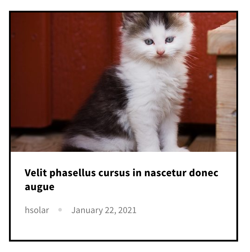
The card in "What's happening" section has two incorrect styles:
1. The post author and post date should use `small caption` and `$color-dark-slate-gray` styles.
2. The dot separating both fields mentioned above should be smaller. I tried changing the rem definition and `0.4 rem` works to replicate the mockup.
## Observation and featured request
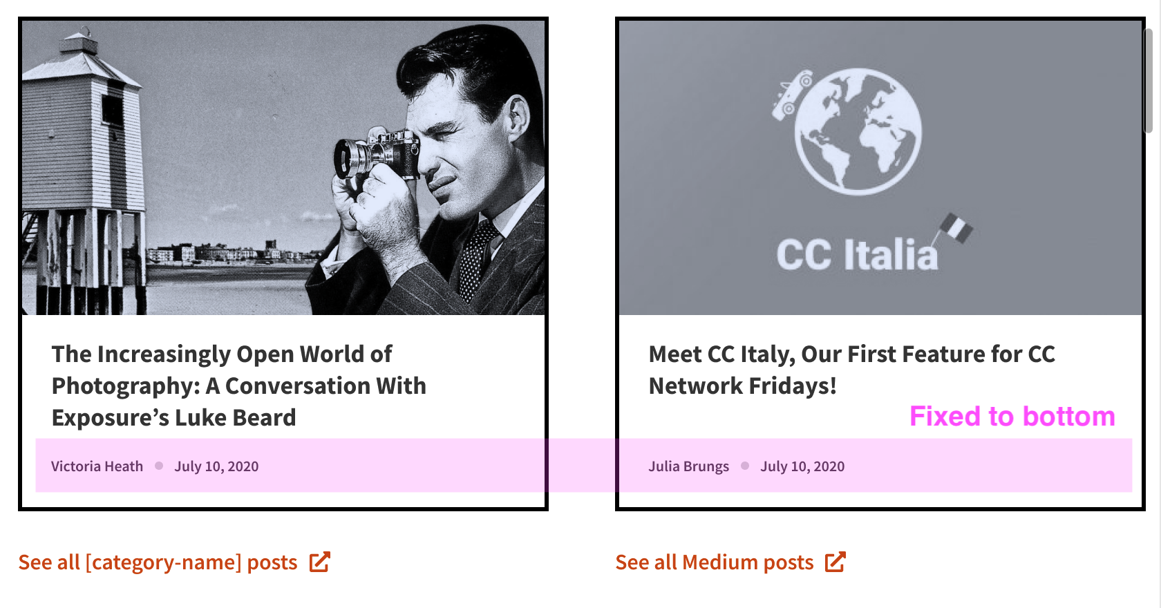
Since this section has three links below, is it possible to define a fixed height for all three cards? The risk is that long titles might break the card, but I think we don't have posts three-line length. And to balance the white space, we should bottom fix the author and date section.
## Screenshot
### Current implementation
### Proposal
Contributor guide
Assessment
This issue has not been assessed yet.