coryhouse / coryhouse/reactjsconsulting
Reusable React Components
- Dominant language
- JavaScript
- Stars
- 374
- Forks
- 33
- PR merge metrics
- No merged PRs in 30d
Description
## Reusable React Components
[My Course - Building Reusable React Components](https://www.pluralsight.com/courses/react-creating-reusable-components)
[Lessons Learned Building a React Component Library in Typescript blog post](https://www.vidyasource.com/blog/lessons-learned-react-component-library-typescript)
Consider [multiple abstraction levels](https://medium.com/nightingale/navigating-the-wide-world-of-web-based-data-visualization-libraries-798ea9f536e7) - May make sense to implement simple standalone components and then compose them in opinionated ways. Consider offering both low and high level abstractions, as inspired by the visualization libraries post above.
Rigid vs Flexible tradeoffs:
Rigid benefits:
- Enforces consistency
- Encourages teams to reach out so we can systematize customizations by adding props
- Fewer props = simpler, but can lead to proliferation of props if we keep adding ad-hoc props for styling.
- Less duplication risk
- Can programmatically enforce best-practices such as accessibility
- Building each component takes longer, since we have to carefully try to cover all scenarios
Flexible benefits:
- Favors developer autonomy and initial dev speed. Less need to wait for a new component library release to get what you need.
- Encourages use. If it's not flexible enough, people just won't use, or will create ugly hacks based on implementation details.
- The APIs and styles need not be perfect. Can be more freewheeling.
- Developers may rely upon classnames to customize, making DOM changes in the component library risky
[Broadly, choose an abstraction level](https://medium.com/@danieljyoo/levels-of-abstraction-a-key-concept-in-systems-design-7fdb33d288af), or perhaps multiple.
Choosing a CSS abstraction level via [customization-vs-configuration-in-evolving-design-systems](https://engineering.atspotify.com/2021/04/28/customization-vs-configuration-in-evolving-design-systems/)
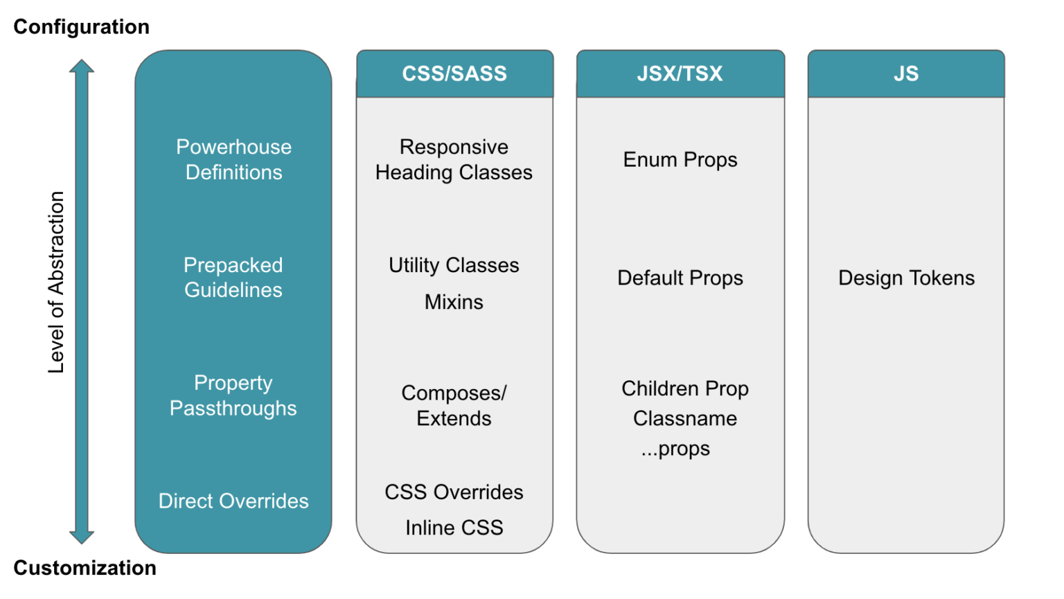
### Questions
- [ ] Have you created any reusable components yet?
- [ ] How are you handling reused components within a single project?
- [ ] Open to considering monorepo?
- [ ] Specific components in mind?
### Storybook Tips
- Skip HTTP for mock APIs. Instead, develop mock API that return Promises.
- Use setTimeout to fake 1 second delay so preloaders show
- Use the same mock data as you use for tests and driving the app's mock API.
- Document all the potential states listed below.
- Place stories alongside the component so they're easier to find, open
- Consider knobs, info plugins
### Picking a Third Party Library
- [ ] List: [reactcomponent.io](https://www.reactcomponent.io/) and [awesome-react-components](https://github.com/brillout/awesome-react-components), also [robinwieruch has a list](https://www.robinwieruch.de/react-libraries/)
- [ ] [Chakra UI](https://chakra-ui.com/)
- [ ] [Adobe Spectrum](https://spectrum.adobe.com/)
- [ ] [Uber Base Web](https://baseweb.design/)
- [ ] [Blueprint](https://blueprintjs.com/)
- [ ] [Ant Design](https://ant.design/components/overview/)
- [ ] [SemanticUI](https://semantic-ui.com/)
- [ ] [Material UI](https://material-ui.com/)
- [ ] [shadcn](https://ui.shadcn.com/)
- [ ] [NextUI](https://nextui.org/)
- [ ] [DaisyUI](https://react.daisyui.com/)
- [ ] [Mantine](https://mantine.dev/)
- [ ] [React Bootstrap](https://react-bootstrap.github.io/)
- [ ] [Gestalt by Pinterest](https://gestalt.pinterest.systems/)
- [ ] [Grommet](https://v2.grommet.io/)
- [ ] [Mantime](https://mantine.dev/)
- [ ] [vechaiui](https://www.vechaiui.com/)
### Headless component libraries
If you have a specific design system from your designer, it might be easier and better solution to go with headless components that come unstyled than to adapt a fully featured library's components to your needs. These tools solve the most important accessibility challenges while remaining totally agnostic when it comes to cosmetics and styles:
[Reakit](https://reakit.io/) - Focused on a11y
[Chakra UI](https://chakra-ui.com/) - Okay, it has some styles, but listing here since it basically has some lightly styled defaults
Reach UI
[Headless UI](https://headlessui.dev/)
[Radix UI](https://www.radix-ui.com/)
[react-aria](https://react-spectrum.adobe.com/react-aria/)
[MUI Base](https://mui.com/blog/introducing-mui-base/)
Lexical - headless editor from Meta, alternatives: Slate, Tiptop
Tanstack Table, TanStack Virtual (similar to react-virtualized, react-window)
Downshift
Riakit / AriaKit
TailwindUI
cmdk
FloatingUI
React dnd-kit
Formik, React Hook Form
https://react-hot-toast.com/
[Many more options and context in this slidedeck](https://docs.google.com/presentation/d/1xKiaIU74fdc-iTbZNNO3KA-CIxq1dw6YAyLJjpir1Gc/edit#slide=id.p)
[Lexical](https://lexical.dev/) - Rich text editor (WYSIWYG)
How to choose between the libraries above:
- [ ] Library ecosystem
- [ ] Accessibility
- [ ] Have a corp style guide? Need to match existing design?
- [ ] What sorts of components do you envision yourself needing?
- [ ] Styling approach? Need to consume styles outside of React?
- [ ] Documentation
- [ ] Browser support
- [ ] Open issues
- [ ] Consider grabbing a few off the shelf like a datepicker, then build the rest.
### Potential Component States
A handy checklist to consider. Typically, it's useful to have a dedicated storybook story for each applicable state below.
1. Disabled
1. Initial state (before any interaction on the screen - sometimes just renders empty)
1. Responsive design
1. Validation error
1. No data
1. Focused
1. Hover
1. Lack of permissions
1. Data changed / pristine / not persisted
1. Loading state (spinner / skeleton / no render / progress bar...)
1. Slow connection (consider displaying a "Keep waiting?" message)
1. [Loading timed out ](https://twitter.com/DavidKPiano/status/1229848770306879498)- Can also consider a fallback state that displays cached data and a button to retry. Example: A todo's list component fails to load, so you display the todos that were stored in localStorage. The user also sees the message: "The latest data failed to load. Click here to try again."
1. Action timed out - Example: A save failed. Keep users data on the screen and display a message "Sorry, save failed. Click save to try again."
1. API call error
1. Offline - One could be offline, but still be able to write if the component writes to localStorage. Though it's helpful to tell the user their data is being temporarily stored locally until a network connection exists.
1. Read only
1. Using a screenreader
1. Consider and test for different permutations of props
Related tweets [here](https://twitter.com/housecor/status/1110657232885243906) and [here](https://twitter.com/housecor/status/1164596045856292864)
### Core Decisions
- [ ] Library or standalone components?
- [ ] Bundled with company framework package or separate?
- [ ] Technology - Rollup vs Webpack (prefer rollup since more efficient for libraries)
- [ ] Want lib to be tree-shakable? [Mark package.json on reusable code to side-effect free](https://webpack.js.org/guides/tree-shaking/#mark-the-file-as-side-effect-free). [Here's more info](https://stackoverflow.com/questions/49160752/what-does-webpack-4-expect-from-a-package-with-sideeffects-false/49203452#49203452)
- [ ] Audience
- [ ] Rigid or flexible. [Blog post by Spotify Engineering](https://engineering.atspotify.com/2021/04/28/customization-vs-configuration-in-evolving-design-systems/). Also, [my Twitter thread](https://twitter.com/housecor/status/1429426336695824384).
- [ ] Link, wrap, or fork
- [ ] Select a Third Party Library to start
- [ ] Check [Awesome react](https://github.com/enaqx/awesome-react) for libs and standalone components to link, wrap, or fork.
- [ ] Import style (named vs direct) - Can use named imports without bloating bundle via [babel-plugin-transform-imports](https://www.npmjs.com/package/babel-plugin-transform-imports). But I prefer just setting rollup to generate a js file for each component, and importing directly. [Twitter thread](https://twitter.com/housecor/status/1195753315067297792).
### Dev Environment
- [ ] Pick a Boilerplate. Options:
- [ ] Vite
- [ ] [nwb](https://github.com/insin/nwb)
- [ ] Storybook
- [ ] [Ladle](https://www.ladle.dev/blog/introducing-ladle) - Fast Storybook alternative (uses ESBuild)
- [ ] [Codux](https://www.codux.com/)
- [ ] [create-react-library](https://github.com/transitive-bullshit/create-react-library) (uses Rollup)
- [ ] [Thread with many options](https://twitter.com/DavidWells/status/1276956011522166784)
- [ ] [create-react-library](https://github.com/DimiMikadze/create-react-library) (fork of create-react-app that uses webpack)
- [ ] [Gatsby theme for create component library](https://www.gatsbyjs.org/docs/component-libraries/)
- [ ] [tsdx - TypeScript library starter](https://github.com/palmerhq/tsdx)
- [ ] Consider Rollup wrappers like [microbundle](https://github.com/developit/microbundle), [unbuild](https://github.com/unjs/unbuild), or [preconstruct](https://github.com/preconstruct/preconstruct)
- [ ] Or, go custom
- [ ] Review codebase for Material UI, React Bootstrap, Bluekit, others in [this thread](https://twitter.com/pomber/status/1148189795103006723).
- [ ] [Custom Rollup example](https://hackernoon.com/making-of-a-component-library-for-react-e6421ea4e6c7)
- [ ] [Sharing code between iOS, Android and Web via React](https://dev.to/brunolemos/tutorial-100-code-sharing-between-ios-android--web-using-react-native-web-andmonorepo-4pej)
- [ ] Monorepo or separate
- [ ] Bundler: Webpack or Rollup
- [ ] Use Lerna or Yarn in monorepo for instant local changes, manual symlinks, or relative path import across projects
- [ ] Traditional npm package, [publish via Git](https://www.npmjs.com/package/gitpkg), or [bit](https://bitsrc.io/)?
### Documentation
- [ ] Off-the-shelf or custom
- [ ] [Custom via React docgen](https://github.com/reactjs/react-docgen)
- [ ] React storybook
- [ ] [Zeroheight](https://zeroheight.com/) (CMS, and can nest Storybook stories inside)
- [ ] [Docz](https://www.docz.site/)
- [ ] Styleguidist
- [ ] Generating documentation
- [ ] Search
- [ ] Syntax highlighting
- [ ] Interactive playground
- [ ] Integration with a corporate style guide
- [ ] Share a code base for styling
- [ ] Consider publishing plain CSS-based components for longer term value. Example: Stacks
- [ ] Inspiration: [awesome-design-systems](https://github.com/coryhouse/awesome-design-systems) and [https://designsystemsrepo.com/](https://designsystemsrepo.com/)
- [ ] Blog series: [Best practices for documenting components and design systems](https://medium.com/eightshapes-llc/documenting-components-9fe59b80c015)
- [ ] Hosting
- [ ] Automated deployment
## Sandbox / playground / live editing
https://github.com/nihgwu/react-runner
https://github.com/FormidableLabs/react-live
https://github.com/codesandbox/sandpack
[Tweet](https://twitter.com/housecor/status/1500823285688324096)
### Design
**States** - When a user is interacting with a component, what are the different states the entire component or its parts can go through? Common states include:
- Hover - The mouse is over the component. Keep in mind this state will never be seen in mobile.
- Focus - The component has cursor focus, so typing will affect this component.
- Active/Pressed - Usually only visible briefly e.g while the mouse button is pressed.
- Selected - Mainly applies to lists or toggle-able elements.
- Disabled - The user can't interact with it currently even though it usually is an interactive component.
- During dragging - We haven't figured out a general approach here yet.
- Error states - Do errors apply to this component? Does it need to catch the user's attention for a critical or patient safety issue?
**Content** - What is the range of content that a component can take?
- Text - Is it only text or can it be anything?
- Size - How small or big can it get?
- Truncation - If we set a size limit, how do we truncate and indicate to the user that there's content they can't see?
**Surroundings** - What are the different surroundings a component is likely to be used in and do they affect the design? Common relevant contexts include:
- Darker background - Do the component colors need to change?
- Limited space (or very large space) - how does the component accommodate space limitations
- Mobile - No hover states or cursor in addition to smaller size (not considering much now, but should start)
- Co-location - Is this component's relationship to another piece of the UI especially important? If so, what are the variations of that other component to consider?
**Animation** - When changing states or content, what do the transitions look like?
- Layout - Layout transitions like height and width are especially tricky and can impact the work needed to implement.
- Speed - Preference for fast or slow? Often this is based on size.
## More Design Concerns
- [ ] Use [useId](https://reacttraining.com/blog/use-useid-instead-of-hand-making-ids) to avoid id collisions. Useful for associating label and input in reusable components.
- [ ] Make impossible states impossible. Group related props into an object.
- [ ] Declare [contain](https://developer.mozilla.org/en-US/docs/Web/CSS/contain) CSS to improve rendering performance
- [ ] Atomic Design
- [ ] Atoms
- [ ] Molecules
- [ ] Organisms
- [ ] Keep booleans positive
- [ ] Extend HTML base element's props and pass them to the root - And [consider the tradeoffs in different approaches to doing so](https://twitter.com/housecor/status/1557855447482134528)
- [ ] Honor native API. Accept native HTML props and pass them down to the underlying element. Avoid creating a new API that doesn't honor the plain HTML element.
- [ ] [Prefer false defaults to shorten JSX](https://twitter.com/housecor/status/1218238430104227841)
- [ ] [Avoid the boolean trap](https://spicefactory.co/blog/2019/03/26/how-to-avoid-the-boolean-trap-when-designing-react-components) - Avoid using booleans that may conflict. Instead, accept an "enum" for mutually exclusive options. Example, accept a buttonType prop with a list of potential string values like primary, secondary, etc, rather than `isPrimary`, `isSecondary`.
- [ ] Watch out for bool props - might be a sign you need an enum. Might also be a sign two separate components would be preferable (much like funcs)
- [ ] [Create a BaseProvider for things like themes, i11n, LTR](https://baseweb.design/guides/bidirectionality/)
- [ ] Internationalization (i11n) - [Nice example from Uber's base UI](https://baseweb.design/guides/internationalization/)
- [ ] Support "addons" props for TextInput, etc. `addons: [{ element: , position: POSITION.AFTER_INPUT}]` or simply `belowAddons: `.
- [ ] Different approaches: Accept child components or strings for things like headers on tabs or styled `
` - `
` components. Use [isValidElement](https://reactjs.org/docs/react-api.html#isvalidelement) to determine if string or element passed.
- [ ] Selecting an audience
- [ ] Be consistent. Example: If you're prepending boolean property names with `is` or `has` in one place, do so consistently.
- [ ] [Allow caller to declare the top-level DOM element that will be rendered](https://www.dropbox.com/s/n5l7yq7gbzfvxw7/Screenshot%202019-07-03%2011.23.00.png?dl=0) - For example, use or instead of
- [ ] Export an enum for a finite set of props so the consumer can import the enum along with the component and use it, and use the enum in propType declaration for `oneOf`
- [ ] Wrap HTML primitives?
- [ ] Don't rename HTML attributes. Never override HTML attributes in your components. A great example is the element's type attribute. It can be submit (the default), button or reset. However, a lot of developers tend to re-purpose this prop name to mean the visual type of button (primary, cta and so on). By repurposing this prop, you have to add another override to set the actual type attribute, and it only leads to confusion, doubt and sore users.
- [ ] Whenever your component is passing a prop in your implementation, like a class name or an onClick handler, make sure the external consumer can do the same thing. How:
- [ ] Use spread when working with a single underlying component. This way you can easily pass all props to it.
- [ ] Use string concatenation or [classnames](https://github.com/JedWatson/classnames) to combine your classes with the className passed in
- [ ] [Create a combine func to combine functions together](https://www.dropbox.com/s/kcnwzyv9zc11l36/Screenshot%202019-07-03%2010.07.39.png?dl=0)
- [ ] Use props.children for more flexibility, and consider creating named "slots" if a single child isn't sufficient. Names slots are useful when the component allows the user to place arbitrary content in multiple spots (such as a card component with different named sections, or a pagelayout component with named header, body and footer slots.
- [ ] [Consider accepting an "as" prop to declare the top level element type](https://www.dropbox.com/s/ejub0z3vr42j3z5/Screenshot%202019-06-26%2009.43.16.png?dl=0)
- [ ] Folder structure
- [ ] Declare propTypes and be specific. Start required. Loosen as needed.
- [ ] Set useful defaults so users can pass fewer props. Plus, you need not check within the component
- [ ] Apply custom props?
- [ ] Defaults?
- [ ] Accessibility
- [ ] Server rendering
- [ ] Config object vs. primitives
- [ ] The orchestration pattern
- [ ] The default implementation pattern
- [ ] Handling API calls, auth, Redux (smart vs dumb components)
- [ ] [Some techniques for creating solid "smart" reusable components](https://twitter.com/housecor/status/1197526279643377671). Also, consider passing in a "provider" object which provides the needed data via either cache or http call. Can share this among components.
- [ ] [iFrame vs dumb vs smart reusable apps](https://medium.freecodecamp.org/designing-reusable-react-components-1cbeb897b048)
- [ ] [Compound components using context](https://medium.com/@ablamunits/react-context-in-the-world-of-component-composition-ce049d99afd9). [Also a simple tabs example](https://codesandbox.io/embed/jzyk7qk0yw?codemirror=1)
- [ ] [Only allow certain prop types](https://gist.github.com/coryhouse/f972ade3ce0ed2215a8211487ebdb751) - This forbids using certain child elements by validating each child element tag
- [ ] [More here - The 10 component commandments](https://dev.to/selbekk/the-10-component-commandments-2a7f)
### Mobile
Mobile friendly component options:
1. Responsive design, so no mobile-specific features. Example: BottomSlidePanel
2. Built-in media query - Examples: IconButton, Accordion, Table. Advantage: Easy. Disadvantage: Not configurable. Compromise: Include mobileMaxWidth or isMobile prop.
3. isMobile prop - isMobile prop - Consumer must set it. Downside: Extra work that people will likely forget. And prop name doesn’t specify what this does. Gotta check the docs. And if the consumer wants only some of the mobile features, they can’t specify. It’s all or nothing. Advantage: Could use this same convention for any components, if we can accept the caveats.
4. mobileMaxWidth prop - mobileMaxWidth - Advantage: Slightly better than previous option since consumer doesn’t have to read the width to determine when the mobile features should kick in. Disadvantage: All the same as previous.
5. Well-named prop that describes the specific behavior. Advantage: Can use certain features. Disadvantage: User must wire it up and read the screen width. Example: Avatar. Table density.
6. Separate mobile component - Advantage: Can lazy load, or not use at all if not relevant. Avoids bloating bundle or slowing loads. And can use on desktop too if relevant (for better or worse). But more work to weave, and many won’t bother. Example: https://material-ui.com/components/steppers/#mobile-stepper
### Styling
- [ ] See Styling list
### Testing
- [ ] Framework
- [ ] Assertions
- [ ] Helpers
- [ ] Unit
- [ ] Interaction
- [ ] Structural
- [ ] Style
- [ ] When to run
- [ ] Where to place tests
- [ ] Continuous Integration
- [ ] [More here](https://github.com/coryhouse/reactjsconsulting/issues/6)
### Development decisions, tips, and workflow
- [ ] Will this be maintained by a single, centralized team?
- [ ] Open or closed source? Inner source?
- [ ] Keeping UX and UI in sync
- [ ] The rule of three
- [ ] Consider standalone npm packages at first, then deprecate when pulled into central lib
- [ ] Use [nwb](https://github.com/insin/nwb/blob/master/docs/guides/ReactComponents.md) or better yet your own solution with more opinions
- [ ] Consider a naming scheme or centralized documentation for standalone components to aid discovery
- [ ] Testing changes before publish
- [ ] Link
- [ ] Pack
- [ ] Beta
- [ ] Lerna bootstrap
- [ ] Documentation
- [ ] Use as dev environment
- [ ] Generate or build by hand
- [ ] Use a boilerplate, doc tool, or build your own?
### Deployment
- [ ] [npm package structure](https://itnext.io/how-to-package-your-react-component-for-distribution-via-npm-d32d4bf71b4f)
- [ ] [Tips here too](https://codeburst.io/extracting-a-react-js-component-and-publishing-it-on-npm-2a49096757f5)
- [ ] Automated build
- [ ] Exclude React/React-DOM from the build
- [ ] CommonJS build
- [ ] ES build
- [ ] UMD build
- [ ] Dependency declarations
- [ ] Hosting
- [ ] Versioning - honor [semver](https://semver.org/)
- [ ] Import approach
- [ ] Declaring package files
- [ ] Output formats
- [ ] Pre-publish testing
- [ ] Build process
## Validate children - only allow certain types of children
```ts
const allowedChildren = ["string", "span", "em", "b", "i", "strong"];
function isSupportedElement(child: React.ReactElement) {
return (
allowedChildren.some((c) => c === child.type) || ReactIs.isFragment(child)
);
}
// Only certain child elements are accepted. Recursively check child elements to assure all elements are supported.
function validateChildren(children: React.ReactNode) {
return React.Children.map(children, (child) => {
if (!React.isValidElement(child)) return child;
const elementChild: React.ReactElement = child;
if (child.props.children) validateChildren(elementChild.props.children);
if (!isSupportedElement(elementChild)) {
throw new Error(
`Children of type ${
child.type
} aren't permitted. Only the following child elements are allowed in Inline Alert: ${allowedChildren.join(
", "
)}`
);
}
return elementChild;
});
}
// For performance, only run during development
if (inDev) {
validateChildren(children);
}
```
[More solid tips in this blog post](https://www.gabe.pizza/notes-on-component-libraries)
- [ ] Export an enum for a finite set of props so the consumer can import the enum along with the component and use it, and use the enum in propType declaration for `oneOf`
- [ ] Wrap HTML primitives?
- [ ] Don't rename HTML attributes. Never override HTML attributes in your components. A great example is the element's type attribute. It can be submit (the default), button or reset. However, a lot of developers tend to re-purpose this prop name to mean the visual type of button (primary, cta and so on). By repurposing this prop, you have to add another override to set the actual type attribute, and it only leads to confusion, doubt and sore users.
- [ ] Whenever your component is passing a prop in your implementation, like a class name or an onClick handler, make sure the external consumer can do the same thing. How:
- [ ] Use spread when working with a single underlying component. This way you can easily pass all props to it.
- [ ] Use string concatenation or [classnames](https://github.com/JedWatson/classnames) to combine your classes with the className passed in
- [ ] [Create a combine func to combine functions together](https://www.dropbox.com/s/kcnwzyv9zc11l36/Screenshot%202019-07-03%2010.07.39.png?dl=0)
- [ ] Use props.children for more flexibility, and consider creating named "slots" if a single child isn't sufficient. Names slots are useful when the component allows the user to place arbitrary content in multiple spots (such as a card component with different named sections, or a pagelayout component with named header, body and footer slots.
- [ ] [Consider accepting an "as" prop to declare the top level element type](https://www.dropbox.com/s/ejub0z3vr42j3z5/Screenshot%202019-06-26%2009.43.16.png?dl=0)
- [ ] Folder structure
- [ ] Declare propTypes and be specific. Start required. Loosen as needed.
- [ ] Set useful defaults so users can pass fewer props. Plus, you need not check within the component
- [ ] Apply custom props?
- [ ] Defaults?
- [ ] Accessibility
- [ ] Server rendering
- [ ] Config object vs. primitives
- [ ] The orchestration pattern
- [ ] The default implementation pattern
- [ ] Handling API calls, auth, Redux (smart vs dumb components)
- [ ] [Some techniques for creating solid "smart" reusable components](https://twitter.com/housecor/status/1197526279643377671). Also, consider passing in a "provider" object which provides the needed data via either cache or http call. Can share this among components.
- [ ] [iFrame vs dumb vs smart reusable apps](https://medium.freecodecamp.org/designing-reusable-react-components-1cbeb897b048)
- [ ] [Compound components using context](https://medium.com/@ablamunits/react-context-in-the-world-of-component-composition-ce049d99afd9). [Also a simple tabs example](https://codesandbox.io/embed/jzyk7qk0yw?codemirror=1)
- [ ] [Only allow certain prop types](https://gist.github.com/coryhouse/f972ade3ce0ed2215a8211487ebdb751) - This forbids using certain child elements by validating each child element tag
- [ ] [More here - The 10 component commandments](https://dev.to/selbekk/the-10-component-commandments-2a7f)
### Mobile
Mobile friendly component options:
1. Responsive design, so no mobile-specific features. Example: BottomSlidePanel
2. Built-in media query - Examples: IconButton, Accordion, Table. Advantage: Easy. Disadvantage: Not configurable. Compromise: Include mobileMaxWidth or isMobile prop.
3. isMobile prop - isMobile prop - Consumer must set it. Downside: Extra work that people will likely forget. And prop name doesn’t specify what this does. Gotta check the docs. And if the consumer wants only some of the mobile features, they can’t specify. It’s all or nothing. Advantage: Could use this same convention for any components, if we can accept the caveats.
4. mobileMaxWidth prop - mobileMaxWidth - Advantage: Slightly better than previous option since consumer doesn’t have to read the width to determine when the mobile features should kick in. Disadvantage: All the same as previous.
5. Well-named prop that describes the specific behavior. Advantage: Can use certain features. Disadvantage: User must wire it up and read the screen width. Example: Avatar. Table density.
6. Separate mobile component - Advantage: Can lazy load, or not use at all if not relevant. Avoids bloating bundle or slowing loads. And can use on desktop too if relevant (for better or worse). But more work to weave, and many won’t bother. Example: https://material-ui.com/components/steppers/#mobile-stepper
### Styling
- [ ] See Styling list
### Testing
- [ ] Framework
- [ ] Assertions
- [ ] Helpers
- [ ] Unit
- [ ] Interaction
- [ ] Structural
- [ ] Style
- [ ] When to run
- [ ] Where to place tests
- [ ] Continuous Integration
- [ ] [More here](https://github.com/coryhouse/reactjsconsulting/issues/6)
### Development decisions, tips, and workflow
- [ ] Will this be maintained by a single, centralized team?
- [ ] Open or closed source? Inner source?
- [ ] Keeping UX and UI in sync
- [ ] The rule of three
- [ ] Consider standalone npm packages at first, then deprecate when pulled into central lib
- [ ] Use [nwb](https://github.com/insin/nwb/blob/master/docs/guides/ReactComponents.md) or better yet your own solution with more opinions
- [ ] Consider a naming scheme or centralized documentation for standalone components to aid discovery
- [ ] Testing changes before publish
- [ ] Link
- [ ] Pack
- [ ] Beta
- [ ] Lerna bootstrap
- [ ] Documentation
- [ ] Use as dev environment
- [ ] Generate or build by hand
- [ ] Use a boilerplate, doc tool, or build your own?
### Deployment
- [ ] [npm package structure](https://itnext.io/how-to-package-your-react-component-for-distribution-via-npm-d32d4bf71b4f)
- [ ] [Tips here too](https://codeburst.io/extracting-a-react-js-component-and-publishing-it-on-npm-2a49096757f5)
- [ ] Automated build
- [ ] Exclude React/React-DOM from the build
- [ ] CommonJS build
- [ ] ES build
- [ ] UMD build
- [ ] Dependency declarations
- [ ] Hosting
- [ ] Versioning - honor [semver](https://semver.org/)
- [ ] Import approach
- [ ] Declaring package files
- [ ] Output formats
- [ ] Pre-publish testing
- [ ] Build process
## Validate children - only allow certain types of children
```ts
const allowedChildren = ["string", "span", "em", "b", "i", "strong"];
function isSupportedElement(child: React.ReactElement) {
return (
allowedChildren.some((c) => c === child.type) || ReactIs.isFragment(child)
);
}
// Only certain child elements are accepted. Recursively check child elements to assure all elements are supported.
function validateChildren(children: React.ReactNode) {
return React.Children.map(children, (child) => {
if (!React.isValidElement(child)) return child;
const elementChild: React.ReactElement = child;
if (child.props.children) validateChildren(elementChild.props.children);
if (!isSupportedElement(elementChild)) {
throw new Error(
`Children of type ${
child.type
} aren't permitted. Only the following child elements are allowed in Inline Alert: ${allowedChildren.join(
", "
)}`
);
}
return elementChild;
});
}
// For performance, only run during development
if (inDev) {
validateChildren(children);
}
```
[More solid tips in this blog post](https://www.gabe.pizza/notes-on-component-libraries)
Contributor guide
No contributing guide indexed for this repository
Assessment
This issue has not been assessed yet.