codestates / codestates/ds-blog
[최근후] seaborn 소개 + (언제 어떤 plot 을 써야할까?)
- Dominant language
- No language data
- Stars
- 2
- Forks
- 4
- PR merge metrics
- No merged PRs in 30d
Description
# seaborn 이란?
seaborn 은 matplotlib 기반의 파이썬 데이터 시각화 **라이브러리**입니다. 데이터를 시각화하는 것은 내가 도출한 분석결과를 보는사람으로 하여금 더 **이해하기쉽게** 만들고, 내가 알리고자하는 내용과 의견을 **어필**하기 위함입니다.
## seaborn 을 사용하는 방법
### 라이브러리를 import 하고 데이터셋을 불러옴
seaborn 에서는 자체적으로 제공하는 데이터셋들이 있어서 .load_dataset() 을 사용해 데이터셋을 불러올 수 있습니다~!
```py
import seaborn as sns
import matplotlib.pyplot as plt
# 연습을 위한 데이터들
penguins = sns.load_dataset("penguins") # 펭귄 데이터
tips = sns.load_dataset("tips") # 팁 데이터
flights = sns.load_dataset("flights") # 여객운송 데이터
crashes = sns.load_dataset("car_crashes") # 자동차사고 데이터
```
어떤 그래프를 써야할까?
- 시간에 따른 변화 -> line, area, bar
- 비교와 랭킹 -> bar
- 연관성 -> scatter
- 분포 -> box plot, histogram
# 1. 시간에 따른 변화 -> line, area, bar
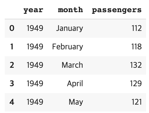
flights 데이터로 해보자!
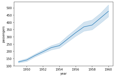
```py
# x축은 year, y축은 passengers로 라인플롯 보기
sns.lineplot(data=flights, x='year', y='passengers')
```
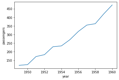
난 **각년도의 5월 승객수**만 볼때는 이렇게 하세요!
```py
may_flights = flights.query("month == 'May'")
sns.lineplot(data=may_flights, x="year", y="passengers")
```
# 2. 비교와 랭킹 -> bar
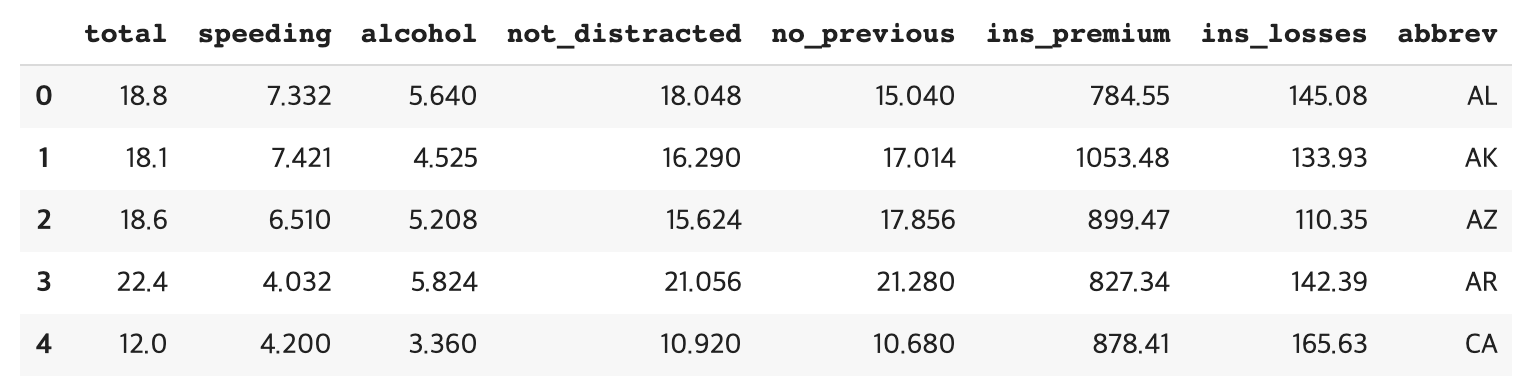
crashes 데이터셋을 써보자!
```py
crashes.head()
```
어떤 주에 가장 사고가 많이나는지 보자!
```py
sns.barplot(x="abbrev", y="total", data=crashes, color="b")
```
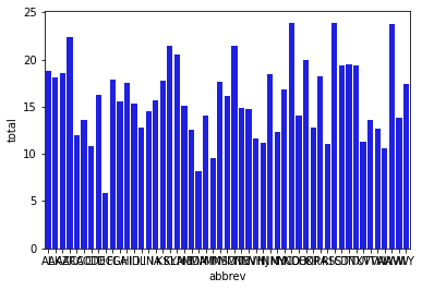
이대로 쓰면 랭킹에 의미가 없으니 데이터를 순서대로 나열해야함!
```py
# total 를 sort 해서 순서대로 나열
crashes = sns.load_dataset("car_crashes").sort_values("total", ascending=False)
sns.barplot(x="abbrev", y="total", data=crashes, color="b")
```
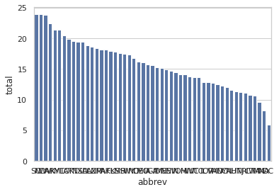
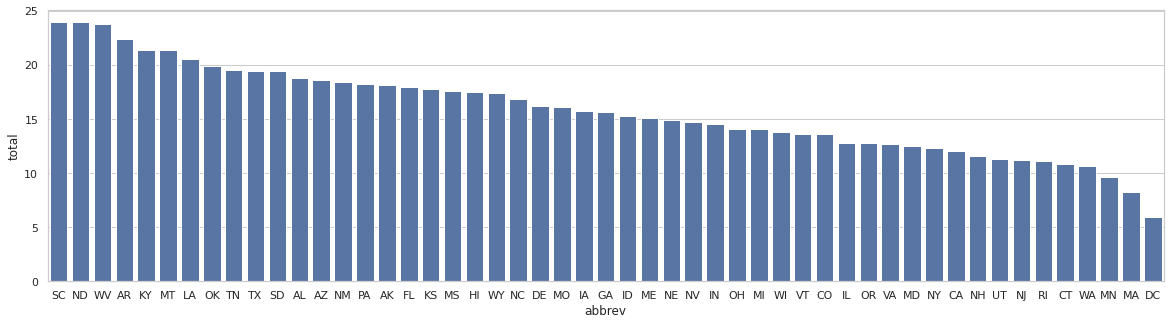
근데 아직 보기불편하다... 넓게 만들자!
```py
# 그래프 크기 조절
plt.subplots(figsize=(20, 5))
sns.barplot(x="abbrev", y="total", data=crashes, color="b")
```
# 3. 연관성 -> scatter
펭귄 데이터를 보자!
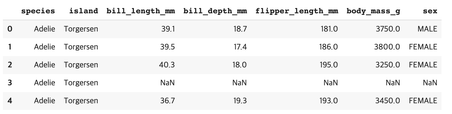
펭귄의 날개길이와 몸무게의 연관성을 보기위해 scatter 플롯을 씀
```py
sns.scatterplot(data=penguins, x="flipper_length_mm", y="body_mass_g")
```
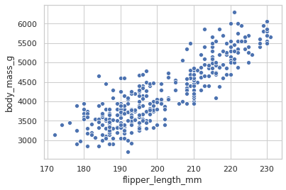
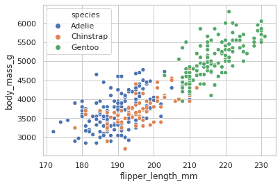
좀 더 다양한 정보를 볼려면 hue 를 사용하면 된다. hue 는 범주형 데이터에만 적용할 수 있음!
```py
sns.scatterplot(data=penguins, x="flipper_length_mm", y="body_mass_g", hue = "species")
```
# 4. 분포 -> box plot, histogram
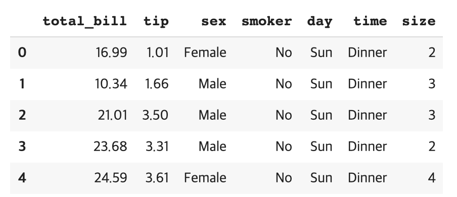
tips 데이터를 보자!
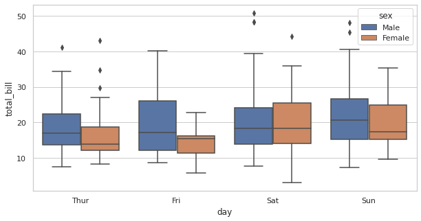
요일별로 total bill 이 얼마나 나오는지 보기! hue 를 이용해 남녀가 계산할때의 차이를 볼 수 있다. 이번엔 그래프 크기조절도 같이해봄.
```py
plt.subplots(figsize=(10, 5))
sns.boxplot(x="day", y="total_bill", data=tips, hue = "sex")
```
# 결론!
- 우선 분석할 데이터셋의 attributes 를 파악해야함
- 어떤 attribute 가 numeric 인지, categorical 인지, 시간인지
- 빠진 데이터가있는지
- attribues 끼리의 연관성
- attributes 을 파악 후에는 데이터의 성질에따라 어떤 플롯을 쓸지 고민해보는 것이 좋다.
- 시간에 따른 변화 -> line, area, bar
- 비교와 랭킹 -> bar
- 연관성 -> scatter
- 분포 -> box plot, histogram
- 부분이 전체에 차지하는 정도 -> pie, bar
Contributor guide
No contributing guide indexed for this repository
Assessment
This issue has not been assessed yet.