codestates / codestates/ds-blog
[윤형준] Titanic Data Visualization (타이타닉 데이터 시각화)
- Dominant language
- No language data
- Stars
- 2
- Forks
- 4
- PR merge metrics
- No merged PRs in 30d
Description
**오늘은 타이타닉 데이터를 가지고 시각화를 해보았습니다.**
먼저 필요한 라이브러리들을 가져옵니다.
```py
import pandas as pd
import matplotlib.pyplot as plt
import seaborn as sns
```
데이터를 불러옵니다.
```py
df = pd.read_csv('https://web.stanford.edu/class/archive/cs/cs109/cs109.1166/stuff/titanic.csv')
```
**Distribution Graphs**
```py
# Age distribution
# Age is quite normally distributed
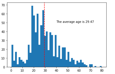
plt.hist(df["Age"], bins=50)
plt.axvline(df["Age"].mean(), color="red", linestyle="--")
plt.annotate("The average age is " + str(round(df["Age"].mean(),2)), xy=(40,50))
plt.show()
```
배에 탄 사람들의 Age Distribution 을 시각화 해 보았습니다.
```py
# Age distrubution conditioning on survival
surv_true = df[df["Survived"]==1]
surv_false = df[df["Survived"]==0]
fig = plt.figure(1, figsize=(10,3))
chart_1 = fig.add_subplot(121)
chart_2 = fig.add_subplot(122)
chart_1.hist(surv_false["Age"], bins=25)
chart_2.hist(surv_true["Age"], bins=25)
chart_1.annotate("The average age: " + str(round(surv_false["Age"].mean(),2)), xy=(35,50))
chart_2.annotate("The average age: " + str(round(surv_true["Age"].mean(),2)), xy=(35,30))
chart_1.axvline(surv_false["Age"].mean(), linestyle="--", color="red")
chart_2.axvline(surv_true["Age"].mean(), linestyle="--", color="red")
chart_1.set_title("Non-survivors")
chart_2.set_title("Survivors")
chart_1.set_xlabel("Age")
chart_2.set_xlabel("Age")
plt.show()
```
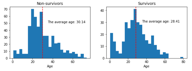
데이터를 생존유무로 conditioning을 한 후에 Age distrubution을 시각화 해 보았습니다.
생존자들이 생존하지 못한 자들보다 연령대가 조금더 낮습니다.
```py
# Fare distribution
# Fare is rightly skewed
plt.hist(df["Fare"], bins=25)
plt.axvline(df["Fare"].mean(), color="red", linestyle="--")
plt.annotate("The average Fare is " + str(round(df["Fare"].mean(),2)), xy=(40,400))
plt.show()
```
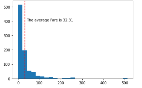
사람들이 배를 타기위해 낸 탑승권 가격을 distribution 으로 표현해 보았습니다.
아래 코드는 다음 시각화를 위해 약간의 데이터 변형입니다.
```py
# First create the column "Age_Group" and fill them in with zeros.
df["Age_Group"] = 0
# Assign appropriate names for each condition
for i in range(len(df["Age"])):
if df["Age"][i] < 10:
df["Age_Group"][i] = "Child"
elif (df["Age"][i] >= 10) and (df["Age"][i] < 20):
df["Age_Group"][i] = "10s"
elif (df["Age"][i] >= 20) and (df["Age"][i] < 30):
df["Age_Group"][i] = "20s"
elif (df["Age"][i] >= 30) and (df["Age"][i] < 40):
df["Age_Group"][i] = "30s"
elif (df["Age"][i] >= 40) and (df["Age"][i] < 50):
df["Age_Group"][i] = "40s"
elif (df["Age"][i] >= 50) and (df["Age"][i] < 60):
df["Age_Group"][i] = "50s"
elif (df["Age"][i] >= 60) and (df["Age"][i] < 70):
df["Age_Group"][i] = "60s"
elif (df["Age"][i] >= 70) and (df["Age"][i] < 80):
df["Age_Group"][i] = "70s"
elif (df["Age"][i] >= 80) and (df["Age"][i] < 90):
df["Age_Group"][i] = "80s"
# Create a new column, "Count"
df["Count"] = 1
```
**Ordered Bar Chart**
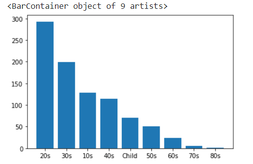
배에 탄 사람들을 나이대 별로 구분하여 차트를 만들어 보았습니다.
```py
# On the cruz, the 20s took up the most part of the passengers, and it followed by the 30s.
# 20대가 배에 가장 많았고 그 다음이 30대 입니다.
s = df.groupby(df["Age_Group"]).count()["Count"].sort_values(ascending=False)
plt.bar(s.index, s.values)
```
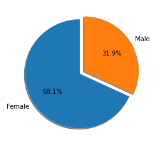
**생존자 내에서의 성별 비교**
Sex ratio within the survivors
```py
female_survived = df[df["Survived"]==1]["Sex"].value_counts()[0]
male_survived = df[df["Survived"]==1]["Sex"].value_counts()[1]
labels = ["Female", "Male"]
sizes = [female_survived, male_survived]
explode = (0, 0.1)
# 생존자 중에서 여자는 68.1% 였으며 남자는 31.9% 이다.
plt.pie(sizes, explode=explode, labels=labels, autopct='%1.1f%%', shadow=True, startangle=90)
plt.show()
```
Contributor guide
No contributing guide indexed for this repository
Assessment
This issue has not been assessed yet.