codestates / codestates/ds-blog
[조보현][beginner’s curiosity] How to explain machine learning?(PDP, SHAP)
- Dominant language
- No language data
- Stars
- 2
- Forks
- 4
- PR merge metrics
- No merged PRs in 30d
Description
# [beginner’s curiosity]

# How to explain machine learning?(PDP, SHAP)
> 모델링을 하다보면, 데이터사이언스는 타인에게 설명을 할 때 많은 생각을 하게 된다. ~(특히 예상외 상황에는 더욱)~

## 왜 가장 중요한 특성이라는 걸까?
### 모델은 무엇을 근거로 해당 특성이 가장 중요하다 말하는 걸까?
> 이러한 상황을 대비하여 시각화로 설명하는 방법을 소개 하고자 한다.
- 현재 예시로 소개할 방법은 **PDP(Partial Dependence Plot)과 Shap value plot** 이다.
### 1. PDP(Partial Dependence Plot) 란?
- 부분의존도그래프로써 예측모델에서 어떤 특성(feature)이 예측모델의 타겟변수(target variable)에 어떤 영향을 미쳤는지 알려주는 그래프이다.
### 2. SHAP(SHapley Additive exPlanations) 란?
- 단일 관측치로부터 특성(feature)들의 기여도를 계산하기 위한 방법으로 쓰인다. 즉, 전체적인 데이터 대신에 **개별** 변수들의 영향을 고려하여 어떤 영향을 미쳤는지 알려주는 그래프이다.
> a skipable section
-----------------
## 자료를 통해 확인해 보자
> [참조한 노트북](https://www.kaggle.com/kairosart/machine-learning-for-mental-health-1)
> [블로그에 있는 설명외에 데이터 처리과정 및 데이터셋 설명 확인 in colab](https://colab.research.google.com/drive/1NpG1XoNgusvSRNjCaW6KxcOvvXtrrsBi?usp=sharing)
> 사용 할 데이터셋 : [Mental Health in Tech Survey](https://www.kaggle.com/osmi/mental-health-in-tech-survey)
- 원래 해당 데이터 셋은 지지도 학습을 바탕으로 되어있어 따로 타깃 지정이 안 되어있다.
그래서 임의로 `treatment`이라는 **타깃을 설정**하여 진행하도록 한다.
### 오늘 사용해볼 데이터는 'Mental Health in Tech Survey' 데이터이다.

> 데이터의 형태는 아래와 같다.[자세한 설명 확인 in colab](https://colab.research.google.com/drive/1NpG1XoNgusvSRNjCaW6KxcOvvXtrrsBi?usp=sharing)


### 우리는 이 데이터를 통해 " 이전에 치료를 받은 적이 있는지"를 예측 하고자 한다.
> 문제는 ‘분류문제(1인지, 0인지 예측하는 문제)’이다.
### 여기서 타겟 변수는 “ treatment” 이며, 숫자 ‘1’은 ‘Yes’ / 숫자 ‘0’은 ‘No’
> treatment: Have you sought treatment for a mental health condition?
> 정신 건강 상태에 대한 치료를 받으셨습니까?
### 기본 EDA를 통해 target 정보 확인
```python
# target
target = 'treatment'
sns.countplot(x='treatment', data=train_df);
# yes =1 / No =0
```

### 기본 EDA를 통해 관련 있어보이는 feature를 확인
```python
#correlation matrix
corrmat = train_df.corr()
f, ax = plt.subplots(figsize=(12, 9))
sns.heatmap(corrmat, vmax=.8, square=True);
plt.show()
```

```python
#treatment correlation matrix
k = 10 #number of variables for heatmap
cols = corrmat.nlargest(k, 'treatment')['treatment'].index
cm = np.corrcoef(train_df[cols].values.T)
sns.set(font_scale=1.25)
hm = sns.heatmap(cm, cbar=True, annot=True, square=True, fmt='.2f', annot_kws={'size': 10}, yticklabels=cols.values, xticklabels=cols.values)
plt.show()
```

```python
# Separate by treatment or not
g = sns.FacetGrid(train_df, col='treatment', size=5)
g = g.map(sns.distplot, "Age")
```

### forest를 활용하여 예측모델 확인
```python
# Plot the feature importances of the forest
plt.figure(figsize=(12,8))
plt.title("Feature importances")
plt.bar(range(X.shape[1]), importances[indices],
color="r", yerr=std[indices], align="center")
plt.xticks(range(X.shape[1]), labels, rotation='vertical')
plt.xlim([-1, X.shape[1]])
plt.show()
```

-----------------
> a skipable section end

> 자, 여기까지만 보더라도 데이터 사이언스는 많은 정보를 다룬다.
> 이를 비전공자에게 하나하나 나열하며 설명하기에는 ~(매우)~ 많은 어려움이 생긴다.
> 그래서 미리 만든 예측 모델을 통해 시각적으로 설명하고자 한다.
# Create a PDP and explain the model
- PDP for one characteristic
```python
import matplotlib.pyplot as plt
plt.rcParams['figure.dpi'] = 80
from pdpbox.pdp import pdp_isolate, pdp_plot
from pdpbox import pdp
import matplotlib.font_manager
# work_interfere 대한 PDP
selected_feature = 'work_interfere'
isolated = pdp_isolate(
model=model,
dataset=X_val_encoded,
model_features=X_val_encoded.columns,
feature=selected_feature
)
pdp_plot(isolated, feature_name=selected_feature);
```
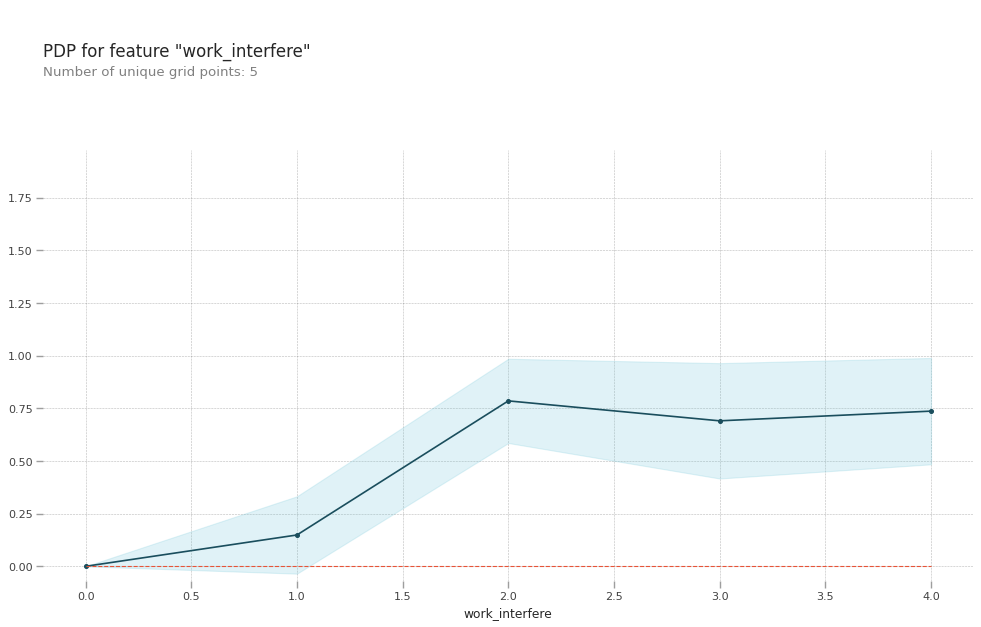
- 확인시, `work_interfere`에 대한 인식이 있을 때, `treatment`에 영향을 미침을 확인 할 수 있다.
> work_interfere: If you have a mental health condition, do you feel that it interferes with your work?
- 두 특성간 관계에 대한 PDP
```python
from pdpbox.pdp import pdp_interact, pdp_interact_plot
# work_interfere과 supervisor에 대한 PDP
selected_feature = ['work_interfere', 'supervisor']
interaction = pdp_interact(
model=model,
dataset=X_val_encoded,
model_features=X_val_encoded.columns,
features=selected_feature
)
pdp_interact_plot(interaction, plot_type='grid', feature_names=selected_feature);
```

- 확인시, 일정 수준의 `work_interfere` 와 `supervisor`가 있을 수록 `treatment`에서 **Yes**일 가능성이 높음을 확인 할 수 있다.
> work_interfere: If you have a mental health condition, do you feel that it interferes with your work?
> supervisor: Would you be willing to discuss a mental health issue with your direct supervisor(s)?
❕
❔
❓
> 이미 눈치 채신분들도 있겠지만..

## ‼️ PDP분석은 특성과 타겟변수의 관계를 전체적으로만 파악할 수 있을뿐 개별 관측치에 대한 설명을 하기에는 부족‼️
그래서 PDP는 전역적 (Global) 방법론, 개별 관측치에 대한 방법론인 Shap은 지역적(Local) 방법론이다.
그럼, **개별 관측치에 대한 설명**을 위해 Shap 로 시각화를 진행해보자.
> 보다 다양한 사례 확인을 돕기 위해 **분류성능평가지표**를 통해 진행하였다.

- True Positive(TP) : 실제 True인 정답을 True라고 예측 (정답)
- False Positive(FP) : 실제 False인 정답을 True라고 예측 (오답)
- False Negative(FN) : 실제 True인 정답을 False라고 예측 (오답)
- True Negative(TN) : 실제 False인 정답을 False라고 예측 (정답)
# Visualize using the SHAP library
### True Positive(TP) : 실제 True인 정답을 True라고 예측 (정답)
```python
row = X_test.iloc[[sp_list[0]]]
explainer = shap.TreeExplainer(model)
row_processed = X_test_encoded.iloc[[sp_list[0]]]
shap_values = explainer.shap_values(row_processed)
shap.initjs()
shap.force_plot(
base_value=explainer.expected_value,
shap_values=shap_values,
features=row,
link='logit'
)
# 이 그래프는 치료를 받았을 것이라고 예측되었고 실제로 치료를 받은 경우이다.
# 이렇게 판단된 것에 가장 큰 영향을 미친 것은 work_interfere이다. 반면, care_options은 예측되는데 부정적인 영향을 주었다.
```

### True Negative(TN) : 실제 False인 정답을 False라고 예측 (정답)

### False Positive(FP) : 실제 False인 정답을 True라고 예측 (오답)

### False Negative(FN) : 실제 True인 정답을 False라고 예측 (오답)

## 이렇게 PDP(전역적Global)와 Shap(지역적Local) 의 장점을 이용하여, 큰그림부터 세부적인 그림까지 소환한다면!
# 우리는 천.하.무.적!

> 그럼 전 이만, 모델링 정확도 올리러... 다시 ...

# 다들 다음 블로그 글에서 뵈요!!!

Contributor guide
No contributing guide indexed for this repository
Assessment
This issue has not been assessed yet.