codeforboston / codeforboston/cliff-effects
Layout for inputs/selections
- Dominant language
- JavaScript
- Stars
- 30
- Forks
- 62
- PR merge metrics
- No merged PRs in 30d
Description
Would like to discuss the layout of labels with text-input.
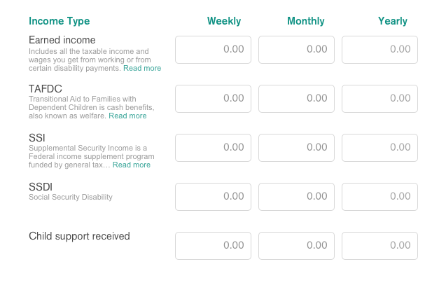
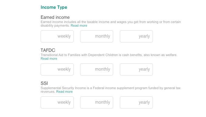
Labels are currently on left side for: current benefits, income, expenses, predictions.
Labels are currently on right side for: household
As we read left to right in English, it is typically easier to read label and then input or select answer. I would recommend putting labels on the left hand side. I would also consider not preselecting anything on current benefits, so a user has to select to continue.
I heard a discussion of wanting tooltips/description text and wanted to do a pass at options for that. I'm curious where the user already has this information and how it is currently styled for them -- it would likely be easiest to mimic that pattern to reduce cognitive load and user error.
Contributor guide
No contributing guide indexed for this repository
Research direction
Review the attached screenshots and compare the current label placement for benefits, income, expenses, predictions, and household. Clarify whether the intended work is label alignment, changing the current-benefits default selection, tooltip or description styling, or some combination. Done should be defined as an agreed layout and interaction change, but no files or tests are identified in the issue.
Written by the indexing model from the issue text.
Assessment
- Tech stack
- javascript
- Domain
- design, frontend
- Issue type
- Feature
- Difficulty
- 5/5
- Estimated time
- Over a week
- Activity status
- Stale
- Clarity
- Needs clarification
- Newbie friendliness
- 20/100