cityofaustin / cityofaustin/techstack
Post-MVP multipage forms considerations
- Dominant language
- No language data
- Stars
- 11
- Forks
- 3
- PR merge metrics
- No merged PRs in 30d
Description
Reviewed:
https://janis-3288-content-padding.netlify.com/en/health-safety/health-records-certificates-2/birth-death-certificates/multi-page-form-test
## Suggestions
Continue button is occasionally cutoff in the iframe, see below:
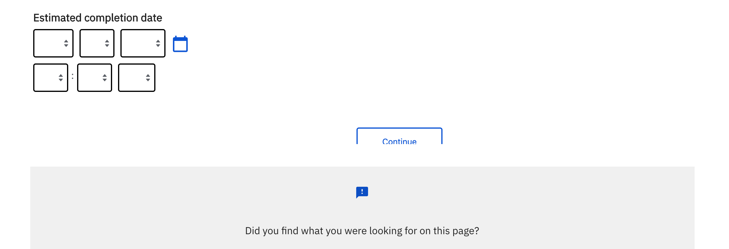
Dropdowns don't have any kind of field label, so the user has to open the dropdown to learn what information it's asking for:
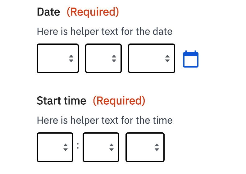
Dropdowns for dates are inconsistent: sometimes they're represented as numbers, sometimes by the month name, but we should be consistent.
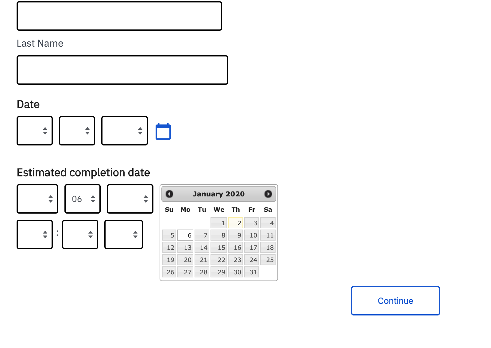
The calendar icon could use a label so that it's clear that this is actually a button as opposed to a field label, maybe something like "view calendar"
Also adding to this list: calendar picker styling
Contributor guide
No contributing guide indexed for this repository
Research direction
Start by reviewing the linked multipage form test and the screenshots in this issue, focusing on the iframe's Continue button, dropdown labels, date representations, calendar-button label, and picker styling. Done means these concerns are addressed consistently across the reviewed multipage forms and the updated interface is checked against the reported examples.
Written by the indexing model from the issue text.
Assessment
- Domain
- accessibility, design, frontend
- Issue type
- Feature
- Difficulty
- 4/5
- Estimated time
- 3-5 days
- Activity status
- Stale
- Clarity
- Mostly clear
- Newbie friendliness
- 35/100