Add a native adaptive layout for iPad
- Dominant language
- Rust
- Stars
- 32.7k
- Forks
- 4.3k
- Avg merge
- 1d 13h
- Merged PRs (30d)
- 253
Description
**Motivation**
Buzz runs in iPhone compatibility mode on iPad. In landscape, iPadOS centers a narrow portrait-sized app frame and leaves most of the display unused. The app also shows only the phone navigation surface instead of using the available width for channel navigation and content.
**Proposed solution**
- Add iPad as a supported device family instead of shipping an iPhone-only target.
- Add an adaptive tablet layout for regular-width screens.
- In landscape, keep channel and DM navigation visible beside the selected conversation or surface.
- In portrait and narrow split-screen widths, collapse to the existing phone navigation when space requires it.
- Preserve safe areas, rotation, keyboard behavior, and Dynamic Type at each supported width.
**Acceptance criteria**
- Buzz fills the available iPad window in portrait, landscape, Split View, and Stage Manager.
- Landscape uses a multi-pane layout rather than a centered phone frame.
- Selecting a channel or DM displays its content without replacing the persistent sidebar at regular width.
- Compact widths keep the existing phone navigation behavior.
- Add widget or integration coverage for compact and regular-width layout selection.
**Additional context**
Current iPad landscape behavior:
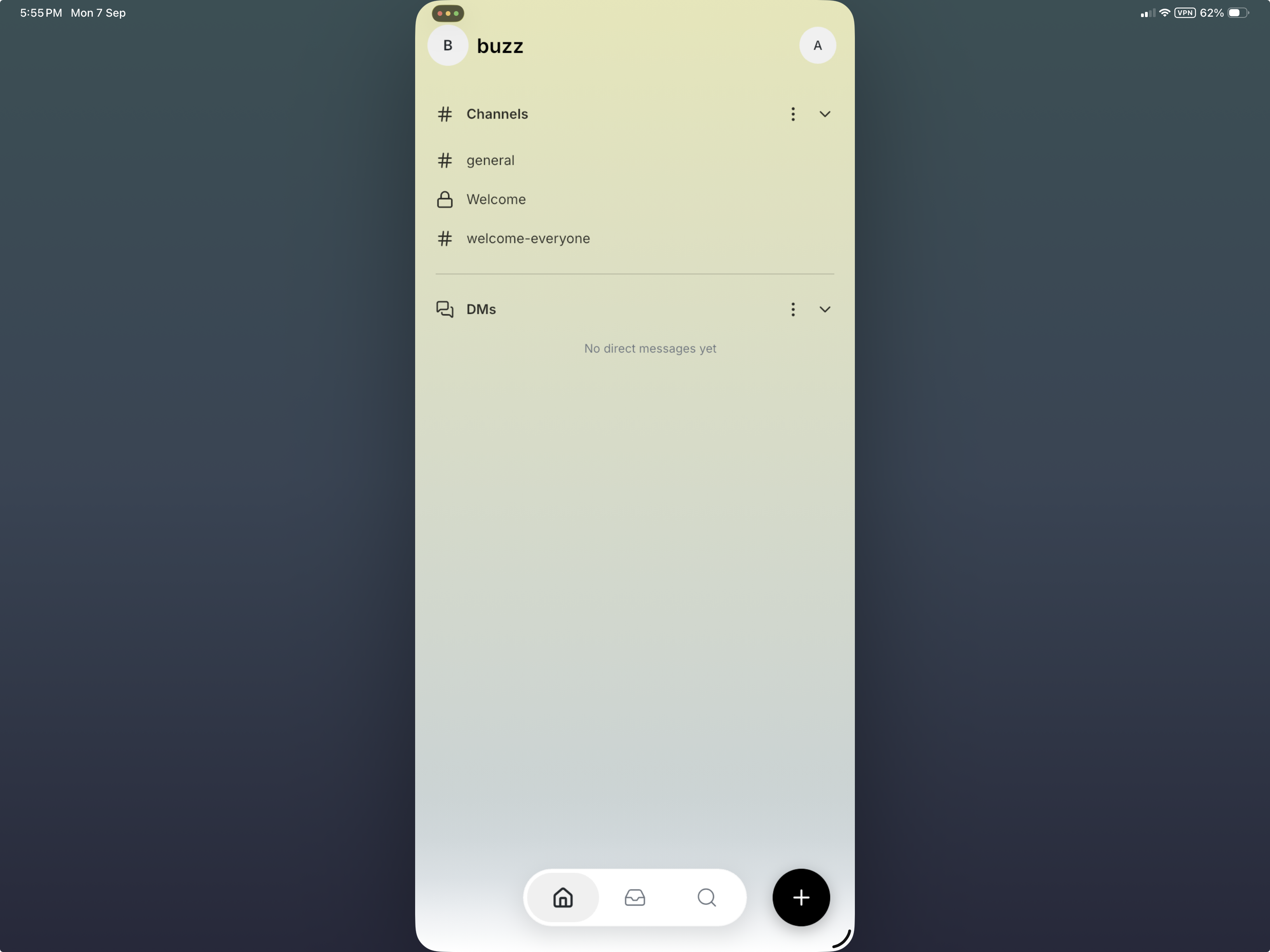
The iOS project currently sets `TARGETED_DEVICE_FAMILY = 1`, so the App Store package targets iPhone only. No duplicate issue found.
Contributor guide
Research direction
Start by locating the iOS project and its TARGETED_DEVICE_FAMILY setting, then trace the existing phone navigation and layout selection. Check how compact and regular-width states are represented before planning the adaptive panes. Done means the app fills iPad windows across the listed size modes, preserves the sidebar at regular width, keeps phone navigation at compact widths, and includes widget or integration coverage.
Written by the indexing model from the issue text.
Assessment
- Tech stack
- ios
- Domain
- mobile
- Issue type
- Feature
- Difficulty
- 4/5
- Estimated time
- 3-5 days
- Activity status
- Active
- Clarity
- Mostly clear
- Newbie friendliness
- 48/100