bitshares / bitshares/bitshares-ui
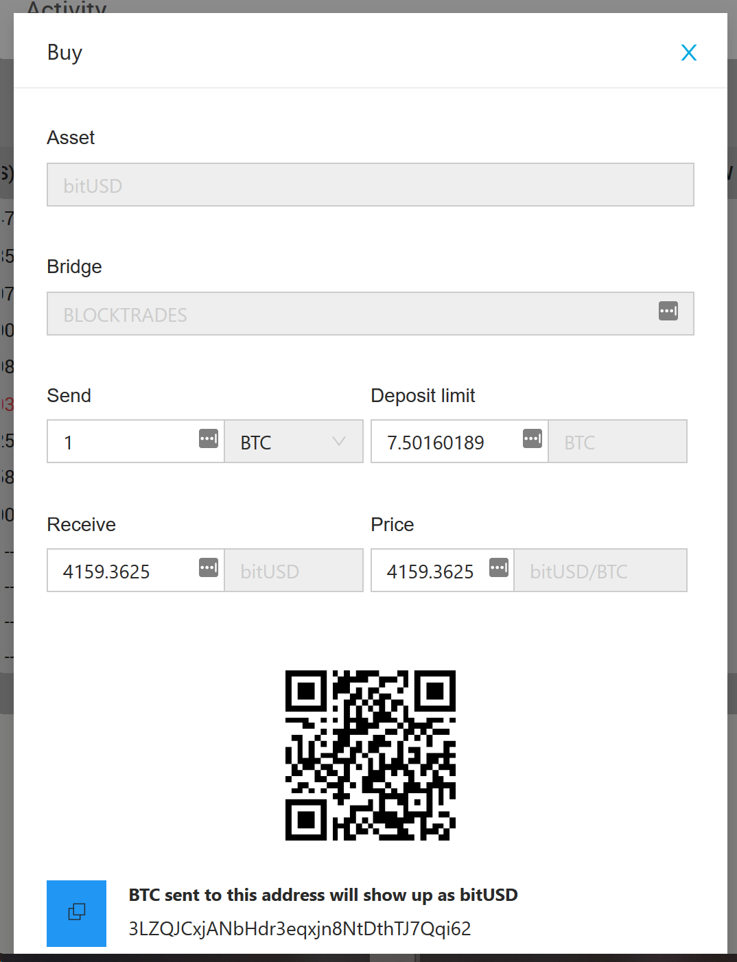
[0.5] Disabled Input/Select is difficult to read
Open
[1b] User Story
[3] Enhancement
[5a] Tiny
[6] Style Guide
[7] Estimated
- Dominant language
- JavaScript
- Stars
- 520
- Forks
- 575
- Avg merge
- 12h 7m
- Merged PRs (30d)
- 5
Description
A Disabled Input or Select will be difficult to read by the user.
- [ ] Find a background color + text color that works on all themse for disabled fields that can still be read easily.
## Example
Contributor guide
Research direction
No file or test is named. Start by locating the styles or components for disabled Input and Select controls, then compare them with the attached example and check that the chosen background and text colors remain readable. Done means both disabled field types have an accessible, consistent appearance.
Written by the indexing model from the issue text.
Assessment
- Domain
- accessibility, design, frontend
- Issue type
- Bug
- Difficulty
- 3/5
- Estimated time
- 1-2 days
- Activity status
- Stale
- Clarity
- Mostly clear
- Newbie friendliness
- 35/100