make the error modal feel like more error than info
- Dominant language
- JavaScript
- Stars
- 23
- Forks
- 62
- Avg merge
- 24m
- Merged PRs (30d)
- 1
Description
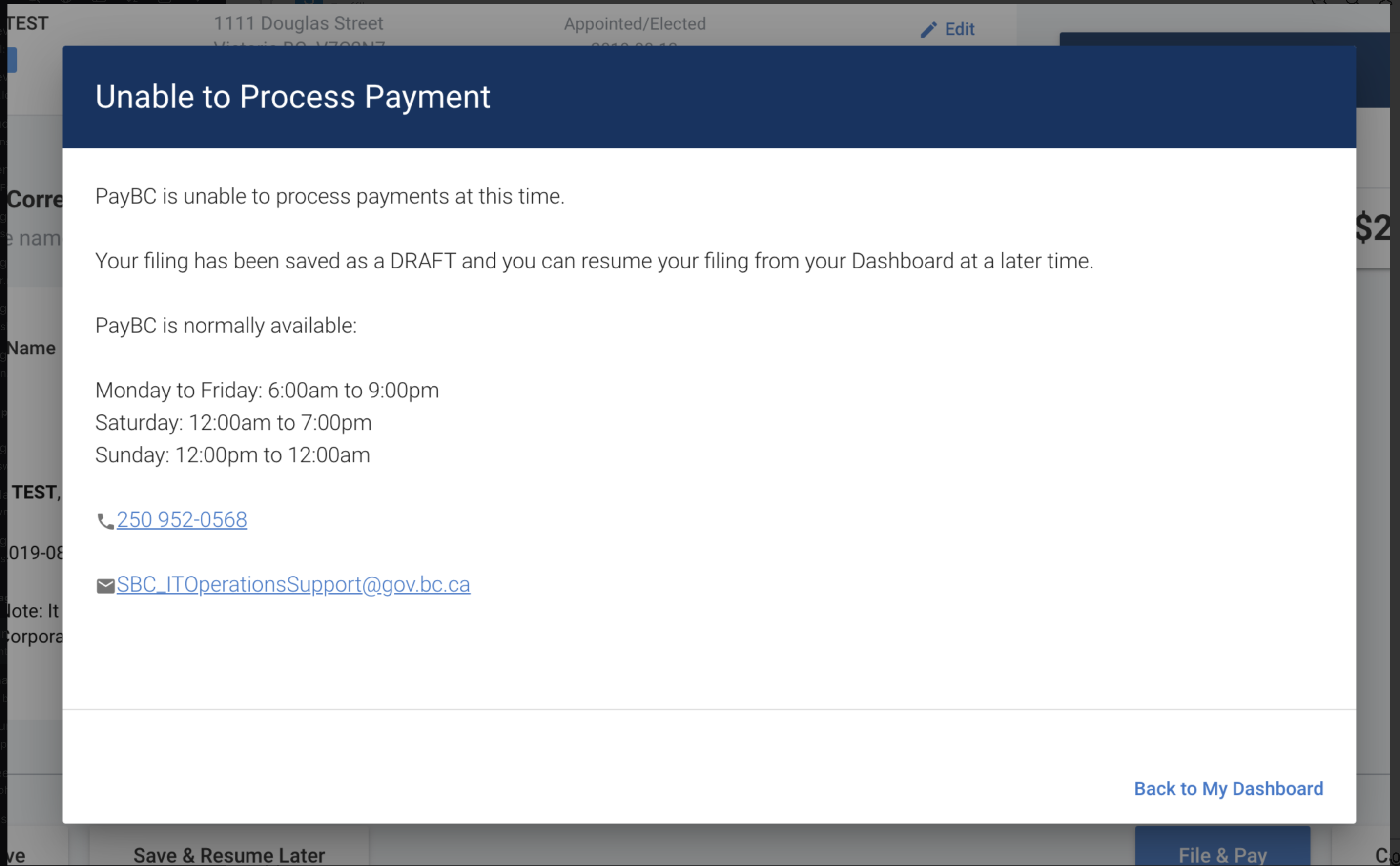
### payment failed error modals are more of info , than of an error .
## Description:
The payment info modal feels like an info modal than an error modal.With some color changes , it will give user the feeling ,something wrong happened.
Its of minor priority since all works good.Just the visual aspects
https://github.com/bcgov/lear/blob/e0324b0af754713ea3f20c35f98c872ba9ac8975/coops-ui/src/views/AnnualReport.vue#L3
I created a component in the sbc-common-components so that this can be reused across. But not finished neither tested. Once its tested and changed , it can be used across.
https://github.com/bcgov/sbc-common-components/blob/master/vue/sbc-common-components/src/components/SbcSystemErrorModal.vue
Acceptance / DoD:
- [ ] Product Owner advised if task >= 1 full-day, or forms part of the business day
- [ ] Requires deployments
- [ ] Test coverage acceptable
- [ ] Peer Reviewed
- [ ] Production burn in completed
Contributor guide
No contributing guide indexed for this repository
Assessment
This issue has not been assessed yet.