UX Improvement: Hover on lat/long fields in registration is the wrong colour [2]
- Dominant language
- No language data
- Stars
- 0
- Forks
- 0
- PR merge metrics
- No merged PRs in 30d
Description
#### Describe the Bug:
When a user hovers over the field, the outline usually turns blue. However, in the facility form in registration, the outline is black:

The outline is correctly blue in admin in the same form.
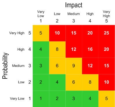
#### Probability: 1
(How likely the bug is to happen, scored from 1-5. For example, probability of 5 is something like "it happens to all users every time they log in." whereas probability of 1 "only happens to certain users when a really specific and unlikely path is followed.")
#### Impact: 1
(How bad the bug is when it does happen, scored from 1-5. For example, effect of 5 is "the entire app crashes and makes it unusable for all users" or "the bug causes the wrong data to be saved, with critical information (e.g. payment) being affected." whereas effect of 1 is "It makes some styling look a little bit weird.")
#### Steps to reproduce the behaviour:
1. Step #1
2. Step #2
3. Step #3
#### Screenshots:
#### Additional information:
OS: [e.g. iOS]
Browser: [e.g. chrome, safari]
Version: [e.g. 22]
#### Additional Context
-
Contributor guide
No contributing guide indexed for this repository
Research direction
Start by reproducing the hover state on the latitude/longitude fields in the registration facility form and compare it with the same form in admin. Locate the frontend component or styles for these fields; done means the registration hover outline matches the blue admin outline.
Written by the indexing model from the issue text.
Assessment
- Domain
- frontend
- Issue type
- Bug
- Difficulty
- 2/5
- Estimated time
- 1-3 hours
- Activity status
- Stale
- Clarity
- Needs clarification
- Newbie friendliness
- 35/100