Horizontal barcharts and white + blue theme on shields metrics
- Dominant language
- JavaScript
- Stars
- 27.2k
- Forks
- 5.6k
- Avg merge
- 1d 8h
- Merged PRs (30d)
- 46
Description
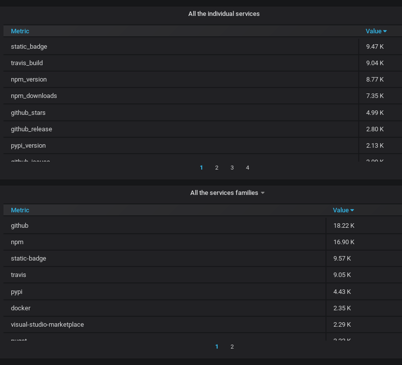
From #966. [metrics.shields.io](https://metrics.shields.io/d/aESRBSjmz/services?orgId=2) is not aligned with overall shields design. They look out of place, because it is default theme in `grafana`. If the theme could be changed to the example below, it would be more pleasing:

The digits in services stats are also hard to compare. Implementing horizontal bar charts will greatly improve the readability of the info.
Contributor guide
Research direction
Start with the metrics.shields.io Grafana dashboard linked in the issue and compare its current presentation with the two reference images. Identify where the services panel's theme and chart type are configured; done means the dashboard uses the requested white-and-blue styling and horizontal bar charts, with the services values easier to compare.
Written by the indexing model from the issue text.
Assessment
- Tech stack
- grafana
- Domain
- data-visualization
- Issue type
- Feature
- Difficulty
- 4/5
- Estimated time
- 3-5 days
- Activity status
- Stale
- Clarity
- Mostly clear
- Newbie friendliness
- 35/100