authgear / authgear/authgear-server
Need more consistent portal width
- Dominant language
- Go
- Stars
- 2k
- Forks
- 125
- Avg merge
- 2d 17h
- Merged PRs (30d)
- 32
Description
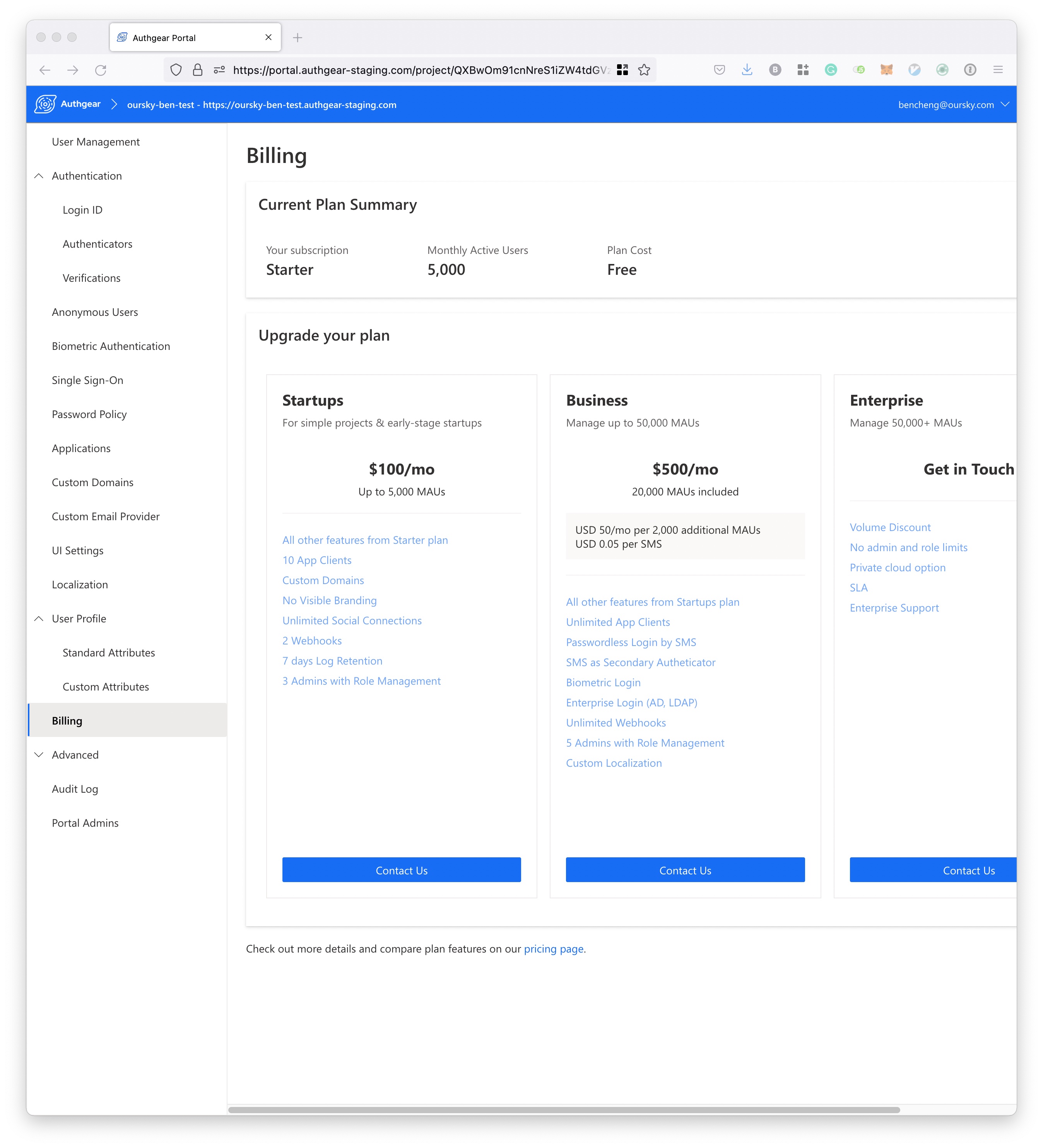
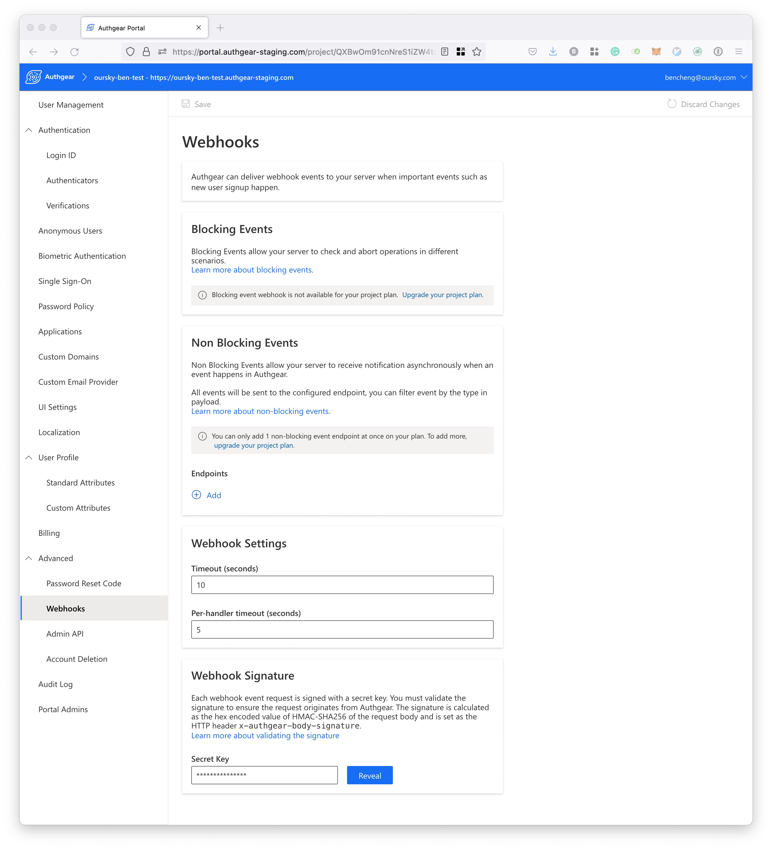
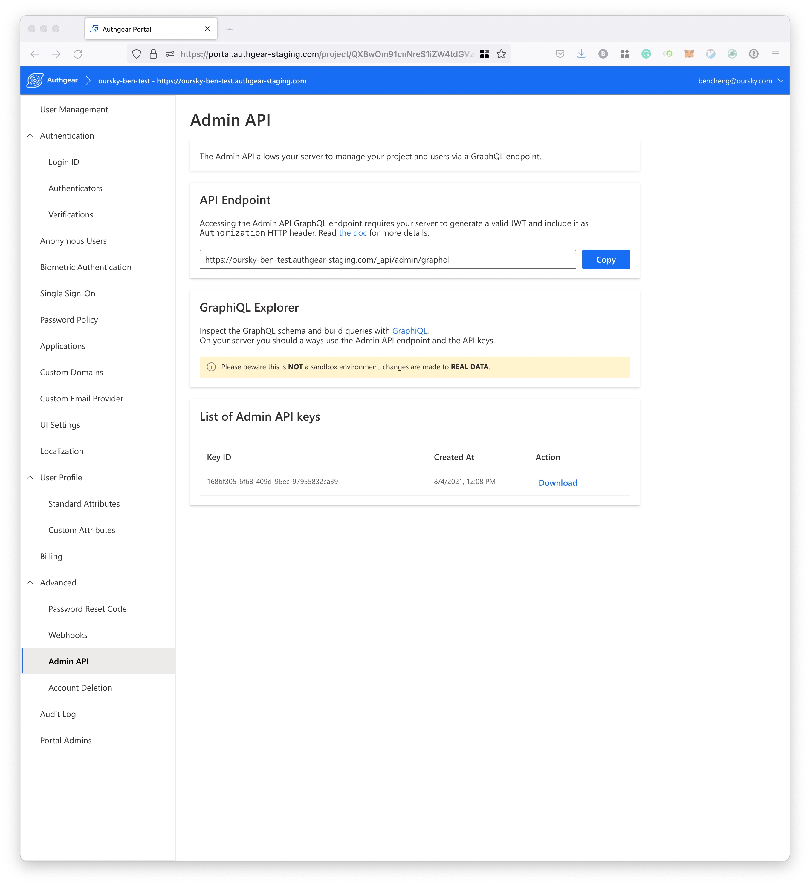
Currently, the width of the portal is not consistent and doesn't really make sense. Here are a few examples:
1. The width is a bit too long (e.g. Billing Page)
2. The width is too narrow (e.g. Webhooks)
3. The width is longer then 2, shorter than 2 (e.g. Admin API)
I think it is okay to have different width, but we should have some consistency and fix as follows:
1. For really wide pages (Billing Page, Standard/Custom Attributes), consider having a shorter min-width and responsive if the screen is wider?
2. For pages with dropdown at top right (UI Settings, Localization, ), the top right dropdown should align with the right position of panel, **don't** overlap outside the pane
3. For pages that would looks better if longer (Webhooks, Applications), have a wider width like Admin API?
Contributor guide
Research direction
Compare the portal layouts for Billing, Standard/Custom Attributes, UI Settings, Localization, Webhooks, Applications, and Admin API, focusing first on their current panel widths and top-right dropdown placement. Done means the affected pages use a consistent responsive width approach, with dropdowns aligned inside their panels and wider layouts where the content needs them.
Written by the indexing model from the issue text.
Assessment
- Domain
- design, frontend
- Issue type
- Bug
- Difficulty
- 4/5
- Estimated time
- 3-5 days
- Activity status
- Stale
- Clarity
- Mostly clear
- Newbie friendliness
- 35/100