[Feature] Improve animation on option changes
- Dominant language
- TypeScript
- Stars
- 67.3k
- Forks
- 19.8k
- Avg merge
- 11d 14h
- Merged PRs (30d)
- 8
Description
### What problem does this feature solve?
https://user-images.githubusercontent.com/1726061/151282420-a1e61bb9-7c41-47ec-b5b1-c2bb50bdfa48.mp4
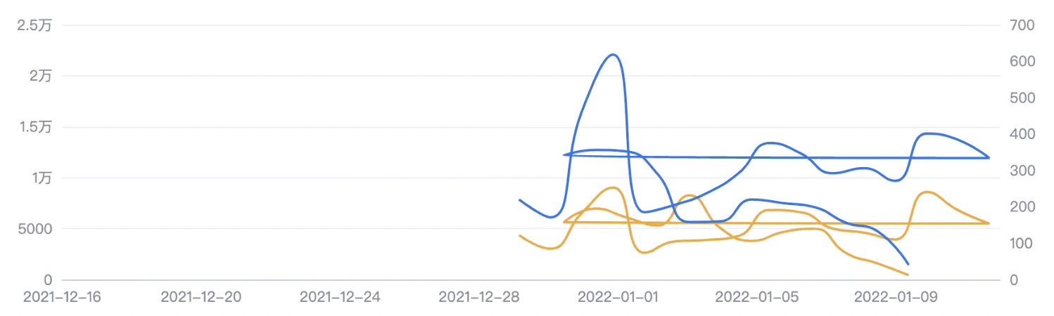
As showed in the video above, the current transition animations in ECharts don't feel natural for scenarios where the data changes dramatically. And sometimes the curves even overlap with each other. See below:
### What does the proposed API look like?
Improve the transition animations to make them more natural and intuitive. Of course, I understand that this is bound to be hard to fit all possible situations. So maybe we can offer a few types of animations and let users choose the one closest to their desired behavior, like "incremental", "restart", etc.?
Contributor guide
Assessment
This issue has not been assessed yet.