Use actual area measure instead of radius in Rose Chart
- Dominant language
- TypeScript
- Stars
- 67.3k
- Forks
- 19.8k
- Avg merge
- 11d 14h
- Merged PRs (30d)
- 8
Description
### What problem does this feature solve?
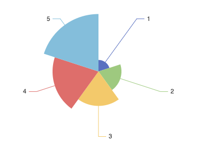
With `roseType: area` property of the `pie` type chart, sectors have their radius mapped to the data instead of the area, which is misleading not only in the graph options definition, but also as the resulting visualization.
In fact longer slices receive more emphasis than they should because of their larger area size. This disproportionately represents increases in value, leading the reader to exaggerate the differences.
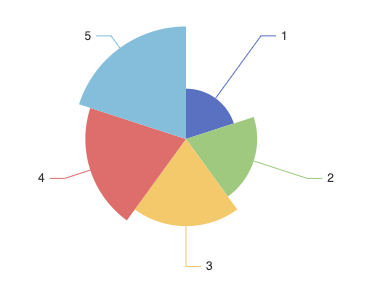
Mapping the data value to the area instead of the radius would thus both make the api more consistent and the final result more accurate and effective.
### What does the proposed API look like?
Rather than an API change it's just a different calculation of the slice radius, which should be calculated using the square root of the value, instead of the value itself. I.E. if values are `[4,9,25]` using `[2,3,5]` as the radius.
Demonstration as follows.
With:
```
alpha = central angle of the slice
At = total area of the circle = pi * r^2
As = slice area = ( ( pi * r^2 ) / ( 2 * pi ) ) * alpha = r^2 * ( alpha / 2 )
```
Since alpha is equal for all slices, slice areas will be proportional to the square of the radius. Thus, to obtain areas with the same proportion of the datapoints, the actual radiuses should be proportional to the square root of the data points.
*Current rendering with data as radius: difference between data points is evidently out of proportion*
*Rendering with radius as the square root of the data: much more accurate rendering of proportions between data points*
Contributor guide
Assessment
This issue has not been assessed yet.